Showing posts with label RE-FIX. Show all posts

25 Aug 2015

Fernando de Noronha (Brazil) [II]

To read the original post, click here.

Almost three years ago, I proposed the following flags for the heavenly archipelago of Fernando de Noronha:


For sure, it removed most of the nonsense in current flag (look original post for rationale):


However, I now tend to believe that I could have a more effective proposal. Previous ones had too many colors, and the landscape wasn't effective and, possibly, as relevant as I used to think. My new proposal is the following:


My new design kept the link to current flag as well as Brazilian flag, but is much simpler. I decided to focus on the dolphins, major symbols of the archipelago. The arrangement in circle is classic and catching, and better remarks Brazilian flag.

Comments and suggestions are welcome.
As I'm still without computer, I thought a re-fix is what I could offer.

25 May 2015

New Zealand [II]

New Zealand is going to hold a referendum about a flag change. NZ Government is listing all the designs submitted so far. Looking there, I got in the mood of submitting my own design.


I thought about submitting the flag of my original post about NZ, but similars design were already submitted. So I made this design:


The Southern Cross is were it was supposed to be. I decided to use a straight silver fern instead of more usual, curved fern. Due to laziness, I used the same fern from a (beautiful, indeed) design by James Bowman, from Auckland:


I think the silver fern and Southern Cross are more neutral than Union Jack or Tino rangatiratanga (main Maori flag). The silver fern could be, obviously, of a motif different from Bowman's.

Comments and suggestions are welcome.
Not submitted it yet, but may do it next days.

10 Feb 2015

Brazil [III]

Click to see parts I and II.

Once more, I'm inclined to fix the Brazilian national flag. In this case, my idea is more subtle and doesn't fix all issues I described in parts I and II, it's more like a hotfix.

This is the current Brazilian flag:


My idea, inspired by Paraná flag, is just substitute this confuse set of stars for the Southern Cross:


Apart from being a more effective way of showing a national symbol, it's a much simpler and remarkable design. A side effect is that the white ribbon is less horizontal, a bonus for those that see a reference to the armillary sphere.

It keeps the criticized "Ordem e Progresso" [Order and Progress] writing, considered both unaesthetic and partisan (being originally derived from a Positivist motto). One step further:


Comments are welcome.
Don't forget to check parts I and II of the series.

21 Jul 2014

Anglo-Quebecers, Anglophone community in Quebec (Canada) [II]

To read the original post, click here.

About one year and a half ago, I posted a flag for the English-speaking community on Quebec, what would make sense since the French-speaking communities of majorirarily English-speaking provinces have their own flags.

My final proposal was this, inspired by the provincial coat of arms and symbolizing duality and unity. For the complete rationale, click on the link on the top of the page.


Recently, a commenter posted that Montreal flag could almost pass as a flag for the English-speaking Quebec. So I noticed to have a re-though on the flag.

Curiously, Montreal and its neighborhood concentrates the biggest part of the community. Below, the flag of Montreal: a red cross, representing the religious that founded the city, and a fleur-de-lis, a Lancaster rose, a thistle and a shamrock, representing, respectively, the French, the English, the Scottish and the Irish settlers. In my opinion, the flag is a bit busy:


And this is the flag of Quebec:


Both flags have a cross and a fleur-de-lis on superior left quarter. So I have the idea of coloring the flag of Quebec like that of Montreal, obtaining this result:


The red cross could also be handled as the St. George's cross of England, the birthplace of English language. The link with the flag of Quebec makes it more suitable to the whole province, and not only Montreal. The disposition of colors have also a curious similarity with British flag.

I like the final result, and it's bold but also very significative.

Comments are welcome.
Just curious: two consecutive flags on North America category.

4 Jun 2013

Brazil [II]

To read the original post, click here.

I recently showed a flag proposal to incentive the debate about a possible new Brazilian national flag. If you want to know the reasons why the debate is interesting, click on original post.

Below, you can see, respectively, current Brazilian national flag and my first proposal:


My newest proposal is, in certain way, derivative of the flag Brazil used during monarchy:


I'm not a great fan of imperial coat of arms for a couple of reasons: it's very complex, the green shade is too dark, the tobacco branch doesn't represent Brazilian history, it needed to be changed every time a new province was created, etc. Moreover, it's impractical since the country became a republic, because of the crown. My proposal, reworking previous flag, is the following:


The armillary sphere and the cross of the Order of Christ have long being associated with Brazilian iconographic history. The blue circle is blue, with an allusion to current flag and to the flag Brazil used during the United Kingdom with Portugal and Algarve. The flag now has red, the color of the tincture of the brazilwood, the tree that gives name to Brazil.

For the fans of the lozenge occupying the whole plan:


It's important to notice that, although this flag is a little complicated to being drawn, the current one is worse: it's much more difficult to draw 27 stars, each one with its correct size and position, while the proposal has a logic infinitely easier to be remembered. Moreover, this proposal is only a prototype, and can be simplified in other occasion.

Your comment is welcome!
If you have a favorite Brazilian flag proposal, by you or whoever, fell free to post it on comment.

18 Mar 2013

Fiji [II]

To read the original post, click here.

A little more than two months ago, I presented a suggestion to a new Fijian flag. The reason is simple: a new Constitution to Fiji will be approved soon, and it was announced that a new national flag will come together. The only info about how it'll look: without the Union Jack.

Now you can see the current Fiji flag and, after that, my first proposal to a Fijian flag (that I re-thought):


With precious reviews from Flags Forum, I came with a re-do:


Sky blue, white and black are colors identified with Fiji, specially because of their use by the national sportive teams. The palm tree represent the island itself (and is used by rugby team), while the blue background represents the great Pacific Ocean that surrounds the island. The doves come from a pre-colonial flag, and the way they are positioned on the flag represents the peace and stability coming directly to the island. I think this flag is more representative and equilibrated than my first attempt, so I think that, in the end, it's a better flag.

By the way, a set of ensigns I made based on the flag. Respectively, the state, civil, naval and air force ensigns:


Comments are welcome. Please, leave your comment.
As soon as the new Fiji flag appear, I'll comment it on Flag Review, my other blog. Why don't you visit it right now?

16 Jan 2013

Ceará (Brazil) [II]

To read the original post, click here.

Last year, I ran a series about Brazilian state flags (the epilogue of series can be seen here). After that, unsatisfied with my early proposal to Rio Grande do Norte, I made a new one. I decided that I'd redo my Ceará flag in a next opportunity, and this is the time. First, look at current state flag and, after that, my early proposal:


You can see a complete rationale about problems in current flag in original post, the biggest of them, obviously, is the excessive similarity with Brazil national flag. I like my early proposal because it represents Ceará state in all its nuances. But the result is maybe too complicated to be used as a flag (I still think it could do a good banner of arms), so I decided to returned to simplicity.

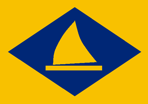
My first decision was make the reference to Brazil flag present in current flag, but in a more subtle way: keeping the lozenge layout, but changing the colors. It'll be charged with the jangada (that kind of raft you can see on both flags above). So I come with two proposals:


The yellow background represents the beaches, symbols of that sunny state, while blue is for the sea (alternatively, they can represent, respectively, the semi-arid interior and the dikes), where navigates the jangada. The first proposal uses a yellow raft, keeping the flag with only two colors, what's a great deal in manufacturing aspect. But the second, with a white one, shakes my heart with more intensity (notice that a jangada has, naturally, a white candle). What do you prefer?

Please, send your comment. It's important to the blog.
Soon you'll see my proposal to Fortaleza, capital city of Ceará. Wait!

2 Jun 2012

Rio Grande do Norte (Brazil) [II]

To read the original post, click here.

Approximately two months ago, during my Brazilian States Series, I showed a proposal to Rio Grande do Norte. But, unsatisfied with my own result, suring the series epilogue, I said I was unsatisfied with Rio Grande do Norte and Ceará final proposals. See the current state flag, and my first proposal below:


Hum, it's specially very meaningful, but, for my taste, too colorful and unorthodox. My new proposal is this:


Blue and green have the same meaning than in original proposal, but yellow substitutes the white for representing sand more effectively. The new element is the rising sun. If you realize, RN isn't the most Western state in Brazil, but it symbolizes the state's geographical position, however. It also has the same symbolism than green and white colors in current flag: hope.

After completed, I noticed something: green, yellow, blue, white... the national colors!

What of three flag in this post is your favorite? Comment.
I'm accepting suggestions to my new Ceará flag. You can contribute with it.