Some weeks ago, Samuel McKittrick published, on his blog, a
post about a flag proposal to the Greater London. What's Greater London? Well, the
City of London, officially, is only 2.9 km² large, and, as you can suppose, the area that surrounds the City is much bigger.
His interesting flag proposal is the following, on versions with and without St. Gorge's cross (being the latter a banner of his proposed coat of arms):
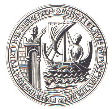
The portcullis represents the fact that London is capital of UK (it appears on
Westminster coat of arms), as it's a symbol associated with Parliament, and represents the Greater London, for example, on
London Regiment cap badge. The lion and the Lancaster and York roses are symbols of England.
His proposals, specially the second, are quite nice, but I was just curious to take a different approach, adding the Saxon crown to represent the status of capital and main town of England since before the Norman Conquest, and appears, for example, on the flag of
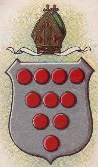
Middlesex (that comprises good part of Greater London) and many London boroughs, like
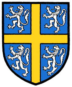
Barnet,
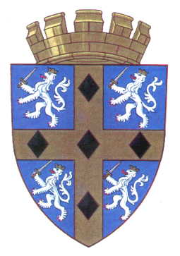
Brent and
Ealing.
I decided to make the flag from the coat of arms, making the design have double usage. The coats of arms (only the shields) are here:
The color scheme is inspired by the St. George's red and white. Both shields contain the Saxon crown and the portcullis, whose meanings are explained above. The fess wavy was added because, as Samuel stated, the crown just above the crown could be confused with
Parliament logo. It represent the River Thames, that divides London in north and south, and the Port of London attached to it. On the chief of second shield, a St. George's cross, that can represent, among other things, the
city of London, charged with Tudor rose, an authentic English symbol. But first shield is still my favorite.
Transposing the coat of arms to a flag:

Maybe a taller ratio would be better, but its unique horizontal pattern (all red, with blue and white wavy stripe) would make it recognizable in any wind condition.
Comments are welcome.
Original Sammy McKittrick post, that's an excellent reading, can be accesses here.


