Showing posts with label United Kingdom. Show all posts

2 Jun 2016

NEWS: Denny and Dunipace (Scotland, UK)

It will be a different kind of post, because today I have some great news to share!

Weeks ago, I wrote about my proposals to the flag of Denny and Dunipace, and noticed that a proposal very similar to my design was among the finalists.

What I didn't know is that that finalist design was a merge between my own design and the one by a Spanish man named Fernando Álvarez Martín. And it won! Therefore I'm technically co-author of first town flag of Scotland!

That's the winner design:

For comparison, one of my proposals was like this:

(I currently don't know Fernando's exact proposal. If I obtain it, I'll submit it here.)

I'm very excited! Firstly, because I'm very proud about contributing someway to the final design. Secondly, because it's an important precedent to other Scottish towns adopting their own cool flags, specially due to support by the Flag Institute and the Court of Lord Lyon.

Comments are welcome!
Greetings to Denny and Dunipace, from Brazil.

21 Apr 2016

Denny and Dunipace (Scotland, UK)

Denny and Dunipace is holding a contest to decide its new flag (more info here). I've submitted two entries, that didn't made the final list (even though similar entries did), but I'll show them here just for entertainment.

The burgh used to have a beautiful coat of arms, before it was incorporated into Falkirk, even though it's too busy for a flag:

My first entry adapted it into a more flag-friendly design:

The entry was followed by this rationale:
The flag resembles burgh seal and coat of arms. It contains a landscape, with river Carron and the bridge joining Denny and Dunipace. The white color remarks the important treaties signed in this place. The bar engrailed represents the connection with the Sinclair.
My second entry was less derivative but, I have to admit, more generic:


It was an improvement over a previous design, that took "twin towns" too literally:


I've submitted it with the following rationale:
The flag shows River Carron, with Dunipace in north bank and Denny in south. The white color remark the important treaties signed in this place. The black color represents coal and iron. Apart from Denny and Dunipace, the two fortified buildings can represent the forts on its banks dividing Roman and Picts — "Carron" may come from Latin "caer avon", i.e. "river of the forts".
None of them made the final, but designing them was nonetheless some fun.

Comments and suggestions are welcome.
To know the finalists, click here.

25 Feb 2016

Bristol (England, United Kingdom)

I've came accross a petition for a new flag of Bristol. Apparently, it's related to Facebook and Twitter accounts. So I became excited about making a design by myself.

Theorically, Bristol council is allowed to fly its banner of arms:


But this banner couldn't be used by Bristolians without authorization. I've become inspired by Bristol's original seal and current badge (diverse from coat of arms, it was used to show allegiance).


Ship and fortified bridge represents the famous Bristol port. The cross fleury is a reference to a compass rose. I think I've simplified enough the complex design to make a good flag, but still keep the elements understandable.

Comments and suggestions are welcome.
Sorry for small delay. I've had a commitment.
Access the campaign's Facebook and Twitter for more ideas.
The banner of arms was made by Paul Callan.

2 Nov 2015

27th International Congress of Vexillology

When I designed a flag for London borough of Greenwich, I was looking for designing a flag for ICV 27, that will at University of Greenwich Old Royal Military College at August 2017.

One of my designs for Greenwich:


Then, I designed many doodles mixing this flag with vexillological themes, but none of them was satisfactory. My next idea was using the flag of Flag Institute, organizers of the congress, as a base. This is the charming flag of FI:


So I came up with this design:


The visual references for FI flag are obvious. I took advantage of the triangle that represents the letter V of "vexillology". The tiny red line represents the world-known prime meridian of Greenwich (traced using the Greenwich observatory as reference), where East and West are joined. The globe represents our planet, as the congress will be attended by people from all around the world, without division (the red line doesn't cross the circle).

Comments and suggestions are welcome.
Design an imaginary flag for a ICV is very funny. I invite the fellow vexillologists to have a try.

8 Sept 2015

Greenwich (London, UK)

From last August 31st to September 4th, the 26th International Congress of Vexillology happened in Sydney, Australia. The next ICV will happen in 2017, in London, more specifically in the University of Greenwich and the Old Royal Naval College, in the royal borough of Greenwich. So I think designing a flag for Greenwich would be welcome.

My inspiration for this design was the 1903-1965 coat of arms, before the annexation of Woolwich borough (for this specific purpose, I don't think that references to Woolwich are needed). The first attempt was a simplified version of the banner of arms (i.e. with less stars):

The central stripe is tinier in reference to Prime Meridian, also referred by the hourglass. The stars represent the Royal Observatory.

For my second attempt, I removed one more star, to make the flag look more balanced:

I like the result. But I'm not sure if it's better than with reversed colors:

I have a feeling that this version looks more "natural", but less unique.

Comments and suggestions are welcome.
Which of the three is your favorite proposal for Greenwich flag?

16 Jul 2015

Belfast (Northern Ireland, United Kingdom)

Today, I'll try to fix the flag of Belfast, the capital and largest city of Northern Ireland.

This is the current flag of Belfast:


That's not more than a banner of city's coat of arms:


The coat of arms is not the best heraldry, not it's not horrendous, either. The bell seems to be canting (i.e. punning) with city's name. The vair is taken from Chichester's family heraldry, being Arthur Chichester the founder of the town. The ship may refer to the importance of shipbuilding or the etymology of the city (from Gaelic, "mouth of the sandbar") and is decorated with St. Patrick's cross.

But, as a banner of arms, it's not effective, really too busy. My proposal is the following:


Let me explain it...The river refers to city etymology, and its importance as a portuary and shipbuilding city.Besides remarking Chichester's heraldry, the individual parts of a vair are known as "vair bells", thus keeping the pun. With some luck, they can barely remember a sail.

Comments and suggestions are welcome.
Sorry for being REALLY late... It seems like a (negative) record.

11 Jun 2015

British Overseas Territories (United Kingdom)

Let's take a careful look at Gibraltar's flag:

Why is this different from any other British overseas' flag? Because it don't have an Union Jack on it. Now, look at the flag of the other fifteen British overseas territories:

Akrotiri and DhekeliaAnguillaAscension
BermudaBritish Antarctic TerritoryBritish Indian Ocean Territory
British Virgin IslandsCayman IslandsFalklands Islands
MontserratPitcairnSaint Helena
South Georgia and South
Sandwich Islands
Tristan da CunhaTurks and Caicos

Quite boring, isn't it? So today I'll present my proposal for the fifteen! Some of the designs are mine, others aren't (when noted).

My design for Akroitiri and Dhekelia is inspired by the Dhekelia Garrison's flag. For difference, I've added the colors of British Ministry of Defence, to show it's a military base.


My proposal for Anguilla is actually a rip-off of Republic of Anguilla (1967-1969) flag i.e. a banner of current arms.


For Ascension, a banner of arms, too. I added a tiny white fimbriation in the green chevron, just to increase visibility:


For Bermuda, I picked the lion and red of current flag (both representing British influence) but put the lion's face on a triangle, a reference to famous Bermuda's triangle.


My British Antarctic Territory flag proposal is based on coat of arms, too. I put the blue stripes on center and made the white background shine.


For British Indian Ocean Territory, I picked the flag of Chagossians (natives) in exile and put the palm tree and crown from current design. Some minor details is that I put the crown crossing the tree and centered in black stripe, for better aesthetics. This is one of my favorite flags in the series.


Also original is my flag for the British Virgin Islands. The lamp refers to Saint Ursula and the 11,00 martyred handmaidens that give the islands its name. The four stars represent the four main islands: Tortola, Virgin Gorda, Anegada and Jost Van Dyke.


My proposal for Cayman Islands is a simplification of current coat of arms; this design, actually, was reportedly once used by independentist movement.
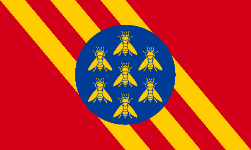

My flag for Falkland Island is freely inspired in the coat of arms. I removed the ship and shifted the flag for the hoist for aesthetic reasons.


The flag of Montserrat represent, basically, the island of Ireland (due to physical similarities and the origin of many settlers) and the cross. So I made the following design:


Another of my favorite design on the series is that of Pitcairn. It's, basically, a rotated and simplified version of the coat of arms.


For Saint Helena, I kept the symbol bird of the territory, but added a cross in red and yellow in reference to Byzantine empress Saint Helena, that, according to tradition, found the True Cross.


I rotated and simplified the coat of arms of South Georgia and South Sandwich Islands. Now, the two wavy stars represent both James Cook and the two island chains (South Georgia and South Sandwich) that gives the territory its name.


The flag of Tristan da Cunha is just the striking banner of arms:


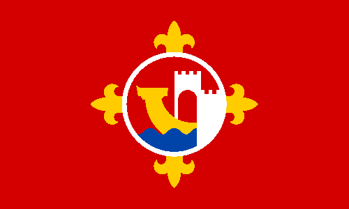
Finally, my proposal for Turks and Caicos. I couldn't satisfactorily harmonize the three charges of its coat of arms, so I used yellow for sand, green for the flora, pink for the shell and the flamingoes and a lobster as lone charge.


Comments and suggestions are welcome.
Sorry for the delay; I hope the long post is enough sorry.

4 Jun 2015

City of Manchester (England, United Kingdom)

The city of Manchester is one of most important in United Kingdom. But, after a quick internet search, I couldn't find any instance of a related flag. So I decided to propose one design by myself.

The city council uses the following coat of arms:

I've found this flag-like image on internet, but it seems to be just a logo:

I decided to make a design with the key symbolism of the coat of arms, but with vexillological appeal:

The three diagonal stripes represent the three rivers that cross the city: Irwell, Irk and Medlock. The blue glode represents the role of world-level trade center. The worker bees is commonly used as a Mancunian symbol as the birthplace of Industrial Revolution.

A simplified attempt, with just one worker bee:

One thing that I like in the designs (my favorite is still the first) in the circle incidentally tangential to the thicker diagonal stripe formed by the three thin diagonal stripes and their interspaces.

Comments and suggestions are welcome.
Sorry for the delay in publishing this post.