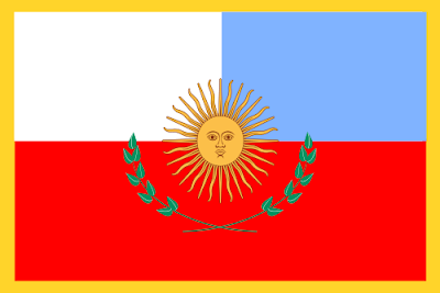
But it's just the first Catamarca flag, and they're still forming their visual identity. An aspect I don't like in the flag is the May Sun. This symbol is among the most meaningful and remarkable of the world. But currently it is in Argentine national flag, Uruguayan national flag, and aproximately five Argentinean provincial flags and three Uruguayan departmental flags.
The core of my proposal comes from the Artigas' Flag, early used by the United Provinces of the Río de la Plata, a confederation of Argentina and Uruguay. Historians indicate that this was the first flag ever to be flown in Catamarca — a version of this flag is currently used by Entre Ríos province in Uruguay, and as Uruguayan narional banner.
As I said before, this flag has current use, so I needed to made some adaptations (however, I never thought to use this flag as it was concepted). I continued using the colors, but made it a true triband. To identify it as local flag, I put the sol de Catamarca (Catamarca sun) in a bend. The result was curious, because the most voluminous size is the right, and not the left. I was lucky because the sun comes from East to West, making it one more symbology. My final proposal is this:
As always, I hope you liked my post. Comment and follow my blog, please.
P.S. As Brazilian, I meet everyday a lot of other Brazilian people that don't like Argentina (some of them actually hate), but I don't think like that. Our resemblances are very bigger than our differences. Obviously, I prefer Brazil, but I don't think Argentina is in the bandit size.


I really like your proposal. If a state in the US had a flag like Catamarca's current one, it would be one of the best and I would probably have just suggested simplifying the sun emblem. Your idea is much better.
ReplyDeleteThe best part of your design is the Catamarca sun, nice and simple and also very eye catching. Is it a native design?
Your flag could also serve as a stylized map. I was looking at the province's Wikipedia entry and noticed it has a vaguely diagonal shape to it.
Thank your post. I'm glad you enjoyed it.
DeleteAbout your questions, I'll tell just what I know: the "Catamarca sun" was a governmental logo, but it was never very used. Rumours say it was planned to be used in a flag, but the fact is that it wasn't. Currently, the Catamarca governamental website used other logo.
Yeah, doing a re-look, it seems like a stylized map, but I didn't link it when I was designing (is there this verb?) the flag. I admit...
I live in Argentina, more precisely in Salta, Catamarca bordering, study history, but I never knew this (Sol de Catamarca), the way insurance is a native sun symbol.
ReplyDeleteOn the other hand, some Argentine provinces since its inception had a flag for identification, often were not regulated, and its use was rare. In recent years resurfaced proviniciales the use of flags. Some cities like (San Fernando del Valle de Catamarca) or (Ciudad de Buenos Aires) has its own flag.
The flags used Jujuy, Mendoza and Tucuman are historical, as the three were not used at some point by the Argentine hero.
Regards
Flag of Argentina
ReplyDelete