24 Jun 2014

Ecuador

On the comments of my previous post, an anonymous reader asked if I could make "a more distinctive flag for Ecuador". Yes, I can, why not? If you have a suggestion to a future post, you're welcome to do the same!

The problem alluded by the dear anonymous commenter is due to Colombia, Ecuador and Venezuela were once part of a bigger country, called Gran Colombia. To show the shared heritage, they all adopted very similar flags based on Gran Colombian yellow-blue-red pattern. Below, you can see the Ecuatorian flag, and, more below, the Colombian and Venezuelan flags. You can notice Ecuatorian flag is no more than the flag of Colombia charged with a coat of arms.

Ecuador

ColombiaVenezuela

I'd like to come with something that still remembers the Gran Colombian colors, but with enough distinctiveness. I've come with two similar proposals, basically two variants of same theme.

The first is this:


I've made the blue stripe wider, to put, on the middle of the flag, a theme from national coat of arms. The sun represents the independence, and had very importance to the Inca Empire, that included the biggest part of Ecuatorian territory. The symbols of Aries, Taurus, Gemini and Cancer constellations, representing the months March to July, the period that comprised the 1845 March Revolution.

The second flag removes the astrological symbols, gaining a new symbolism.


Instead of the ecliptic (zodiac line), the white stripe represents the equator, that gives the country its name.

The rest of the symbolism, originary from the Gran Colombian flag, fits the country very well: yellow for the fertile soil, blue for the sky and the Pacific Ocean (in this proposal, you could separate upper blue stripe to sky and lower blue stripe to the ocean), red for the blood spilled to achieve the liberty.

Comments are welcome.
Which of the two proposal is your favorite: with or without the signs?

18 Jun 2014

McMurdo Station (USA)

McMurdo Station is an American scientific base in Ross Island, Antarctica. The headquarters of Antarctic Vexillological Association is located on the base, so, to celebrate this flag-friendly place, I thought it could be interesting to design a flag to the station.

My base for the design was the American flag, seen on uniforms and, if I'm not wrong, on some poles (no pun intended). Here's my design:


The orangish shade of red is helped by the fact that fluorescent colors are the most visible in the white vastness and, among them, orange is the color that best contrasts with blue. The very dark blue represents winter's eternal night, and the white represents summer's eternal day. The Southern Cross is the a symbol of the Southern Hemisphere and, apparently, it's how it looks on Antarctic.

I like the design, althought it's too generic: could be used by any US base in Antarctic continent!

Comments are suggestions are welcome. Do you know how to make this flag more distinctive?
Is there an astronomer that can confirms if this is the correct display of Southern Cross on South pole?

11 Jun 2014

Burgundy (France)

Burgundy is now a historical and administrative region of France. With times of more and less autonomy, it was, historically, one of most important regions of Europe.

These days, I was reading about a Burgundian trying to find a better flag for his region. The current flag is a complex banner of arms, quartering the arms of the houses of Valois-Burgundy and Burgundy.


An obvious choice would be the historical "cross of Burgundy", a very clever design but, nowadays, possibly much more related to the former Spanish Empire than the French region.


As I wanted a simple design, I decided to focus on the second and third quarters, from the original House of Burgundy. It could have been a good choice alone, but I decided to add elements from the House of Valois-Burgundy, that expanded the duchy to its maxime extension.

Considering this, I created this flag design:


The fleurs-de-lis is typical to French flags, the red and white border being more unique. The counterchanged border is more harmonic to the center and, in my opinion, not too far from original.

Comments are welcome.
Hope everybody commemorated International Heraldry Day (June 10th).

2 Jun 2014

Mercosur

The Mercosur (Mercado Común del Sur in Spanish, "Southern Common Market" in English) is a South American political and economical organization, originally comprising Argentina, Brazil, Paraguay and Uruguay; Venezuela joined in 2012, and Bolivia is in admission process. A blog reader called Gonzalez proposed a post about a Mercosur flag that "does not need to be translated".

Gonzalez's worry is based with the fact that the flag that flies on Brazil is this, with "Mercosul" (the name of the organization in Portuguese) inscription. In Brazil, flag law states that this flag should be flown near national flag in many kinds of public bodies.


And, on the rest of the member countries, that speak Spanish, the inscription is "Mercosur":


The symbolism of the flag is interesting: the Southern Cross emerging from horizon is a clear reference to the south, and represents the motto "our north is the south" (a reference to compass' north, used as guide). The fours starts also stand for the four founding members.

An easy solution for the issue is just removing any inscription from the flag and, catching the opportunity, making the stars bigger.


As it would be too easy, I'll propose a more original design, too, presented below:


This flag doesn't have the logo aspect anymore. The white stars on blue seems more natural (it's similar to a Mercosur's unofficial flag variant), and the triangle points to the south, as stated on the motto.

Comments are welcome.
Once more, I'd like to thank the suggestions, and invite you to send me one.

28 May 2014

Vitória (Espírito Santo, Brazil)

The series of Brazilian capitals flags is near the ends (in my counts, it's the penultimate post!) and now it's time to propose a new flag to Vitória, the capital of Espírito Santo state. It's the oldest Brazilian state capital located on an island.

The flag of Vitória is the following:


It's nothing more than city's coat of arms on white background. The first quarter, with a golden star, refers to the star of Brazilian national flag that represents Espírito Santo. The caduceus is symbol of commerce and, together with the ship on a landscape containing the Penedo (actually part of Vila Velha municipality) and the Ilha das Pombas, represents the portuary nature of the city. The most interesting item of the coat of arms is certainly the arrows behind it, a tribute to the native indians of the region.

Inspired by the foundation of the city (whose details I explain better on next paragraph), I designed the following flag:


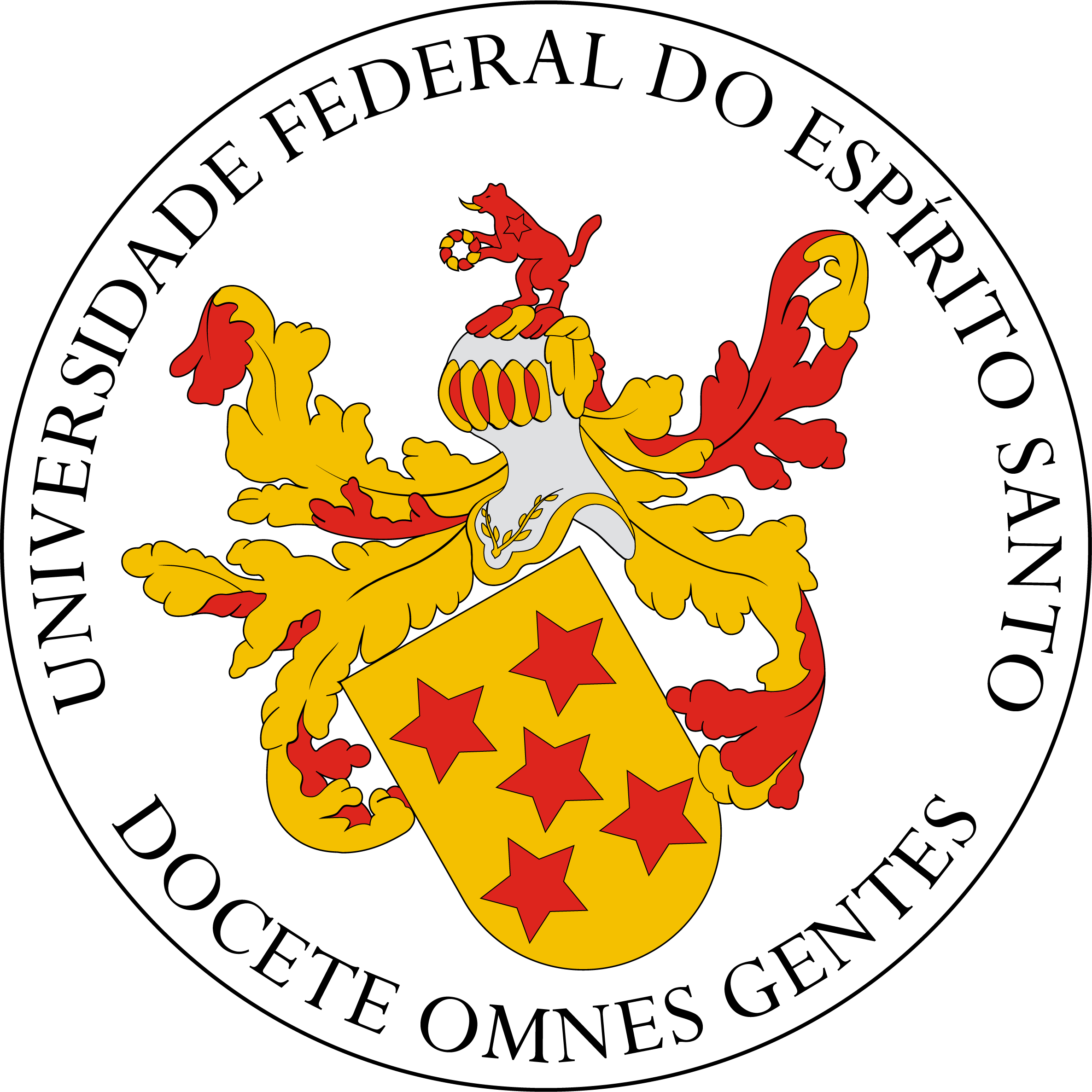
The five red stars arranged in cross on a yellow background is from the coat of arms of Vasco Fernandes Coutinho, first proprietor of Espírito Santo captaincy and founder of the city; this motif appears, for example, on the coat of arms of the Federal University of Espírito Santo. The arrows, took from coat of arms, represent the indians that inhabitated the island, specially the Goytacazes, famous for their techniques with bow and arrows. The victory of Coutinho over the Goytacazes names the city ("Vitória" = victory).

Comments (critiques, suggestions, additional info, etc.) are welcome.
That was the first flag I made with help of Paint.Net 4.0 beta.

22 May 2014

Colonia del Sacramento (Colonia, Uruguay)

The origins of Colonia del Sacramento (capital of Uruguayan department of Colonia) dates from the Portuguese Colônia do Santíssimo Sacramento ("Colony of the Most Holy Sacrament") settled on the estuary of the River Plate (on the margin, the Argentinean capital, Buenos Aires). For its strategic position, the region was disputed between Portuguese and Spanish settlers; its historic quarter being World Heritage Site due to the mix of both colonial architectonic traditions.

As far as I know, the town doesn't have neither a flag nor any coat of arms. My first inspiration was the famous city's gate, but it can be too generic, maybe. So my next attemp was this:

Blue and white are the Uruguayan colors, and, at the time of city's foundation, both Portugal and Spain used flags with white background. The blue shape is like a fort, a reference to the historic quarter of the city. The sunny white disc is a common representation to the sacramental bread, as the colony was named after the Eucharist, "the most holy sacrament". Again, the sun remembers the Uruguayan national symbols.

Comments are welcome. Please, leave a comment.
If you can locate any Colonia del Sacramento symbol, please cite it on comments.

14 May 2014

Fredericton (NB, Canada)

Fredericton is the capital city of New Brunswick, Canada. I never was a fan of its flag, whose appearance obviously demonstrates it was made by an amateur. There are some other issues, that I'll address along the post.

This is the current flag of Fredericton:

The flag ratio (1:2) is too wide, considering that about two thirds of it is left empty. The coat of arms, consisting mostly of other escutcheons, is badly composed. Two top escutcheons represent the monarch of Canada, the bottom one represents the New Brunswick forests, and the cross is a sign that Fredericton is se of ecclesiastical cathedra. The motto is Fredericopolis silvæ filia nobilis ("Fredericton noble daughter of the forest").

My basis for the flag proposal is the bottom escutcheon, that can be related to city's motto. The fir-tree line pattern is originary from Finnish heraldry. Take a look:

Moreover, I'd like to keep the monarchic theme on the flag, as removing it could be potentially unpopular. One of the things I dislike on current coat of arms is that it represents much more the British than the Canadian queen. Luckily, the coronets that crown the two top escutcheons is the St. Edward's crown, that also appears on Canada and New Brunswick coats of arms. Here, I simplified it to the cross patty and fleurs-de-lis that adorn the crown.

The result, in my opinion, is much fresher and more aesthetic than current flag.

Your comments are always welcome.
If you have any suggestion to a potential suggestion to the blog, please, leave it on comments.