25 Feb 2014

Goiás, Piauí, Sergipe (Brazil)

On last post, I asked the readers of the blog about making suggestions for future themes. A suggestion I received was about re-making the flags of Goiás, Piauí and Sergipe, because, according to the anonymous commentator (and I have to agree on this point), they are "too similar".

If you aren't familiar to those flags, here they are:
GoiásPiauíSergipe

In short, Sergipe flag has few stripes and five stars, Goiás has many stripes and five stars, and Piauí has many stripes and one star, apart from that the flags have the same colors and same arrangements.

It's not the first time where I write about those flags on this blog, actually. On the original post, I suggested Piauí flag being reversed to previous version (without text), and a totally novel flag to Goiás whose rationale can be read here.

Goiás proposal (03/2012)Piauí proposal (03/2012)

I decided I'd do a novel design to each state. As I had it done to Goiás yet, there are two remaining.

Next on batch is Piauí. My first proposal to Piauí state is inspired by state coat of arms, that follows:


The state coat of arms is party per fess: the top is yellow, with three green trees representing the three native palm trees of the state, from left to right, Copernicia prunifera ("carnaúba"), Mauritia flexuosa ("buriti") and Orbignya phalerata ("babaçu"); on bottom, the three fishes represent the three biggest rivers of the state (Parnaíba, Canindé and Poti), while the seven blue pallets stand for the main tributary rivers on the right margin of Parnaíba river. Here's the proposal:


The white star representing statehood and progress appears both on flag and on the crest of the coat of arms. The blue field represents the waters of the state in general.

My second proposal is more abstract, so possibly more suitable for a flag, taking inspiration from the bottom of the coat of arms:


The blue stripes represent the three biggest rivers of the state, while the number seven still appears if you sum the blue and white stripes. The green stripes represent the main trees (only the boles?) while the yellow stand for the hot climate predominant on the state. The white star gains a predominant place, on the center of the flag.

My proposal for Sergipe is more thought: the flag says few about the state (it was initially adopted by a local private shipping company), and the current state coat of arms is neither very appealing nor heraldically correct. I'll first present the flag then explain its symbolism.


The base of this flag is the yellow sun on red, took from a coat of arms adopted initially by Dutch colones, and, as far as Wikipedia may suggest, also used by the Portuguese province (what I suspect isn't true). The state takes its name from the a river called Sergipe (from Tupi, "river of siri") or the tribal leader Serigy (from Tupi, "water of siri"). "Siri" is a name given to the "swimming crabs", that have the last pair of paws in the form of swim fins, therefore the wavy stripe and swimming crabs on the flag; similar iconography is found on the coats of arms of the Roman Catholic archdiocese of Aracaju and some of its bodies.

If you prefer, a version without the crabs, but still with all symbolism:


Your comments are welcome and, as proved today, I read all them.
I'm still open to suggestion; leave yours on comments.

20 Feb 2014

2nd Anniversary's Post

It's the second anniversary of my first post on this blog. It's a very special occasion to thank sincerely all the viewers and followers of the blogs and, emphatically, the comments that make the blog so special.

The best of the year


Here's my selection of my favorite blog posts of this year, in no particular order. If you feel the absence of one design, cite it on comment!

 Iberian Union

 Brazil

 Dunedin (New Zealand)

 Dahlak Archipelago (Eritrea)

 Gaza Strip

Goals from previous year


It's the list of goals I've made on previous year. Let's see if I achieved them? On parentheses, the possibility I bet.
  • A year full of posts (90%): Yes!
  • Keep all blogs alive (80%): More or less. I diminished the Flag Review posting frequency on the half, and Flags of U.S. States is alive, but a bit dormant.
  • Complete the US states series (95%): As I said above, no.
  • Complete my Brazilian capital flags series (70%): Almost there!
  • Keep posting on Flags Forum (80%): Yes!
  • Complete my personal coat of arms (60%): Yes!
  • Achieve a real change with Vexillology Wiki (10%): No.
  • Establish a Brazilian vexillology society (30%): It almost happened, but idea is a bit dormant now, I guess.

Goals to next year


  • A year full of posts (85%);
  • Keep all blogs alive (85%);
  • Complete the US states series (90%);
  • Complete my Brazilian capital flags series (95%);
  • Keep posting on Flags Forum (80%);
  • Establish my new blog focuses on Brazilian heraldry [in Portuguese or bilingual] (90%).

Gain a gift!

 
The blog is making anniversary, and who gains the gift is its most important actor: you! Suggest a theme to a post, and I'll do my best on it.

Your comments are very important.
I can't forget to thank you again for viewing, following or commenting.

11 Feb 2014

Greater London (England, UK)

Some weeks ago, Samuel McKittrick published, on his blog, a post about a flag proposal to the Greater London. What's Greater London? Well, the City of London, officially, is only 2.9 km² large, and, as you can suppose, the area that surrounds the City is much bigger.

His interesting flag proposal is the following, on versions with and without St. Gorge's cross (being the latter a banner of his proposed coat of arms):

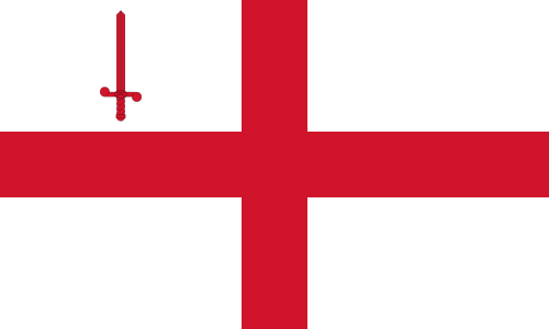
The portcullis represents the fact that London is capital of UK (it appears on Westminster coat of arms), as it's a symbol associated with Parliament, and represents the Greater London, for example, on London Regiment cap badge. The lion and the Lancaster and York roses are symbols of England.

His proposals, specially the second, are quite nice, but I was just curious to take a different approach, adding the Saxon crown to represent the status of capital and main town of England since before the Norman Conquest, and appears, for example, on the flag of Middlesex (that comprises good part of Greater London) and many London boroughs, like Barnet, Brent and Ealing.

I decided to make the flag from the coat of arms, making the design have double usage. The coats of arms (only the shields) are here:

The color scheme is inspired by the St. George's red and white. Both shields contain the Saxon crown and the portcullis, whose meanings are explained above. The fess wavy was added because, as Samuel stated, the crown just above the crown could be confused with Parliament logo. It represent the River Thames, that divides London in north and south, and the Port of London attached to it. On the chief of second shield, a St. George's cross, that can represent, among other things, the city of London, charged with Tudor rose, an authentic English symbol. But first shield is still my favorite.

Transposing the coat of arms to a flag:


Maybe a taller ratio would be better, but its unique horizontal pattern (all red, with blue and white wavy stripe) would make it recognizable in any wind condition.

Comments are welcome.
Original Sammy McKittrick post, that's an excellent reading, can be accesses here.

4 Feb 2014

Pachuca de Soto (Hidalgo, Mexico)

Last Sunday, I was surprised by a request: a man from Mexico named Guillermo asked me about designing a coat of arms for his birthplace: the city of Pachuca de Soto. Well, I accepted.

Although he asked only about a coat of arms, I'll present it here inside a flag. The work is not finished, Guillermo suggested some changes,  but I think the current status is good enough to be displayed.

Part of my goal was to make it look like Spanish-style heraldry. I can best explain the symbolism after I show the flag:


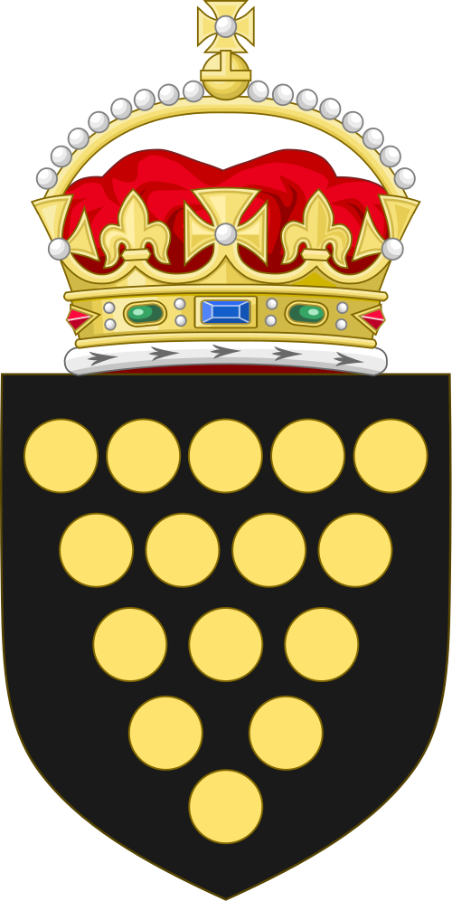
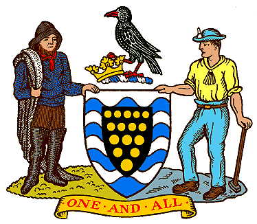
On the chief of the coat of arms, there's a representation of one of the anemoi, the Greek wind deities. I decided for it because the city is nicknamed "the airy beauty" and "the wind's fiancee". The green background is a tribute to the hills that surround the city. The base (bottom) of the coat of arms is inspired by the coat of arms of both the duchy and county of Cornwall, as the Cornish influence to the city is still perceived (just for curiosity, Pachuca had the first Mexican football club), but with golden roundels substituted by silver ones, as the silver extraction was main economic activity until the middle XX century.

The bordure was added as it was a common element in Spanish colonial heraldry. The silver bordure is adorned by green tau crosses, associated with the Franciscans monks, fundamental to early settlements on the city.

Based on Mexico City coat of arms, this shield don't have any crown or crest. The background colors of the flag are a very obvious pick.

Comments are welcome.
This work is still not finished. Possibly, I can futurely release a post with updates.

29 Jan 2014

South Atlantic Islands (Argentina)

I've recently saw a Polandball comics containing a Malvinasball, a character representing Argentine claim over Falkland Islands (the islands are commonly known as Malvinas in Spanish). In effect, the claimed region corresponds to Argentine department of Islas del Atlántico Sur (South Atlantic Islands). The character used a novel flag, that I reconstructed on the image below:


Well, it's not a great flag, for many reasons: too similar to Argentine flag, yellow on white isn't a contrasting color scheme, the map is too difficult to be reproduced.

This flag, if used elsewhere, is totally unofficial, as the Argentine department doesn't have a flag. The flag flown by British territory of Falkland Islands is the following (Argentine claim also include parts of South Georgia and South Sandwich Islands and British Antarctic Territory):


Some proposed flags to the department can be found here, but flags are too generic, plagiarist or badly designed.

My flag proposal is inspired by a coat of arms that gained a competition in 1966 to a new coat of arms for Argentine. The coat of arms below, as well as many others related to the islands, can be seen here.


My flag proposal is the following:


The blue-white color scheme is predominant in most Argentine provincial flags, and I decided to follow the pattern to this department. The Sun of May is a symbol of claimed sovereignty over the islands. The symbolism of the waves is very obvious. In a arrangement inspired by coat of arms above, four stars are put on cross, each one representing a island or an archipelago: top (special place) for Falkland, left for South Orkney, right for South Georgia and south for South Sandwich.

Your comments are welcome.
I'd like to remember it's a creative exercise and no way has intentions to show political statements.

20 Jan 2014

Children of Lir flag (Republic of Ireland)

This post is my part on an interesting thread. The Vexillology Ireland (VIBE) [alternate website] on its Facebook page, make a challenge to design a flag for the president of Republic of Ireland having a reference to the tale of the Children of Lir (actually considered in early 1940s, the reason is in the Facebook post).

The challenge was actually proposed in August 2013, and, although I had read it at the time, wasn't inclined to make one design by myself. Reading a post by Samuel McKittrick, decided to make a design by myself.

A very summarized plot of the tale is the following (not sure if correct):
Bodb Derg was elected king of Tuatha Dé Danann, with the discordance of Lir (sea god). To pacify Lir, Bod's daughter Aoibh married with him, and the couple had four children. Following the death of Aoibh, that made the children very melancholy, Lir married another Bodb's daughter, Aoife. The jealous Aoife tried to kill the children, but could only manage to transform them in swans. Knowing it, Bodb transformed Aoife in an air demon.
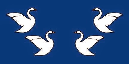
Below, you can see six designs: the three on top, by Zachary Harden, was found on original Facebook page, while the bottom three were took from Samuel McKittrick's post.
My unofficial contribution to this challenge is the following:


I really don't believe that this kind of design could have been considered in early 1940s, but I like it nonetheless. On center, there's the coat of arms of Republic of Ireland, a sign of president's headship of state. The four swans, as placed, remember heraldic supporters, on a curious effect.

Your comments are welcome.
Zachary Harden's designs can be found here, with Samuel McKittrick's proposals can be found here.

15 Jan 2014

Dahlak Archipelago (Eritrea)

This post came from a thread on Flags Forum about flags for some African regions (access the link to see this and other proposals). The Dahlak islands is an archipelago located in Red Sea that belongs to Eritrea.

My proposal on that thread was the following:

The main feature of the flag are the shells. The pearl fishing on the islands is famous since Roman times and was once among the most importants of the world. Today, its relevance isn't the same, but it still exists (including as a touristic attraction, together with scuba diving). Having a pearl a generic circular flag, shells were chosen for more direct identification. The flag have four shells, as four are the inhabited islands of the archipelago.

The white color can also represent the white beach and the limpid waters of Dahlak. The red color is chosen as a reference to the Red Sea, and to the Islamism (islanders were converted yet on 7th century).

An alternative proposal have white circles (representing pearls) instead of white shells, making it simpler but more generic.

Your comments are very welcome.
Remembering you can access the Flags Forum thread here.