30 Sept 2012

Canada: Duality

In Canada, the discussions about a possible flag change are very polemic, dividing people between pro-change and anti-change. One of bigger reasons to change (I'm not saying it's my personal opinion) is that, while Canadian population is basically constituted by Anglophones and Francophones, only the firsts are represented in the flag.


The original meaning of Canadian flag says white is for the French heritage (this color was used in French royal emblems for centuries) and red is for the British, but usually white is considered a neutral flag, so Francophones aren't represented. Therefore, more embracing flags are sometimes proposed. Between them, the most famous is the unofficial "Canadian Duality Flag" or "Canadian Unity Flag", created during 1995 Quebec secession referendum (obviously, by "no" campaign). It consists of Canadian flag with added blue bars. Blue was a color used in flags used in French colonies in America (see example). This is the mentioned flag:


The main virtue of Canadian national flag is simplicity — that "duality flag" ruins. The blue touching the red is neither a good choice. So I come with a new flag proposal to represent the Canadian British-French duality:


The red represents the British heritage, and blue represents the French heritage. The maple leaf is dividing the flag, and it's white because it means peace. The red is not touching the blue, what improves a lot flag's visibility. The position of the colors is based in the principle that French population is concentrated in the east. See the map (darker means bigger Francophone population):


Also, it opposes the French national flag's color order, to avoid any misinterpretation. Finishing, I'd note that it's more a proposal to a new "duality flag", although it could, occasionally, be proposed as Canadian national flag, what I didn't pretend to do at the moment.

Your comment is always welcome. Please feel free to express your opinions. Thanks for reading! If you liked the blog, you may like to follow it (button is on the left).
I'd like to clarify that it's not my intention express any political opinion in this post.

24 Sept 2012

Derry/Londonderry (United Kingdom)

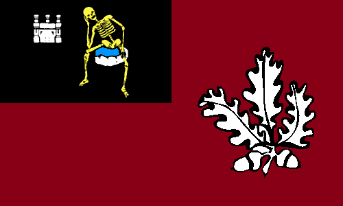
My friend Samuel McKittrick designed a flag to its own city, Londonderry (as unionist usually name it) or Derry (as nationalist usually prefer), the second biggest Northen Irish city (see the post here). It's going to be the first UK City of Culture, in 2013, so it's a good time to build a flag. Just above you can see two flags: the first is the unofficial city council's flag and the second is my favorite Sammy's proposal.


Let's explain them: the first flag depicts the coat of arms, also symbolized in second flag. It depicts a skeleton (or the Death) on a stone with a castle in left. The real origin of the meaning is unknown, but it's popularly said to represent the castle of the 2nd Earl of Ulster, Richard De Burgh (1259-1326), being the skeleton from one of his knights and cousin, starved to death on castle's dungeons. In the chief (top of shield) there's London coat of arms (sometimes with a harp on center), added when city changed its name from Derry to Londonderry.

The field of both flags is a crimson, representing the crimson flag, firstly flown during the Siege of Derry (1689) as symbol of defiance. Sammy's flag contains badge with a oak leaf and a stronghold, taken from a memorial in Guildhall square. The oak represents city's origins and name (Doire means "oak grove" in Irish). The bastion is a reference to the city's insurmountable walled city (hence city's nickname "maiden city").

Based in this flags, I made my own proposal to Derry's/Londonderry's flag:


In the first flag, the coat of arms. I didn't use the London banner of arms to avoid somebody concluding that city has any formal relationship with the English city. The field is crimson, the same shade of flags above. I use the same oak leaves from Doire team in GAA (Gaelic Athletic Association). I'm not still 100% satisfied with the flag, but still think it's reasonable. I tried a half-half version of flag, instead of a "cantoned" one, but that didn't work, for me.

Thanks for reading! Any kind of comment is welcome.
I recommend the visit to Sammy's post about Derry/Londonderry flag: click here.

17 Sept 2012

Natal (Rio Grande do Norte, Brazil)

Some months ago, I tried to contact the prefecture of Natal municipality (in Brazil, it's equivalent to a city) to notice problems in city's coat of arms and, consequently, flag. The prefecture's e-mail bot generated an error, and I couldn't deliver the report I write. I'll resume it to you, but firstly let's see the Natal flag:


The coat of arms of Natal has a immediately noticed meaning, and I think it's good: "Natal", in Portuguese, means "Christmas", a reference to the date of city's foundation, so it depicts the Star of Bethelem. There are some errors, accordingly to Brazilian heraldic rules, and, guaranteeing it's not a replication error, the image was took from city's governmental website, although it's seen, in the same way, in many other sources. Here's a list of rule breaks I noticed:

  • The mural crown shows nine visible towers, while, by a standard inherited from Portuguese settlers, a city should use a mural crown with five visible towers.
  • Being Natal the capital city of  Rio Grande do Norte, this mural crown should be golden, in recognition of this special status.
  • The coat of arms is placed in a English shield shape, while a Spanish escutcheon should be rather used.
  • This next isn't exactly a broken rule, but would make it more good-looking: change the direction of the motto's strip.

Specifically in the flag, I would suggest the change of green tone to the same used in Rio Grande do Norte state flag. Applying this suggestions, I created two proposals: one without the motto, what's vexillologically recommended, and one with it, as commonly the coat of arms are depicted in Brazilian flags.


And a bonus flag: why not a banner of arms?


Finally, I'd like to note that, while some cities and states follow rigorously the Brazilian heraldic rules, most probably the bigger part of them doesn't.

If you want to give any kind of comment, feel free to do it. I'd be pleased.
I'll try again later send the letter to the prefecture. If I obtain success, I'll inform it on the blog.

8 Sept 2012

Liverpool (United Kingdom)

Not many British cities have their own flags. And this week I was verifying this fact, when I decided to create one of them by myself; I chose Liverpool, the third most populous English city, just after London and Birmingham.

I selected two ideal symbols to Liverpool: the Mersey and the Liver bird. The River Mersey is a significant element of Liverpool landmark, and names the region where the city is located: "Merseyside". The liver bird has been a symbol of Liverpool existent for centuries, but only popularly adopted in Modern Times. But what's a Liver bird? Most probably an eagle, possibly a cormorant, sometimes misunderstood as a phoenix or a griffin (read an interesting article about this issue). The polemic is big: the Liverpool City Council  coat of arms uses a cormorant, while the Liverpool Anglican Diocese coat of arms holds an eagle. The Liver bird I used is the most popular form, also seen in Liverpool City Council logo (actually, I used the one in Liverpool FC logo). See it below:


A important point about aforementioned logo is that it's purple, neutral in relation to the colors of biggest football teams of Merseyside: the Liverpool FC red and Everton FC blue. Therefore, purple is the main color in my flag proposal:


The white pale refers to Liverpool position right of River Mersey. The other element of flag, as I said, is the traditional Liver bird.

Do you want to give your opinion about the flag or the post? Leave your comment, please.
Sorry if I didn't post it before, but I had problems uploading the images.

26 Aug 2012

Los Lagos (Chile)

Last days I'm searching something about flags of all South American nations. Some of those that most bothered me was the Chilean ones. Three or four of them are good, but they use to hold a seal over a plain white or blue background - not a creative design choice. I'm still thinking about create flag series about these regions all over the continent that haven't a good one, but however I'm present today my proposal to Los Lagos region, in Chile. Firstly, look at their current flag:


The seal is not this bad, because it shows the two main landmarks that's supposed to be found in there: the mountains (Chile is an Andean country) and a lake ("Los Lagos" means, verbatim, "The Lakes"). But the writing ruins the idea: a flag is intended to be a graphic representation, not a written one! Being, in some point, conservative, I created this design:


I put the lake in a color different of mountain, increasing the contrast. It looks good for me.

What's your opinion my proposed flag? Please let me know through comments.
I want to know one more thing, please: Do you like the idea of more South American flag on blogs? They are a little unknown, but I'd like to share the best and worst about them.

21 Aug 2012

Draft: My coat of arms

Coats of arms are a way created to represent somebody's identity, created during Middle Ages (but based in more ancient principles). They're extremely related to flags, because banner of arms, one of first types of flags, are nothing more than a rectangular representation of a coat of arms.

Currently, I'm creating my coat of arms. It's only a draft, so it might change if I like. I'm trying to make it based on heraldic rules. It looks like this, for now:


Now I'll describe my coat of arms. There's a specific language to this purpose, but I'll try to be clearer. I'll explain the elements of my coat of arms detail by detail, to be more didactic. To a fast explanation about the elements of a coat of arms, click here.

Shield: It's divided by horizontal stripes (per fess), being the first in amaranth, and the second in blue (azure).

  • In the amaranth division, there's a lion in white (argent) profiled, with four legs in the floor (statant), and blue tongue and nails. I chose the lion for represent my name, Leonardo, being this canting arms.
  • In blue (azure) division, a golden (or) moline cross. I chose moline cross because I use this in some web forum and other occasions, and representing my religion.

Mantling: In blue (azure) and gold (or).

Crest: A white (argent) rising owl, with blue beak and legs. I chose the owl because it represents Philosophy, one of my greatest interests.

Motto: "Homines sumus, non Dei". Translated from Latin, "We're men (humans), [we're] not God". I always thought humility is an important virtue, and I liked to set it on my personal motto. Also, my brother helped me to chose it, so it's someway special.

A potential problem I find in it is that amaranth is a rarely used tincture (color), so I might have to change it to red or purple. Basically, I said all I had to say.

Your comment is very important to me. Remember that my coat of arms is under construction, so your opinion can have influence in final result.
A little break to coat of arms... probably, next week I return with flags.

14 Aug 2012

Northern Isles (United Kingdom)

Sometime ago, me and guys at Flags Forum were discussing about a flag for Northern Isles (the traditional name of Orkney and Shetland counties union). In 2014, there'll be a referendum for Scotland independence, but for Shetland and Orkney islanders, it's indifferent be ruled from London or Edinburgh. So, depending if they will leave Union together with Scotland or stay in it, they could need a flag.

Firstly, let's see Orkney and Shetland flags:

Orkney (Since 2007)Orkney (Previous flag)Shetland

My first design was a mix of both counties' flags, this way:


After that, Sammy came with a different way of mix them, therefore I replied with this, with a frontier between Shetland and Orkney flags:


It's OK for me, but some forum members said it had too many colors, so discussion came to other destination: try to emulate Scottish flag, but distinguishing it for show islands unique Nordic identity. Sammy came with three designs, being this two my favorite of them:
with Pictish crosswith shield knot
The two flag above are Sammy's designs.

Meinsauer, another forum member, came with a interesting model using a sun cross:
The flag above is Meinsauer's design.

It's OK, but it's still to similar to Scottish flag. So I used a strategy used before by Nova Scotia: invert blue and white. So I came with them (red is a color well-associated with Nordic countries, for me):


I desisted of using sun cross, because it's, unfortunately, associated with Nazi groups. Therefore, I made a vast search to symbols that represent Nordic heritage in Shetland and Orkney, so I found this Viking ship image in a commemorative badge (400 years of Shetland devolution to Scotland). It resulted in this:


I think this is very appropriated, because it harmonizes Scottish and Nordic heritages, and does anyone dislike cool ships? I'd like, also, to show a flag that Meinsauer did inspired in aforementioned flag.

Meinsauer, another forum member, came with a interesting model using a sun cross:
The flag above is Meinsauer's design.

This is it! Sorry if this post is a bit long.

I'd like to know your opinion about this post, any of the flags in this, or my blog in general. Please, comment.
NOTE: All these flag, except where mentioned differently, are mine. To read a interesting post about this same question, visit Sammy's blog. To see complete discusson, visit Flags Forum.