
The coat of arms dates from the 1960s. The Agnus Dei (lamb of God) and the shells refer to John the Baptist, that gives the city its name. The ship refer to the early finding of the region by John Cabot. The crest is too generic.
For my design, I first removed the busy chief and aligned the shells to the lamb:
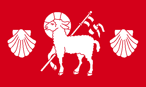
The flag is made only of red and white cloth, notice the St. George's cross carried by the lamb. I could add a symbol related to Cabot, but since he's also named John, the lamb and the shells are also canting (punning). I could remove the shells, but it would make the flag too generic, in my opinion.
Comments are greatly welcome.
Do you have any suggestions of other boring flags that deserve to be fixed?
No comments:
Post a Comment
Every comment is greatly welcome!