The current flag of Goiânia:

The coat of arms of Goiânia is not bad, in spite of the terrible depiction and bad symbolism: green is hope; the fleur-de-lis stands for "sovereignty", the flames on bordure represent the right for a just government; the golden label is for the fact Goiânia was the second capital of Goiás state during the history (after Goiás city). Of good symbolism, the white wavy stripe represents the Botafogo brook, related to Goiânia foundation.
My proposal takes the symbolism of the center of the shield, but adapting colors and shapes to better fit the flag:

Being such a green city, the green of background an additional symbolism.
Curitiba flag, as I hastened, is very similar to Goiânia one:

My initial proposal (I never developed it completely) would be a rectangular version of coat of arms (i.e. a banner of arms), that contains a Brazilian pine, following the fact that Curitiba means, in Guarani language, "many pines" or "many pine nuts". Like this:

But, searching on internet, I found other interesting proposal by a Reddit user nicknamed "lapalu" (posted there). His proposal is the following:

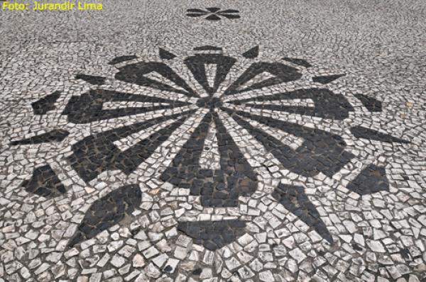
The design is very similar to current Curitiba flag, with a pattern on center that remember a pine cone cut in parallel (the author of the flag refers to it as "pine rose"), that can be found on city's architecture (see photo). I'd only change the shades, that I think are too dark, and make it a little less geometrical.
Your comments are welcome.
You can see original lapalu's rationale here.
No comments:
Post a Comment
Every comment is greatly welcome!