Showing posts with label International. Show all posts

8 Jul 2016

Hacker culture

The "hacker culture" is a subculture that emerged in 1950-60s among computing academia. Nonetheless, the word "hacker" is negatively associated in media with the "black hat crackers" (in hacker slang), usually seen as against true "hacker" spirit.

As a computing major, I was always interested by the hacker ethic. Searches for "hacker flag" will only return pirate or Anonymous flags, that, in my humble opinion, doesn't embrace the whole hacker culture.

So I decided to make a flag by my own. Unfortunately, my flag is not a "hack", but a repurposing of Eric Raymond's proposal for a hacker emblem: the "glider", an interesting pattern often found in Conway's Game of Life.
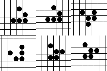


From now, I'm sorry if that all that's Greek to somebody. Flag is coming next!

Based in that proposal, I designed the following flag:


I've rotated the table, making a cleverer use of space, in my opinion. I've chosen an exclusively black and white pattern not just for chromatic minimalism, but also because it's nearer "glider's" most common representation, and permits many different associations: 0s and 1s, black and white hats, the often-seen link with anarchism, and probably many more.

Said that, variations could be made replacing background colors, or even using a national or rainbow flag as background.

I've tried different rotations and common representations of the "glider" pattern,but I guess it's by far my favorite.

Comments and suggestions are welcome.
Any corrections or clearance in hacker culture is also very welcome.

23 Jun 2016

League of Nations

A blog reader nicknamed "Mestre Luiz" suggest a post about a flag about the League of Nations. I'm not sure, but I guess he means that League of Nations.

The League of Nations (1920-1946) never adopted an official flag, Between 1939 and 1941, it seems, it used the following unofficial flag:

I actually like the basic design, but remove the letters, please. The number five represents the five inhabitated continents (Americas was then usually taught as a single continent) and five "races".

I tried to think with the mentality of those times. Here's a humble attempt:

Five smaller rings are arranged like a Borromean cross, representing the association of the five continents — notice the similarity with Olympic rings —, in the sense that all of them are important. The larger ring represents our planet and the whole humanity, embracing the League of Nations. The blue represent our common skies.

Coincidently, it shares similarities with a 1930 proposal. I guess it's not a very original design, but I think it could have been viable at the time.

Comments and suggestions are welcome?
To "Mestre Luiz": If you are meaning a different "League of Nations", feel free to correct me.

20 Jan 2015

International Cooperative Alliance

The International Cooperative Alliance (ICA) is the oldest international cooperative federation. The idea about making a flag for it came from an article I was writing about the flag of Cusco (Peru): the former ICA flag was identical to the Peruvian city's, and are probably related.

That was the first flag of ICA (that was identical to Cusco's), officially adopted in 1925 (read its symbolism on my article):


In 2001, to avoid the confusion to the many rainbow flags that appeared since 1925, it was substituted for a logo flag, with doves appearing from a six-colored rainbow; the seventh color was moved to the letters, that formed ICA's acronym in one of its official languages. For instance, the Anglophone version:


Since then, the flag was replaced once again, for a more logo-like flag. Notice the image formed by the two letters O.


My proposal uses a different cooperative symbol: the twin pine trees. I put it on a green background.


The pine tree is an ancient symbol of life and endurance, while the circle represents eternity. The fact that there are two pine trees represent union and cooperation. Green is a color of life (because of chlorophyll), while the golden yellow represents the sun (specially because it's on a circle), the giver of the life and the light.

For the final design, I chose a variant of the logo where the pine trees are formed by the negative area of the yellow part, but whatever twin pine trees would work. I am happy with the flag, and I think it could embrace not only ICA but cooperativism as a whole.

Comments and suggestions are welcome.
Have you read my post about Cusco? No? You have another chance.