I think I never talked about military heraldry/vexillology on my blog. Actually, it's more like an eventual interest, not something I'm infinitely concerned about. These days, I was reading about the terrible new flags adopted by the Joint Staff of Armed Forces (Estado-Maior Conjunto das Forças Armadas or EMCFA, in Portuguese), and I decided to find alternatives by myself.
Before talk about flags themselves, I'll explain what's the EMCFA. In 1999, the three military ministries (of Army, of Navy and of Air Force) were unified on a single Defense Ministry; before this, existed the EMFA, an office, formed by the staff of the three armed forces, with the objective of planning collaborative actions between the army, the navy and the air force. In 2010, the EMCFA was created with the objective of keep collaborative works on Armed Forces, what apparently haven't yet happened after the unification.
Being created on 2010, the EMCFA only symbols on 2011. See the flag:
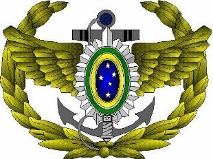
The flag, as well as the coat of arms are tricolor of Army's green (in theory, it should be olive green), Navy's white and Air Force's blue; the colors come from the respective forces' uniforms. The coat of arms contain the emblem of each force on its respective color; in the middle, a sword (representing Armed Forces as a whole, probably). The coat of arms is completed by chains, representing the unity and cooperation between the arms. The yellow border on the flag, according to official description, represents the Ministry of Defense (can't find a reason).
I won't propose a newer coat of arms, as I think it's only needed to render the escutcheon as a proper shield and remove the words (and, if necessary, the chains).
My first thought was only rotate the colors and remove the yellow border (that yet appears on coat of arms):
The logo of defunct EMFA could be used, but I think it doesn't combine with a tricolor flag. In the end, I decided for a yellow sword, representing the EMCFA and the Ministry of Defence, and a horizontal stripe to each force:
Now I think it's a worthy flag! Next to it, I'd like to create a new flag for the chief of the Joint Staff. His current rank flag:
I made only small changes on that flag, compatible with my EMCFA proposal:
The sword now is white (as on Joint Staff arms and logo) because of the yellow background.
Comments are welcome. You don't need a Blogger account to do it.
Images #1 and #4, as well as elements of #2, comes directly from Army official website, so are in public domain.
26 Mar 2013
Joint Staff of the Armed Forces (Brazil)
18 Mar 2013
Fiji [II]
To read the original post, click here.
A little more than two months ago, I presented a suggestion to a new Fijian flag. The reason is simple: a new Constitution to Fiji will be approved soon, and it was announced that a new national flag will come together. The only info about how it'll look: without the Union Jack.
Now you can see the current Fiji flag and, after that, my first proposal to a Fijian flag (that I re-thought):
With precious reviews from Flags Forum, I came with a re-do:
Sky blue, white and black are colors identified with Fiji, specially because of their use by the national sportive teams. The palm tree represent the island itself (and is used by rugby team), while the blue background represents the great Pacific Ocean that surrounds the island. The doves come from a pre-colonial flag, and the way they are positioned on the flag represents the peace and stability coming directly to the island. I think this flag is more representative and equilibrated than my first attempt, so I think that, in the end, it's a better flag.
By the way, a set of ensigns I made based on the flag. Respectively, the state, civil, naval and air force ensigns:
Comments are welcome. Please, leave your comment.
As soon as the new Fiji flag appear, I'll comment it on Flag Review, my other blog. Why don't you visit it right now?
A little more than two months ago, I presented a suggestion to a new Fijian flag. The reason is simple: a new Constitution to Fiji will be approved soon, and it was announced that a new national flag will come together. The only info about how it'll look: without the Union Jack.
Now you can see the current Fiji flag and, after that, my first proposal to a Fijian flag (that I re-thought):
With precious reviews from Flags Forum, I came with a re-do:
Sky blue, white and black are colors identified with Fiji, specially because of their use by the national sportive teams. The palm tree represent the island itself (and is used by rugby team), while the blue background represents the great Pacific Ocean that surrounds the island. The doves come from a pre-colonial flag, and the way they are positioned on the flag represents the peace and stability coming directly to the island. I think this flag is more representative and equilibrated than my first attempt, so I think that, in the end, it's a better flag.
By the way, a set of ensigns I made based on the flag. Respectively, the state, civil, naval and air force ensigns:
Comments are welcome. Please, leave your comment.
As soon as the new Fiji flag appear, I'll comment it on Flag Review, my other blog. Why don't you visit it right now?
11 Mar 2013
North Riding of Yorkshire (UK)
Last day 6, it was announced the finalists of the competition to elect the new flag of the North Riding of Yorkshire (the historical riding, not the ceremonial county). And, fortunately, my entry made the six finalists! Let me explain this flag, and maybe I could deserve your vote.
The basic point of the flag was the coat of arms the county used before it was administratively extinct. I think the references to England and Yorkshire flags are obvious.
This coat of arms is, in my opinion humble, one of the best British coat of arms ever. I thought it would be easy to work with an excellent base like this. However, my first two drafts wasn't didn't satisfy me:
I was trying to do something that could be classic, elegant but, at same time, undated. In my third attempt, I found what would be my final submission:
In the end, as I said, my flag was chose the finalists, without first being amended. At first time, I was a little angry because I took much time to decide the final ratios and shades; at all, it took almost two weeks (I think so) to set the small details in my absolute endorse. As far as I know, members of the Flag Institute and other advisers re-thought my proposal still obtain this result:
I think the changes (specially on blue shade) were made in a way that it could be more easily reproduced by the British flag makers. Not a bad work, I'd say. If you think it deserves your vote, click on link below.
What's your opinion about this design? Your comment is highly welcome.
To vote on that or other flag, click here. The poll closes March 24th.
The basic point of the flag was the coat of arms the county used before it was administratively extinct. I think the references to England and Yorkshire flags are obvious.
This coat of arms is, in my opinion humble, one of the best British coat of arms ever. I thought it would be easy to work with an excellent base like this. However, my first two drafts wasn't didn't satisfy me:
| ![]() |
| Draft #1 | Draft #2 |
I was trying to do something that could be classic, elegant but, at same time, undated. In my third attempt, I found what would be my final submission:
In the end, as I said, my flag was chose the finalists, without first being amended. At first time, I was a little angry because I took much time to decide the final ratios and shades; at all, it took almost two weeks (I think so) to set the small details in my absolute endorse. As far as I know, members of the Flag Institute and other advisers re-thought my proposal still obtain this result:
I think the changes (specially on blue shade) were made in a way that it could be more easily reproduced by the British flag makers. Not a bad work, I'd say. If you think it deserves your vote, click on link below.
What's your opinion about this design? Your comment is highly welcome.
To vote on that or other flag, click here. The poll closes March 24th.
5 Mar 2013
San Francisco (CA, USA)
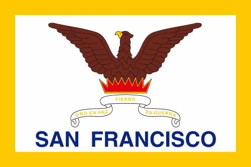
Last times, I was looking at American city flags, when I find San Francisco (on California) flag. Well, the idea of the flag is interesting, but I think the overall execution not so. Look at San Francisco flag:
The flag consists of a phoenix returning from the ashes, the motto "Oro en Paz, Fierro en Guerra" ("Gold on Peace, Iron on War") in Spanish, the city name in giant letters and a yellow border (erroneously put where used to be a gold fringe). I appreciate specially the phoenix symbolism in this flag: it represents the city that, verbatim, was reborn from the ashes; San Francisco suffered six great fires between 1849 and 1852, and earthquakes, too, but was reconstructed even bigger and better.
I think the problem of the current flag is the absence of graphic appeal. So I made this design:
The bird is more similar to a phoenix now, and it features the San Francisco colors, the yellow and the black (from that Spanish motto). I hope San Francisco people like it.
Your comment is very important. Please, leave a comment.
Next week, I'll present a very good news (at least for me).
The flag consists of a phoenix returning from the ashes, the motto "Oro en Paz, Fierro en Guerra" ("Gold on Peace, Iron on War") in Spanish, the city name in giant letters and a yellow border (erroneously put where used to be a gold fringe). I appreciate specially the phoenix symbolism in this flag: it represents the city that, verbatim, was reborn from the ashes; San Francisco suffered six great fires between 1849 and 1852, and earthquakes, too, but was reconstructed even bigger and better.
I think the problem of the current flag is the absence of graphic appeal. So I made this design:
The bird is more similar to a phoenix now, and it features the San Francisco colors, the yellow and the black (from that Spanish motto). I hope San Francisco people like it.
Your comment is very important. Please, leave a comment.
Next week, I'll present a very good news (at least for me).
28 Feb 2013
Anniversary's Post
I thought my first blog post was February 26th 2012, but it seems the correct date was February 19th. However, it's visible that the blog just completed its first anniversary! Firstly, I'd like to thank very much every reader: the numbers are just incredible. It grew up very much this year and gained two brothers - the Flag Review and the Flags of U.S. States -, although, for me, they are almost the same blog.
Some flag-istic goals I'd like to achieve before the next birthday. Between parenthesis, an approximated chance to achieve it.
My personal favorites of the year. I'd like to see your favorites, too.
And you, what's your favorites? Please, leave a comment.
No, I'm not giving iPhones. The way I chose to thank for the reader is the following: choose any subject (yes, anything!) and I'll design a proposal to it, the soonest possible. Don't be afraid, don't be shy, participate!
Thanks again, thanks a million times! This post is specially open to suggestions, critiques, questions, etc. Don't forget to give your comment!
Sorry, I had to take a pause to celebrate, but a new flag in next week!
Goals to next year
Some flag-istic goals I'd like to achieve before the next birthday. Between parenthesis, an approximated chance to achieve it.
- A year full of posts (90%);
- Keep all blogs alive (80%);
- Complete the US states series (95%);
- Complete my Brazilian capital flags series (70%);
- Keep posting on Flags Forum (80%);
- Complete my personal coat of arms (60%);
- Achieve a real change with Vexillology Wiki (10%);
- Establish a Brazilian vexillology society (30%).
The best of the year
My personal favorites of the year. I'd like to see your favorites, too.
![]() | Catamarca (Argentina) |
![]() | Rio Grande do Norte (Brazil) |
![]() | Guangxi Zhuang (China) |
![]() | Los Lagos (Chile) |
![]() | Araucanía (Chile) |
And you, what's your favorites? Please, leave a comment.
Gain a gift!
No, I'm not giving iPhones. The way I chose to thank for the reader is the following: choose any subject (yes, anything!) and I'll design a proposal to it, the soonest possible. Don't be afraid, don't be shy, participate!
Thanks again, thanks a million times! This post is specially open to suggestions, critiques, questions, etc. Don't forget to give your comment!
Sorry, I had to take a pause to celebrate, but a new flag in next week!
18 Feb 2013
Channel Islands (United Kingdom)
The Channel Islands is the name used to collectively refer to the islands in the English Channel, that divides the Great Britain and the France (and the rest of continental Europe). They are constituted by two different British crown dependencies, Jersey and Guernsey, reminiscent of the Duchy of Normandy. There were discussed on Flags Forum about the possibility of a possible independent federated Channel Islands. I prefer to discuss about a "cultural Channel Islands flag".
I don't think the best flag would merge the Jersey and Guernsey, for many reasons: it looks like a science fiction or alternate history flag (they use very much that resource) and it would look very unoriginal considering its neighbor and dependent of the United Kingdom, specially because traditional Guernsey flag is identical to St. George's cross and traditional Jersey flag is identical to St. Patrick's cross. However, if you disagree with me, you can see some proposals on the link below.
What's a big connection between all the islands? The former Duchy of Normandy, I guess. I think the ideal inspiration should be the banner of William the Conqueror. Why? He was maybe the most successful Duke of Normandy, and his achievements included becoming the first Norman king of England. It's how his banner looks like on Bayeux Tapestry (see source):
The best part to be used is the center-left, that's actually what looks more like a flag. The proof this banner is relevant: it inspired the flag of Guernsey. It's my proposal:
The great advantage of this flag is that it's very inserted on Channel Islands root, while not resembling the symbols used in United Kingdom properly nor in French Normandy; so it's very adequate to be used as a "Channel Islands cultural flag".
What's your (good or bad) opinion about this post? Please, leave a comment.
Next week is blog's first birthday's special post. Wait!
I don't think the best flag would merge the Jersey and Guernsey, for many reasons: it looks like a science fiction or alternate history flag (they use very much that resource) and it would look very unoriginal considering its neighbor and dependent of the United Kingdom, specially because traditional Guernsey flag is identical to St. George's cross and traditional Jersey flag is identical to St. Patrick's cross. However, if you disagree with me, you can see some proposals on the link below.
What's a big connection between all the islands? The former Duchy of Normandy, I guess. I think the ideal inspiration should be the banner of William the Conqueror. Why? He was maybe the most successful Duke of Normandy, and his achievements included becoming the first Norman king of England. It's how his banner looks like on Bayeux Tapestry (see source):
The best part to be used is the center-left, that's actually what looks more like a flag. The proof this banner is relevant: it inspired the flag of Guernsey. It's my proposal:
The great advantage of this flag is that it's very inserted on Channel Islands root, while not resembling the symbols used in United Kingdom properly nor in French Normandy; so it's very adequate to be used as a "Channel Islands cultural flag".
What's your (good or bad) opinion about this post? Please, leave a comment.
Next week is blog's first birthday's special post. Wait!
12 Feb 2013
Recife (Pernambuco, Brazil)
Since it's Carnival, I'll update my Brazilian capital flags with a city with a very famous and traditional Carnival: Recife, whose Carnival is related to the twin city, Olinda. Let's take a look to Recife flag:
The basic inspiration to this flag is Pernambuco state flag, that, in its turn, has its origins on a flag used on 1817 Pernambucan Revolt (the only difference is that there were three stars in place of only one). See Pernambuco current flag:
Many elements are common on both flags: the blue and white backgrounds, the golden star and sun and the red cross. The common symbolism is very obvious: blue is for sky, white stands for peace, star is for the Brazilian federation, sun for climate but also energy, strength, cross for Christianism (the 1817 Revolt is also known as the "Priests' Revolt").
The Pernambuco flag has a rainbow, standing for people's pluralism. Exclusive to Recife flag, there are the Latin motto "Virtus et Fides" ("Force and Faith") and a crowned lion, related to both Pernambuco's nickname "Leão do Norte" ("[Brazilian] North Lion"), because of its history of engagement, and the coat of arms of the Prince John Maurice of Nassau, the administrator of Dutch territories on Brazil (whose headquarters were on Pernambuco) that transformed Recife (then "Mauritsstad") in one of most developed cities of American continent at the time.
I really like the Recife flag, although some details, specially the words, left over. My ideas:
I prefer most the second, that resembles even more current flag. This set of colors is very original, but you can change it for a more traditional one:
I think the last, however, is the most probable of being adopted.
Your comment is very important. Please, leave a comment! If possible, follow the blog.
Now that I am talking about Carnival and Recife, a curiosity: according to Guinness Book, Recife has the big Carnival parade of the world, the Galo da Madrugada ("Midnight Rooster"). In 2013, it's claimed to have united 2.5 million people (Recife has only 1.5 million inhabitants).
The basic inspiration to this flag is Pernambuco state flag, that, in its turn, has its origins on a flag used on 1817 Pernambucan Revolt (the only difference is that there were three stars in place of only one). See Pernambuco current flag:
Many elements are common on both flags: the blue and white backgrounds, the golden star and sun and the red cross. The common symbolism is very obvious: blue is for sky, white stands for peace, star is for the Brazilian federation, sun for climate but also energy, strength, cross for Christianism (the 1817 Revolt is also known as the "Priests' Revolt").
The Pernambuco flag has a rainbow, standing for people's pluralism. Exclusive to Recife flag, there are the Latin motto "Virtus et Fides" ("Force and Faith") and a crowned lion, related to both Pernambuco's nickname "Leão do Norte" ("[Brazilian] North Lion"), because of its history of engagement, and the coat of arms of the Prince John Maurice of Nassau, the administrator of Dutch territories on Brazil (whose headquarters were on Pernambuco) that transformed Recife (then "Mauritsstad") in one of most developed cities of American continent at the time.
I really like the Recife flag, although some details, specially the words, left over. My ideas:
I prefer most the second, that resembles even more current flag. This set of colors is very original, but you can change it for a more traditional one:
I think the last, however, is the most probable of being adopted.
Your comment is very important. Please, leave a comment! If possible, follow the blog.
Now that I am talking about Carnival and Recife, a curiosity: according to Guinness Book, Recife has the big Carnival parade of the world, the Galo da Madrugada ("Midnight Rooster"). In 2013, it's claimed to have united 2.5 million people (Recife has only 1.5 million inhabitants).
Subscribe to:
Posts (Atom)