Showing posts with label Canada. Show all posts

8 Apr 2016

Gatineau (QC, Canada)

Gatineau forms, together with Ottawa and smaller communities, Canada's National Capital Region.

Its current flag is the following:


Until 2002, when it was merged with four other townships, it used the following flag:


Both flags use a stylized "G" and, in some way, represent sustainable development.

My attempt is a mix of both and, hope I, better than both:


The blue part represents clean water. The green part, whose shape may remark leaves in the wind, represents nature; it's also an arrow point towards future. The overall design resembles a "G" just like former flag.

A variant on same theme:


Another variant shows five stars, representing the five merged communities:


Comments and suggestions are welcome.
Sorry for recent absence. I had professional compromises.

28 Jul 2015

St. John's (NL, Canada)

I've recently read inhabitants of St. John's, Newfoundland and Labrador, Canada complaining about its boring flag; you can find one example here. St. John's was the first British settlement in America, so it deserves (which doesn't?) something better than a coat of arms in a white cloth.


The coat of arms dates from the 1960s. The Agnus Dei (lamb of God) and the shells refer to John the Baptist, that gives the city its name. The ship refer to the early finding of the region by John Cabot. The crest is too generic.

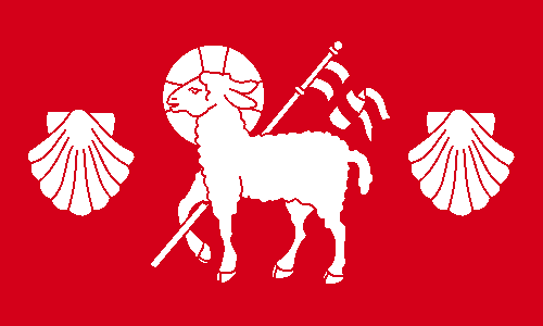
For my design, I first removed the busy chief and aligned the shells to the lamb:


The flag is made only of red and white cloth, notice the St. George's cross carried by the lamb. I could add a symbol related to Cabot, but since he's also named John, the lamb and the shells are also canting (punning). I could remove the shells, but it would make the flag too generic, in my opinion.

Comments are greatly welcome.
Do you have any suggestions of other boring flags that deserve to be fixed?

16 Apr 2015

Vancouver Island (BC, Canada)

When Vancouver Island was granted a flag, in 1865, it was still an independent colony. The next year, though, it joined British Columbia, now part of Canada, so there's doubts that flag ever flew those times.

That flag, however, is been revived by many locals as an unofficial flag. This is how it looks:


It's a bunch of things happening there. The badge is based in then-colony's seal:trident for the sea surrounding the island, caduceus for commerce, pine cone for the forests and beaver for fur trade. I don't think the blue ensign-look is the ideal for current usage.

Here's my first attempt:


I kept the main elements of the flag. Caduceus and tridents, here. The green stands for the forests. The beaver is on canton because, apart from the fur trade, it's also representing the Hudson's Bay Company, the true proprietors of former colony.

My second attempt is more conservative:


Nothing completely original, but this flag is way more ellegant and easier to be manufactured.

Comments and suggestions are welcome.
My real sorry for post's delay. It's been a busy week.

21 Jul 2014

Anglo-Quebecers, Anglophone community in Quebec (Canada) [II]

To read the original post, click here.

About one year and a half ago, I posted a flag for the English-speaking community on Quebec, what would make sense since the French-speaking communities of majorirarily English-speaking provinces have their own flags.

My final proposal was this, inspired by the provincial coat of arms and symbolizing duality and unity. For the complete rationale, click on the link on the top of the page.


Recently, a commenter posted that Montreal flag could almost pass as a flag for the English-speaking Quebec. So I noticed to have a re-though on the flag.

Curiously, Montreal and its neighborhood concentrates the biggest part of the community. Below, the flag of Montreal: a red cross, representing the religious that founded the city, and a fleur-de-lis, a Lancaster rose, a thistle and a shamrock, representing, respectively, the French, the English, the Scottish and the Irish settlers. In my opinion, the flag is a bit busy:


And this is the flag of Quebec:


Both flags have a cross and a fleur-de-lis on superior left quarter. So I have the idea of coloring the flag of Quebec like that of Montreal, obtaining this result:


The red cross could also be handled as the St. George's cross of England, the birthplace of English language. The link with the flag of Quebec makes it more suitable to the whole province, and not only Montreal. The disposition of colors have also a curious similarity with British flag.

I like the final result, and it's bold but also very significative.

Comments are welcome.
Just curious: two consecutive flags on North America category.

14 May 2014

Fredericton (NB, Canada)

Fredericton is the capital city of New Brunswick, Canada. I never was a fan of its flag, whose appearance obviously demonstrates it was made by an amateur. There are some other issues, that I'll address along the post.

This is the current flag of Fredericton:

The flag ratio (1:2) is too wide, considering that about two thirds of it is left empty. The coat of arms, consisting mostly of other escutcheons, is badly composed. Two top escutcheons represent the monarch of Canada, the bottom one represents the New Brunswick forests, and the cross is a sign that Fredericton is se of ecclesiastical cathedra. The motto is Fredericopolis silvæ filia nobilis ("Fredericton noble daughter of the forest").

My basis for the flag proposal is the bottom escutcheon, that can be related to city's motto. The fir-tree line pattern is originary from Finnish heraldry. Take a look:

Moreover, I'd like to keep the monarchic theme on the flag, as removing it could be potentially unpopular. One of the things I dislike on current coat of arms is that it represents much more the British than the Canadian queen. Luckily, the coronets that crown the two top escutcheons is the St. Edward's crown, that also appears on Canada and New Brunswick coats of arms. Here, I simplified it to the cross patty and fleurs-de-lis that adorn the crown.

The result, in my opinion, is much fresher and more aesthetic than current flag.

Your comments are always welcome.
If you have any suggestion to a potential suggestion to the blog, please, leave it on comments.

30 Sept 2012

Canada: Duality

In Canada, the discussions about a possible flag change are very polemic, dividing people between pro-change and anti-change. One of bigger reasons to change (I'm not saying it's my personal opinion) is that, while Canadian population is basically constituted by Anglophones and Francophones, only the firsts are represented in the flag.


The original meaning of Canadian flag says white is for the French heritage (this color was used in French royal emblems for centuries) and red is for the British, but usually white is considered a neutral flag, so Francophones aren't represented. Therefore, more embracing flags are sometimes proposed. Between them, the most famous is the unofficial "Canadian Duality Flag" or "Canadian Unity Flag", created during 1995 Quebec secession referendum (obviously, by "no" campaign). It consists of Canadian flag with added blue bars. Blue was a color used in flags used in French colonies in America (see example). This is the mentioned flag:


The main virtue of Canadian national flag is simplicity — that "duality flag" ruins. The blue touching the red is neither a good choice. So I come with a new flag proposal to represent the Canadian British-French duality:


The red represents the British heritage, and blue represents the French heritage. The maple leaf is dividing the flag, and it's white because it means peace. The red is not touching the blue, what improves a lot flag's visibility. The position of the colors is based in the principle that French population is concentrated in the east. See the map (darker means bigger Francophone population):


Also, it opposes the French national flag's color order, to avoid any misinterpretation. Finishing, I'd note that it's more a proposal to a new "duality flag", although it could, occasionally, be proposed as Canadian national flag, what I didn't pretend to do at the moment.

Your comment is always welcome. Please feel free to express your opinions. Thanks for reading! If you liked the blog, you may like to follow it (button is on the left).
I'd like to clarify that it's not my intention express any political opinion in this post.

19 Feb 2012

Anglo-Quebecers, Anglophone community in Quebec (Canada)

Some time I was reading articles about Canadian vexillology, and one argument makes me wonder. It was something like this:
The Franco-Canadians in Anglophone provinces has their own flag (see here), then, the Anglo-Canadians in Quebec should have a flag too. Why not?


The objective of this article isn't debate if this kind of flag is good or not (I'm not, personally, an enthusiast of them), but satisfy the people that think Anglo-Quebecers should have their own flag. The base for my design proposal is a colonial flag of the province, the blue ensign with the provincial coat of arms:


Naturally, the Anglo-Quebecois may have some familiarity and consideration with this flag (not everyone, but some of them). Other influece was this early Quebec proposal flag. My first proposal flag excludes the Naval Jack, making it a more contemporary design.


I think that a more meaningful flag should have just the fleur-de-lis and the maple leaf, meaning duality and unity. This design is, for me, a lot more beautiful - classic and modern in same proportions.


This is from a serie of done flags I have. In next weeks, I'll post them randomly.
Thank you. I hope you liked this post. If yes, follow me.