25 Feb 2016

Bristol (England, United Kingdom)

I've came accross a petition for a new flag of Bristol. Apparently, it's related to Facebook and Twitter accounts. So I became excited about making a design by myself.

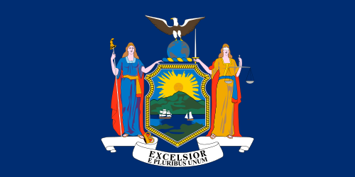
Theorically, Bristol council is allowed to fly its banner of arms:


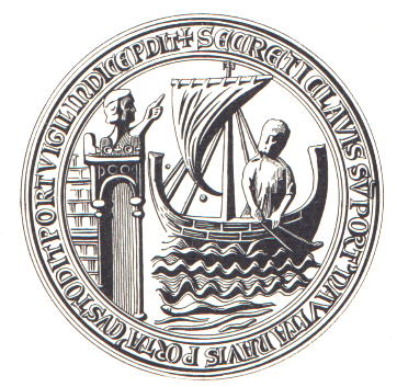
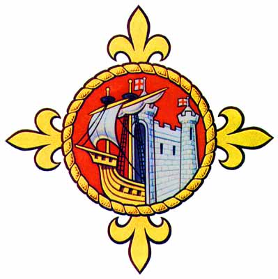
But this banner couldn't be used by Bristolians without authorization. I've become inspired by Bristol's original seal and current badge (diverse from coat of arms, it was used to show allegiance).
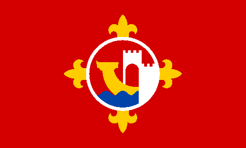


Ship and fortified bridge represents the famous Bristol port. The cross fleury is a reference to a compass rose. I think I've simplified enough the complex design to make a good flag, but still keep the elements understandable.

Comments and suggestions are welcome.
Sorry for small delay. I've had a commitment.
Access the campaign's Facebook and Twitter for more ideas.
The banner of arms was made by Paul Callan.

16 Feb 2016

Pernambuco (Brazil) [Independent]

Pernambuco is the 7th most populous and the 10th richest state of Brazi. I've been requested to design a set of flags for a hypothetical independent Pernambuco state. But today I'm only showing my solution for national land flag.

This is the current flag of Pernambuco:


It's based in a flag used during a colonial rebellion:


In the original flag, the three stars represent three capitanias (similar to a province) that adhered to rebellion: Pernambuco, Paraíba and Ceará. In current flag, the star represents statehood. The rest of symbolism is very obvious: white for peace, blue for sky, sun for energy and brightness, cross for faith, rainbow for plurality.

As I think the reference to statehood is not suitable for an independent country, I designed a new flag, but with links to the historical flag:


I kept the rest of the symbols. Now without the star, I had to rebalance the flag, so I used the rainbow as a partition line, what would give room for both sun and cross and, as a side effect, fix green-blue contrast issue.

Comments and suggestions are welcome.
This flag was made under request. It's not intended as a political statement.

11 Feb 2016

Clinton County (MI, USA)

These days I spotted the flag of Clinton County, Michigan. It's not the most terrible flag, but it's bland — really bland!

This is my rendition of current flag, based on a photo:


The flag contains a spring of mint, representing peppermint and spearmint growing in the county.

I don't know much about the place, but here's my take:


Instead of using a spring of mint, I decided for the shade known as "mint". As a plain mint flag wouldn't do, I put a deer, that scream "MICHIGAN!" and, considering it appears on county seal, is not the worst choice.

Comments and suggestions are welcome.
Sorry for small delay, I'm trying to avoid it.

3 Feb 2016

Bethlehem (Palestine)

Bethlehem is a very ancient city located in West Bank. It's known to be place where Jesus Christ was born, as well as David was born and crowned king of Israel, reportedly. Another popular site is Rachel's tomb. As such, Bethlehem is one of most import pilgrimage places in Middle East.

As far as I know, Bethlehem doesn't flag a flag. My first thought was designing a flag including the silver star, inside the Church of the Nativity, that marks the exact place where Jesus is believed to have been born. However, I haven't figured out a way of making a compelling, but still self-evident, flag.

So I looked at city's logo:


I noticed Christmas Star was the perfect element for the flag. The logo also contains a wheat ear, as Bethlehem's comes from Hebrew and Aramaic for "house of bread".

That was my first attempt at completing a flag for Bethlehem:


Star of Bethlehem in night sky, border yellow like wheat... all very simple, but very attractive. I think adding the border was a good idea to make it less boring.

But it wasn't still as good as I wished. So I transformed the border in an orle:


I guess the second proposal is much more effective.

Comments and suggestions are welcome.
Sorry for recurring delays. I've acquired a new computer, so I'll try to post more often.

23 Dec 2015

Port Authority of New York and New Jersey (USA)

The Port Authority of New York and New Jersey is a NY-NJ interstate compact that administers a large hub of airports, seaports and other facilities.

They use the following flag:


This design mixes elements from the flags of New York and New Jersey states. It's indeed a curious flag, but they only make sense if those flags never change.


I decided to use geographical references in the flag: buff color for NJ, orange for NY and blue for water borders, including Hudson River, all them arranged more or less according to the map. As a distinctive element, I've put the Statue of Liberty, located near the center of Authority's jurisdiction area, where, like Emma Lazarus wrote, it serves as a "New Colossus" for the harbor.


A curious sidenote: here, the Statue is in buff field and, although part of New York city, the Liberty Island is an enclave inside New Jersey.

I live the resuly, but I think the white circle has not enough contrast with buff background, so I moved it to the center, also enlarging it:


This adds a different bit of symbolism: that Statue of Liberty is more or less in the center of Authority's area.

Comments and suggestions are welcome.
If you're interest in flags with a "colossus", look at my proposal for Rhodes.

3 Dec 2015

DROPS: São Paulo (São Paulo, Brazil) [II]

São Paulo is the biggest city of South America. Less importantly, it's the place where I was born and lived since then. The screen of the computer I'm using right now has color issues, so I had to rely on something whose colors I was used; then, I chose re-redesign São Paulo's flag, as I already posted about it here.

This is the current flag of São Paulo:


It's not the most horrible flag in the world, I have to admit, but it's surely a complex design, what's not a good thing when we talk about flags.

The two proposals I made then:


So I was thinking: What if I simplified it, but not as much as my first proposal? Here's the result:


The very same flag, but with a tiny red border around the inner circle:


I made the coat of arms fit in the circle, even though I'm not sure if the shoulder is anatomically correct now. I specially like the proportion of red and white in the flag as a whole.

Even though I think this design appealing, I'm not sure if it's such a big improvement over current flag. But it was funny doing it, and seeing the final result, anyway.

Comments and suggestions are welcome.
If I'm correct, it's blog's 200th post! Thanks for helping it keep alive for such a long time.

23 Nov 2015

Southern USA (USA)

A personal opinion of mine is that flags should be a symbol for unite peopl, not divide them. But it can't perfectly happen if the feelings about a flag occupies a vast range, from pride to shame.

Currently, the most used flag to represent Southern USA pride is a modern reimagination of a Confederate battle flag, never really used as a national flag:


However, series of happenings is making it become more and more politically incorrect. Another flag that surfaced recently is the so-called "Southern Nationalist Flag", but its racist symbolism has no place in a plural South.


One initiative to re-think Southern flag was made by 70kft, a design studio from Dallas, TX. One think that I liked about it is the imaginary arrow pointed to the South. But its admittedly "quilt" look is not quite effective.


My idea is using the basic 70kft's idea of multiculturalism, represented by crossing red and blue bends. I'll use the saltire, not only because of its familiarity with previous flags but also because "X" is punning of Dixie, as dix is French for 10.


I didn't like the result that much, so I applied a "fretty" treatment:


I liked the final result the most.

Comments and suggestions are welcome.
I know it's a sensitive issue, but I tried to keep it flag-related. Be civil.