20 Aug 2014

Luanda (Angola)

Luanda is the capital of Angola. Brazil and Angola, being two parts of Lusophony with shared history, developed a close friendship. Luanda, for example, is friend city of my hometown, São Paulo.

As far as I know, Luanda doesn't have a flag. It acquired a coat of arms while still part of Portuguese Angola, but I couldn't check if it's still used:


This flag showed Our Lady of the Assumption in a blue field, and St. Paul in a red field. Those were the patron saints of Luanda, and its full name was "St. Paul of Assumption of Luanda".

Inspired by the coat of arms, I designed the following flag:


The symbol in the middle of the flag is a stylized cowry, formerly used as currency in many parts of Africa and the world. It represents the shell money extracted in the island of Luanda, but also the wealth of the city and its African roots; it's also related to one of probable origins of city's name.

Comments are welcome.
I have exciting news for next week. Wait!

12 Aug 2014

Brazilian Capital Cities: Epilogue

On the first day of 2013, I officially started series of post about the state capitals of Brazil. That day, I commented, in details, the problems I saw on all those flags. If you haven't read it, click here.

That blog was illustrated with the following image, a set with the current flag of all state capitals of the country:


As none of the cities changed its flag, the image is still updated.

Changing all the flags I felt wasn't adequate, we obtained it:


Some of the flags I proposed were mere fixes, others were completely original. But, more than one year and a half later, I notice I learned a lot about flags design (vexillography) and the final result, in the end, were bold and clever flags.

It's a good time to thank all readers for taking part of these (in my opinion) successful series. In your opinion, dear reader, what was the best post of these series? I'm really interested in reading you.

Your comments and suggestions are welcome.
Thank you very much, again. Your views, comments and sharing is fundamental to the blog!

5 Aug 2014

Campo Grande (Mato Grosso do Sul, Brazil)

A very special post: the last of my series about Brazilian state capitals flags. Today, we'll look at Campo Grande, the capital of Mato Grosso do Sul.

The current flag of Campo Grande is the following:


The eagle of the coat of arms holds a winding horn, symbol of the local agricuulture. The two wavy stripes represent the Segredo and Prosa streams, and the silver bordure with red crosses represents the bandeirantes that settled in the region. It's not a bad flag, but it represents more the region than the city itself.

A curious fact about finishing these series with Campo Grande is that, actually, it was one of the earliest capitals for which I designed a flag prototype, that you can see below. It was inspired by the statues of jabiru, the majestic bird of Pantanal, present in local airport.


It has a fault shared with current flag: it represents the region better than the city. So I decided for a new attempt, taking cities landscape as an inspiration. The result:


From the coat of arms, the two streams that represent the foundation of the city. The bottom red stripe represents the red or purple soil of the place, that gives it the "olive-skinned city" nickname, and the links it still keeps with native people. The top blue stripe represents the horizon, very clear as the city is located in the top of a plateau.

This flag is very unexpected, in my opinion, but I like it.

Comments are welcome.
And here is the last flag from my state capital series. Soon, the epilogue of the series. Wait!

21 Jul 2014

Anglo-Quebecers, Anglophone community in Quebec (Canada) [II]

To read the original post, click here.

About one year and a half ago, I posted a flag for the English-speaking community on Quebec, what would make sense since the French-speaking communities of majorirarily English-speaking provinces have their own flags.

My final proposal was this, inspired by the provincial coat of arms and symbolizing duality and unity. For the complete rationale, click on the link on the top of the page.


Recently, a commenter posted that Montreal flag could almost pass as a flag for the English-speaking Quebec. So I noticed to have a re-though on the flag.

Curiously, Montreal and its neighborhood concentrates the biggest part of the community. Below, the flag of Montreal: a red cross, representing the religious that founded the city, and a fleur-de-lis, a Lancaster rose, a thistle and a shamrock, representing, respectively, the French, the English, the Scottish and the Irish settlers. In my opinion, the flag is a bit busy:


And this is the flag of Quebec:


Both flags have a cross and a fleur-de-lis on superior left quarter. So I have the idea of coloring the flag of Quebec like that of Montreal, obtaining this result:


The red cross could also be handled as the St. George's cross of England, the birthplace of English language. The link with the flag of Quebec makes it more suitable to the whole province, and not only Montreal. The disposition of colors have also a curious similarity with British flag.

I like the final result, and it's bold but also very significative.

Comments are welcome.
Just curious: two consecutive flags on North America category.

14 Jul 2014

Miami (FL, USA)

For today, one more request by the readers, this time by an anonymous commenter. It's for Miami, that, although don't have a terrible flag for American standards, is easily confused with India national flag by tourists.

This is the current flag of Miami:


Like Indian flag, Miami's one have orange-white-green horizontal stripes with a circular emblem on central stripe, here a seal. The seal contains a palm tree. I couldn't find any source for the meaning of the colors, but I have a theory that it may be related to orange tree: orange for the fruits, white for the blossoms, green for the tree itself.

My first proposal is simply rearranging the key elements, rotating the stripes and enhancing the palm tree, like this:


This flag is very bold, and wouldn't be absolutely strange for Miami residents. It's similar to Ivory Coast flag, but the palm tree may be enough difference.

For a more distinctive flag, I suggest this:


This flag keeps all the colors from current flag. Putting the palm tree on a circle actually makes it remember the city's seal. The orange and circle combination remembers Miami's beautiful sunshine. It can also be related to "Orange Blossom Myth".

Substituting sunshine for sun and enhancing orange symbolism, I came with this:


In my humble opinions, all designs presented are good improvements of current Miami flag. The fact none is a total ruptures makes them easier to be practically adopted.

Comments are welcome.
If you have a suggestion for a future post, too, write me on comments.

9 Jul 2014

Acting president (Brazil)

On Brazil, the acting president of Brazil is the first available on the following list: the president of the Republic, the vice president, the president of the Chamber of Deputies (low chamber), the president of Federal Senate (high chamber), the president of the Supreme Federal Tribunal (both the constitutional court and the highest court of appeal). The last three can only assume the presidency interim.

Among them, as far as I know, only the president and the vice president (while not acting president) of Republic has their own flags, respectively as follow:


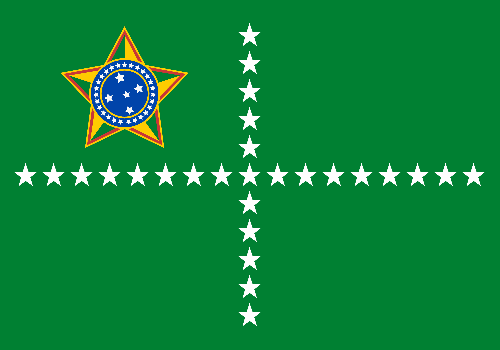
Inspired by the personal flag of the Minister of Defense created in 2009, that use a kind of "lesser arms" of Brazil, and my proposal to national jack, with 27 stars, I propose the following small amendments:
President of the Republic

Vice President of the Republic

The other three don't have known personal flags. So I created them using the same pattern of my proposal for the vice president.

For the presidents of Chamber of Deputies and Federal Senate, I decided the background following the color of their chambers' noble hall: green for the Chamber of Deputies, blue for the Federal Senate. The stars are yellow, partly because I'd like to keep reserving the white stars on blue to the Navy usage. On the inferior left quarters, the silhouette of the well-known Parliament building, that hosts both houses, emphasizing the concave semi-sphere to Chamber of Deputies and the convex semi-sphere for Federal Senate on their respective flags.
President of the Chamber of Deputies

President of the Federal Senate

The noble hall of Supreme Federal Court is white, so I decided to put a white background on th flag of its president. On inferior quarter, I decided to put a balance scale, because its façade is not as famous and the parliament building. The stars and the scale are ruby color, as the ruby stone is associated with Laws.
President of the Supreme Federal Tribunal

On president's cabinet, whoever is the acting president of the day, it's always flown the flag of President of Republic, what can be confirmed by photographs. Alternatively, a single flag for the acting president, when not the elected president, could be easier to handled by the ceremonials. My proposal takes the green from presidential flags, adding white stars:

Comments and suggestions are welcome.
In a future occasion, I may post flags for the Federal Senate and Chamber of Deputies. Wait!

3 Jul 2014

Freamunde (Oporto, Portugal)

Freamunde is a freguesia of Paços de Ferreira, in Oporto district, Portugal. It's known for its Saint Sebastian and its capão (castrated, giant chicken).

In 1991, it was proposed a flag for Freamunde, containing reference to the popular motto "land of culture, labor and peace": an open book, an engine, a chimney and a peace dove. Since then, it started being flown unofficially.


As you can see, the charges of the coat of arms aren't arranged in a blazonable way, so, therefore, it can't be classified as strictly heraldic.

In 2007, the "land without blazons" gained a new, official coat of arms, that you can see on flag below:


I read reports of people that were used by former, unofficial coat of arms and complained against the new one. So I decided to fix the former to a more heraldic layout, using elements from the latter.

Here is my result:


Firstly, I decided to use the same blue and white gironny pattern from both flags. I put the book and the engine in black backgrounds, like the unofficial coat of arms. The capões are white on red background, inspired by the logo of its capões fair. On white background (the color of peace), the olive branch.

I liked the result, because I think it's a nice compromise between the two coats of arms and has a more functional layout.

Comments are welcome.
Sorry for posting thursday, I'm busy this week.