11 May 2016

Oslo (Norway)

I like very much Norwegian local flags. But, unfortunately, the capital has one of few questionable flags there.

The flag of Oslo looks more or less like this:


Between 1924 and 2002, Oslo used a more interesting flag, whose symbolism is unknown to me. This flag was substituted by the flag above, because the previous flag was supposedly too similar to Greek similar, what I disagree.


However, avoiding the same discussion, I'll propose a fix based on current flag, not the previous one. My proposal is, basically, adapt the current flag into Norwegian subnational flag style, that includes minimalism and respect for heraldic rules. Here it is:


This flag, like Oslo seal, with medieval origins, represents patron saint St. Hallvard, holding arrows and a millstone, the instruments of his martyrdom. I've added the throne with lions, that can be associated with the role of Oslo as capital of Norway. I've removed the stars, whose symbolism, if any, is unknown to me, and the naked woman, that seem to be a later addition.

In general, I like very much the result, and I modestly think it could be adapted into a coat of arms.

Comments and suggestions are welcome.
Sorry for the absence last week. I've made stuff, but I've had no time to post it.

27 Apr 2016

House of Orléans-Braganza

The house of Orléans-Braganza are descendant of princess Isabel, heiress to last Brazilian emperor, and her husband, count of Eu. They are current claimants to the Brazilian (extinct) throne.

The current coat of arms of Orléans-Braganza is that of former Empire of Brazil, with inescutcheon of house of Orléans:


On a previous post, Rodrigo Sales asked me for a remake of this coat of arms. It's the kind of creative exercise I've never done, but nonetheless I'll present two suggestions. I've used "french modern shield", because that's the escutcheon shape historically used by Brazilian nobility.

My first attempt:


It's, basically, a simplification of current coat of arms. I've removed the stars that, apart from being too busy, should be updated every time a new province was created. This design uses the room much better, and diminished the contrast-problematic clash of green and red.

It's better to design a family coat of arms with some usages in mind, like impalement, quartering and lozenge (for ladies).
Impaled
Marshalled
Lozenge

My second attempt is my favorite:


In Brazilian imperial flag, the green represents House of Braganza (emperor Peter I of Brazil), while yellow represents House of Habsburg-Lorraine (empress consort Maria Leopoldina), so it can work as genealogical arms. The inescutcheon of Orléans adds the blue and white, similar to current flag and a homage to Our Lady, patroness of Brazil.

Other usages of coat of arms:
Impaled
Marshalled
Lozenge

That inspired to make this dinastic flag:


Comments are welcome.
This post was a request. Feel free to do your request, too.

21 Apr 2016

Denny and Dunipace (Scotland, UK)

Denny and Dunipace is holding a contest to decide its new flag (more info here). I've submitted two entries, that didn't made the final list (even though similar entries did), but I'll show them here just for entertainment.

The burgh used to have a beautiful coat of arms, before it was incorporated into Falkirk, even though it's too busy for a flag:

My first entry adapted it into a more flag-friendly design:

The entry was followed by this rationale:
The flag resembles burgh seal and coat of arms. It contains a landscape, with river Carron and the bridge joining Denny and Dunipace. The white color remarks the important treaties signed in this place. The bar engrailed represents the connection with the Sinclair.
My second entry was less derivative but, I have to admit, more generic:


It was an improvement over a previous design, that took "twin towns" too literally:


I've submitted it with the following rationale:
The flag shows River Carron, with Dunipace in north bank and Denny in south. The white color remark the important treaties signed in this place. The black color represents coal and iron. Apart from Denny and Dunipace, the two fortified buildings can represent the forts on its banks dividing Roman and Picts — "Carron" may come from Latin "caer avon", i.e. "river of the forts".
None of them made the final, but designing them was nonetheless some fun.

Comments and suggestions are welcome.
To know the finalists, click here.

8 Apr 2016

Gatineau (QC, Canada)

Gatineau forms, together with Ottawa and smaller communities, Canada's National Capital Region.

Its current flag is the following:


Until 2002, when it was merged with four other townships, it used the following flag:


Both flags use a stylized "G" and, in some way, represent sustainable development.

My attempt is a mix of both and, hope I, better than both:


The blue part represents clean water. The green part, whose shape may remark leaves in the wind, represents nature; it's also an arrow point towards future. The overall design resembles a "G" just like former flag.

A variant on same theme:


Another variant shows five stars, representing the five merged communities:


Comments and suggestions are welcome.
Sorry for recent absence. I had professional compromises.

22 Mar 2016

Harvard Law School (USA)

Harvard Law School, a college of Harvard University, decided to drop his former coat of arms, because it displayed prominently the family arms of Isaac Royall, the first backers of the college. The issue: Royall was a slaveholder and a slave trader, so the coat of arms was considered "racist".

This is the former coat of arms of the college:


I don't know any replacement proposal, apart from what seems to be a parody and a professor's suggestion to add "Iustitia" ("Justice") below "Veritas" ("Truth"). My proposal is not for total rupture:


I'm defacing Royall's arms with three gouttes de sang ("blood drops"), not forgetting his importance to the school, but denouncing that his wealth was gained in exchange for slave blood.

This way, it gives those black lives the credit for helping build, even though without their will, one of most prestigious law schools in the world.

Comments and suggestions are welcome.
I'm an outsider here. Do you think it avoid racist connotations of former coat of arms? Or should Royall's arms be dropped completely?

16 Mar 2016

My "mon"

Long time followers of my blogs may know I'm fascinated by the aesthetics of mon (Japanese family or individual emblems). I decided to design a mon-like emblem for me.

Unlike flags and "Western" coats of arms, mon don't have fixed colors. Here I'll present them black in transparent background.

I think the ideal starting point would be my coat of arms. But I'd like something that remarked it, not a direct translation.

Looking at some Medieval and Tudor-age armorials, I noticed how the negative area of cross moline (the kind of cross in my coat of arms) resembled four hearts. With that in mind, I designed my first kamon:


Heart-like shapes are present in Japanese mon: examples are the petals of sakura (cherry blossom, five petals each) and katabami (wood sorrel, three petals each).

I improved the previous putting it on an octagon:


Eight is a very meaningful number, specially for a computing geek like me.

I think this look much better than previous attempt. However, I made one final design: make it look like a flower (obviously, in Japanese style), with the hearts being petals.


I think it's a lovely design, and I would surely adopt it, for instance, if I lived in Japan. (As living near the biggest Japanese community outside Japan wasn't enough...)

Your comments and suggestions are mostly welcome.
Sorry for absence. I had some urgencies last weeks.

25 Feb 2016

Bristol (England, United Kingdom)

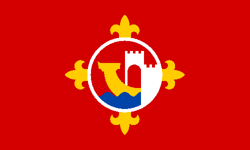
I've came accross a petition for a new flag of Bristol. Apparently, it's related to Facebook and Twitter accounts. So I became excited about making a design by myself.

Theorically, Bristol council is allowed to fly its banner of arms:


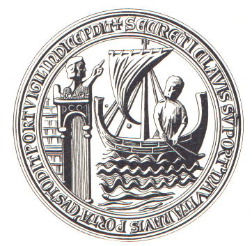
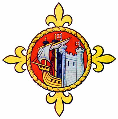
But this banner couldn't be used by Bristolians without authorization. I've become inspired by Bristol's original seal and current badge (diverse from coat of arms, it was used to show allegiance).


Ship and fortified bridge represents the famous Bristol port. The cross fleury is a reference to a compass rose. I think I've simplified enough the complex design to make a good flag, but still keep the elements understandable.

Comments and suggestions are welcome.
Sorry for small delay. I've had a commitment.
Access the campaign's Facebook and Twitter for more ideas.
The banner of arms was made by Paul Callan.