28 May 2014

Vitória (Espírito Santo, Brazil)

The series of Brazilian capitals flags is near the ends (in my counts, it's the penultimate post!) and now it's time to propose a new flag to Vitória, the capital of Espírito Santo state. It's the oldest Brazilian state capital located on an island.

The flag of Vitória is the following:


It's nothing more than city's coat of arms on white background. The first quarter, with a golden star, refers to the star of Brazilian national flag that represents Espírito Santo. The caduceus is symbol of commerce and, together with the ship on a landscape containing the Penedo (actually part of Vila Velha municipality) and the Ilha das Pombas, represents the portuary nature of the city. The most interesting item of the coat of arms is certainly the arrows behind it, a tribute to the native indians of the region.

Inspired by the foundation of the city (whose details I explain better on next paragraph), I designed the following flag:


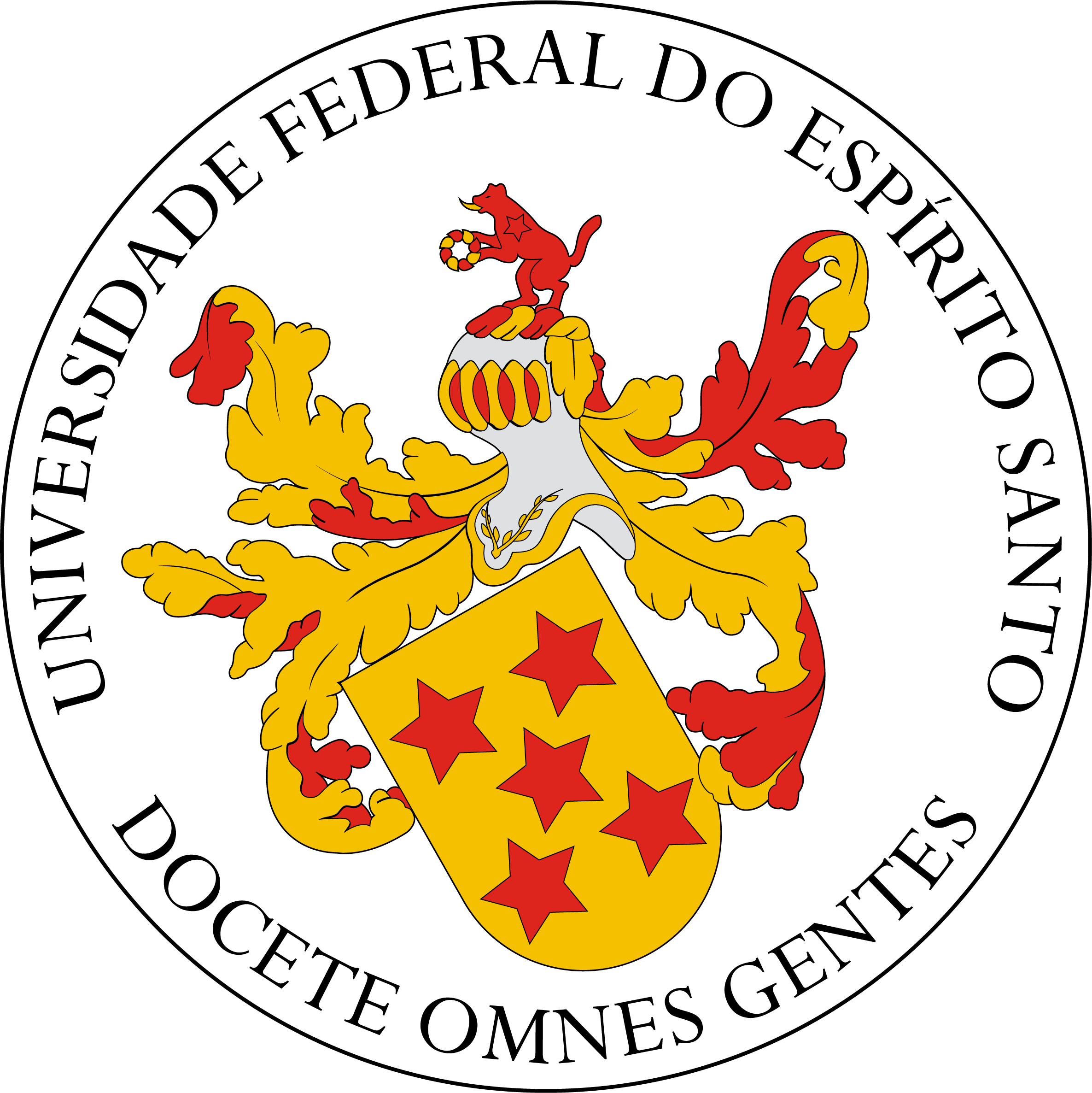
The five red stars arranged in cross on a yellow background is from the coat of arms of Vasco Fernandes Coutinho, first proprietor of Espírito Santo captaincy and founder of the city; this motif appears, for example, on the coat of arms of the Federal University of Espírito Santo. The arrows, took from coat of arms, represent the indians that inhabitated the island, specially the Goytacazes, famous for their techniques with bow and arrows. The victory of Coutinho over the Goytacazes names the city ("Vitória" = victory).

Comments (critiques, suggestions, additional info, etc.) are welcome.
That was the first flag I made with help of Paint.Net 4.0 beta.

22 May 2014

Colonia del Sacramento (Colonia, Uruguay)

The origins of Colonia del Sacramento (capital of Uruguayan department of Colonia) dates from the Portuguese Colônia do Santíssimo Sacramento ("Colony of the Most Holy Sacrament") settled on the estuary of the River Plate (on the margin, the Argentinean capital, Buenos Aires). For its strategic position, the region was disputed between Portuguese and Spanish settlers; its historic quarter being World Heritage Site due to the mix of both colonial architectonic traditions.

As far as I know, the town doesn't have neither a flag nor any coat of arms. My first inspiration was the famous city's gate, but it can be too generic, maybe. So my next attemp was this:

Blue and white are the Uruguayan colors, and, at the time of city's foundation, both Portugal and Spain used flags with white background. The blue shape is like a fort, a reference to the historic quarter of the city. The sunny white disc is a common representation to the sacramental bread, as the colony was named after the Eucharist, "the most holy sacrament". Again, the sun remembers the Uruguayan national symbols.

Comments are welcome. Please, leave a comment.
If you can locate any Colonia del Sacramento symbol, please cite it on comments.

14 May 2014

Fredericton (NB, Canada)

Fredericton is the capital city of New Brunswick, Canada. I never was a fan of its flag, whose appearance obviously demonstrates it was made by an amateur. There are some other issues, that I'll address along the post.

This is the current flag of Fredericton:

The flag ratio (1:2) is too wide, considering that about two thirds of it is left empty. The coat of arms, consisting mostly of other escutcheons, is badly composed. Two top escutcheons represent the monarch of Canada, the bottom one represents the New Brunswick forests, and the cross is a sign that Fredericton is se of ecclesiastical cathedra. The motto is Fredericopolis silvæ filia nobilis ("Fredericton noble daughter of the forest").

My basis for the flag proposal is the bottom escutcheon, that can be related to city's motto. The fir-tree line pattern is originary from Finnish heraldry. Take a look:

Moreover, I'd like to keep the monarchic theme on the flag, as removing it could be potentially unpopular. One of the things I dislike on current coat of arms is that it represents much more the British than the Canadian queen. Luckily, the coronets that crown the two top escutcheons is the St. Edward's crown, that also appears on Canada and New Brunswick coats of arms. Here, I simplified it to the cross patty and fleurs-de-lis that adorn the crown.

The result, in my opinion, is much fresher and more aesthetic than current flag.

Your comments are always welcome.
If you have any suggestion to a potential suggestion to the blog, please, leave it on comments.

7 May 2014

One-state solution

"One-state solution", often called "Isratine", is one of the proposed solutions to Israeli-Palestinian conflict, through the unification of the two countries in a single (often federated or confederated) multi-ethnic and multi-religious state. The theme of this post was proposed on the blog comments by Aj Marohom.

The usual way of designing flags on this topic is combining Israel and Palestine flags. The flag just below, for example, was designed by me using this pattern.


Those flags, though, may seem too artificial and, in the opinion of many, are more divisive than opposite, but I have to admit some of them are aesthetically pleasing designs.

I searched for a symbol with appeal enough to be carried on street marches (many national flags were born from popular movements'), that was emphatically aggregating and wouldn't offend any concerned party. For my surprise, the words in Hebrew and Arabic for "peace", respectively shalom (שָׁלוֹם) and salaam (سلام), had a common root and very similar calligraphies, as you can see on image below:

Source: Justin Watt of justinsomnia.org. Work licensed under CC-BY license.
Hebrew word is in blue and Arabic is in green.

Based on it I made the following design, using a stylized version of the words.


White is a peace color, and present on both Israel and Palestine flags. The golden color is neutral. As the symbolism is all related to peace, this flag wouldn't be, in my theory, offensive to any minority either. Israelis could find a connection between the colors and Exodus 33:3, that describes Canaan as "a land flowing with milk and honey", while Palestinians could associate the white background, a pan-Arab color, to Umayyad Empire.

Comments are welcome. Please, leave a comment.
As you can see here, I try to answer all suggestions as soon as possible. What about leaving a suggestion?
Please, no comments about politics or other delicate themes. Keep them about vexillological or aesthetic merits.
To see more about Justin Watt's works and attribution policy, visit justinsomnia.org.

30 Apr 2014

Czech Republic

I don't have issues with current Czech Republic flag, actually I think it's an awesome design. But its symbolism is outdated, so I was curious to think about an alternate design.

It's the current flag of Czech Republic (also known as Czechia):


This flag was obtained cleverly mixing the Kingdom of Bohemia white-red flag with Slovakia white-blue-red, on the time of Czechoslovakia formation. As Slovakia is now an independent country, one can think about a new flag.

The former Kingdom of Bohemia consisted of three distinct lands, Bohemia, Moravia and Czech Silesia, that used, respectively, white-red, yellow red and yellow-black horizontal flags. Being aware of this, I made this design:


This design still use the same layout of current flag, unique among national flags. Bohemia's white-red is still the most prominent part of the flag, but, slightly turning your head to the left, Moravia's yellow-red is now recognizable. Yellow is also the most prominent color of Silesian coat of arms.

This flag don't have the blue of pan-Slavic colors; if it's good or bad is only personal opinion not related to vexillology. After I designed it, I found a similar, but not identical, proposal here.

Comments are more than welcome.
Because it's a very simple design, there's a chance an identical proposal was made before. If you know any instance, please report me.

22 Apr 2014

Italian diaspora in Americas

A virtual friend, Hosmich, asked some time ago about a flag for the Italian and Italian-descendant people that lives in the Americas. Why? If you look at my surname, you may have noticed I have some Italian ancestry. Italian diaspora is very relevant in countries such Argentina, Uruguay, Brazil, USA, Canada, Peru and Venezuela.

After some thought, I did this design:

As the Italian reunification only occurred in the 19th century, there isn't a long tradition of Italian national symbols. One of them is the stella d'Italia ("star of Italy"), that dates from the first millenium after Christ. It's often associated with the story of the morning star guiding Aeneas, considered by Virgil's Aeneid the legendary founder of Rome. It appears on current Italian national emblem.

The rays on the colors of Italian flag was inspired by this propaganda piece dating from WW1. Specifically to Americas, I chose the purple color, from a Pan-American flag.

Comments are welcome.
Much thanks to Hosmich by the suggestion.

16 Apr 2014

Teresina (Piauí, Brazil)

The series about state capitals flags continues today, with Teresina, the first planned capital of Brazil and, more oddly, the city with third biggest lightning incidence of world.

This is the current flag of Teresina:


The coat of arms is, aside from heraldically incorrect, very redundant, as you can see on following rationale, and overloads the flag. The inescutcheon is an imprecise version of the coat of arms of Saraiva family, referring to city's founder, José Antônio Saraiva. The blue wavy base refers to Poti river, that gave the first name of the settlement, Vila Nova do Poti ("New Village of Poti"); the two anchors and two paddles stands for the navigability of Poti and Parnaíba rivers, that helped the development of the region.

As I said, the coat of arms of Saraiva family is wrongly described: the vair gives way to blue and white lozengy pattern, the fleur-de-lis should be golden instead of white, the crest should be a swordfish and the wreath should be blue and white instead of red and black.

My proposal, that uses the cited misrepresentation as a difference from original Saraiva coat of arms, is the following:


I reduced the changed Saraiva coat of arms to the main features, and stylized it to the two white wavy stripes coincide with Poti and Parnaíba river, confirming all the key symbolism of current flag.

Comments are welcome.
As I think I won't update this post before the occasion, happy Easter and/or Passover for those that commemorates them.