25 Jun 2013

Fortaleza (Ceará, Brazil), Rio de Janeiro (Rio de Janeiro, Brazil)

For today, two cities with very similar flags that gained such the same kind of redesign: Fortaleza (the sunny capital of the state of Ceará) and the worldwide famous Rio (capital of state of same name).

Starting with Fortaleza... This is the current flag:


This flag is constituted by a blue saltire and the coat of arms of the city, that's pretty nice but too busy to a flag. The coat of arms of the city is canting, as "Fortaleza" means, in Portuguese, "fortress". My proposal is, basically, a simplification of current flag:


This flag is much simpler and the fortress is more prominent now.

The current flag of Rio, now:


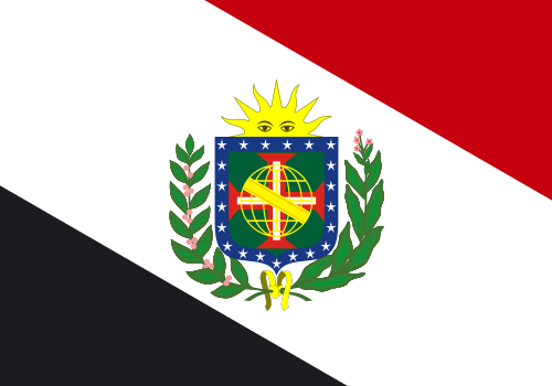
The current Rio flag is very similar to Fortaleza one, isn't it? I could made a nice novel flag, but I think a radical change won't be welcome by local people. The coat of arms depicts an armillary sphere (common reference to Portuguese empire) and three crossed arrows, representing the patron saint of the city, Saint Sebastian. Similar symbols are used to represent the Rio de Janeiro since 1565. For my proposal, I'll remove the Phrygian cap to keep it simpler. For curiosity, compare it to the flag of the former state-city of Guanabara. Here it is:


I can't see why this flag wouldn't be well-accepted.

Your comment is welcome. Feel free to comment.
Only ten cities left on the series. Start the countdown!

18 Jun 2013

Cape Town (South Africa)

Although South Africa has a nice heraldic tradition, its vexillology, specifically in relation to provincial and municipal flags, is still incipient and, in many cases, disappointing.

Look at the flag of Cape Town, one of the few you'll find:


This flag depicts a white stylized Table Mountain (a tourist attraction of the town), some kind of rainbow connected to South African national flag, and a lot of things improper to a flag.

I still prefer the design used before 1997:


This flag depicts the newer the old coat of arms of the city (it was abandoned when the flag changed, but none design was granted since then) on a blue background. The coat of arms consists in a yellow shield, with a black anchor (in reference to the fact that Cape Town is one of most historically important ports in the world, because of its strategic position on the Cape of Good Hope) and an inescutcheon with the arms of Jan van Riebeeck, a Dutch administrator of the area, consisting on three golden annulets on a red field.

My proposal takes the most substantial symbolism but rearranges the elements in a more pleasing design:


The three annulets are in a different disposition but, actually, can be blazoned as the same. Although black anchor in red can ignore the rule of tincture in many traditions (including the South African), the contrast between these colors isn't considered an issue (look, for example, to Albanian flag). This flag holds a harmony between the vertical and horizontal axes, slightly resembling a cross arrangement.

Your comment is welcome. Feel free to comment.
Next week, the Brazil capital series appear again.

12 Jun 2013

Provo (UT, USA)

Provo, Utah is one of most dynamic city of USA, and is well-quoted in many national rankings. However, its flag is between the worst of the country [see a ranking].


So, city mayor wrote a post on his blog asking for suggestions to a new flags. Looking at comments, I noticed that Provo inhabitants like very city's logo:


It isn't a good idea to put the logo integrally on the flag because letters should be avoided. Logos usually aren't a good idea neither, but we hope this logo won't change anytime soon. My suggestion:


Yes, the sun is duplicated, but I think this design potentialize all the good things of Provo.

Your comment is welcome!
You can post your own proposal on mayor's blog. Why don't you try?

4 Jun 2013

Brazil [II]

To read the original post, click here.

I recently showed a flag proposal to incentive the debate about a possible new Brazilian national flag. If you want to know the reasons why the debate is interesting, click on original post.

Below, you can see, respectively, current Brazilian national flag and my first proposal:


My newest proposal is, in certain way, derivative of the flag Brazil used during monarchy:


I'm not a great fan of imperial coat of arms for a couple of reasons: it's very complex, the green shade is too dark, the tobacco branch doesn't represent Brazilian history, it needed to be changed every time a new province was created, etc. Moreover, it's impractical since the country became a republic, because of the crown. My proposal, reworking previous flag, is the following:


The armillary sphere and the cross of the Order of Christ have long being associated with Brazilian iconographic history. The blue circle is blue, with an allusion to current flag and to the flag Brazil used during the United Kingdom with Portugal and Algarve. The flag now has red, the color of the tincture of the brazilwood, the tree that gives name to Brazil.

For the fans of the lozenge occupying the whole plan:


It's important to notice that, although this flag is a little complicated to being drawn, the current one is worse: it's much more difficult to draw 27 stars, each one with its correct size and position, while the proposal has a logic infinitely easier to be remembered. Moreover, this proposal is only a prototype, and can be simplified in other occasion.

Your comment is welcome!
If you have a favorite Brazilian flag proposal, by you or whoever, fell free to post it on comment.

28 May 2013

Rio Branco (Acre, Brazil)

The capital city that we'll see today is Rio Branco, capital of the state of Acre. This is its flag:


It's a white background, with the arms of the Baron of Rio Branco (1845-1912), including the barony crown (!)  and his personal motto ("Ubique Patria Memor", that means "Wherever I go, my patria will be on my memory"), that's also Rio Branco municipal coat of arms, and the letterings "MUNICÍPIO DE RIO BRANCO" ("Municipality of Rio Branco") on top and "ESTADO DO ACRE" ("State of Acre") on the bottom.

From now, I think the origin of city's name is clear. The Baron of Rio Branco, son of the Viscount of Rio Branco (the longest serving prime-minister of Empire of Brazil), was a Brazilian geograph, historian and considered the "father of Brazilian diplomacy", for his work on border disputes (including the case of Acre, hence the tribute on the capitol of the state). His popularity was gigantic: his name was quoted to the presidency and, when he died, the Carnival was paralysed for mourning. Currently, his face appears on Brazilian 50 cents coins. He's also related to vexillology: he made a proposal to a new national flag.

The arms of baron of Rio Branco is a simplified version of the arms of his father (that also included a feather and a compass). It's constituted by the a golden armillary sphere of blue interior (heraldically related to Brazil) and a silver river (canting, as "rio branco" means "white river").

My proposal is a banner of arms of the municipality, identical to those of the baron:


This flag has all the necessary symbolism of current flag, but it's much more direct to the point. The flag is slightly similar to the one of the Kingdom of Brazil (1815-1822), but I don't know if it's a problem at all.

Your comment is welcome!
If you want to know more about Brazilian nobility, click here.

21 May 2013

Africa

May 25th is Africa Day! On this day, Africa will commemorate the 50th anniversary (golden jubilee!) of the foundation of the Organization of African Union (OAU), currently named African Union (AU). I think it's an excellent opportunity to think a flag to represent the African pride on the continent and by African diaspora.

The continent doesn't have an official flag; the nearest you can find is the flag of the African Union, constituted by all African countries with the exception of Morocco (due to Western Sahara recognition and membership):


I think a new flag is necessary, not only because it's not an official African flag, but because it excludes Morocco. My attempt to the flag of whole Africa:


This flag comprehends the main color sets in Africa: the Pan-African red-yellow-green and red-black-green and the Pan-Arab black-green-white-red. The concentric circles, ordered from the lighter to the darker, represents the sun penetrating the darkness i.e. the peace and glory of the continent that will overcome the dark past of slavery and misery.

Your comment is welcome. Please, leave a comment.
If you see any issue regarding this flag, I'd like to be told. In the worst hypothesis, it's purely my ignorance.

14 May 2013

Brazil

Today it's time to discuss a little about the Brazilian flag. What I'll propose today isn't intended to be the definitive Brazilian flag, but only something to incentive the debate about the flag.

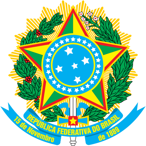
The current Brazilian flag is that:


I'm not saying I don't like the Brazilian flag, actually I like it. Some people say it has problems, and I'll describe some of the most common there:
  • The motto, "Ordem e Progresso", is based on a positivist quote by Auguste Comte. Although the Brazilian republic was instituted by positivist military, you shouldn't privilege any ideology on a democratic state;
  • The star layout is excessively complex, not instinctive and, worst of all, astronomically imprecise;
  • The excess of details and the lettering makes the flag being double-sided, what makes it very expensive to be produced and less wind-friendly.
My proposal is inspired by a proposal by Eurico de Góis, lawyer and politician, during the Constitutional Assembly of 1933. See:


This flag consists on the lozenge background of current flag (but with the lozenge now touching the borders), with the cross of the Order of Christ (flown during the Portuguese expedition that discovered the Brazil) and the center of current Brazilian "coat of arms", containing the Southern Cross and stars in the number of Brazilian states (then 21, now 27).

I made some small changes and obtained it:


Some ratios and shades are the same of current Brazilian flag. I removed the stars, as the flag intends to be eternal i.e. don't change every time the number of states change or so and it won't have big problems if don't made double-sided. It represents, explicitly or not, the historically greatest Brazilian symbols: the Southern Cross, the cross of Christ, the armillary sphere (represented by the blue sphere) and the brazilwood ("brasa", in Portuguese, means "ember", and the tree is so named because of its red tincture). This star layout could be changed, for example, for the one on the medal of the National Order of the Southern Cross.

As a bonus, a proposal of coat of arms (as Brazil current coat of arms isn't heraldically valid), on the same style of current coat of arms. The white background favors the rule of tincture and the simplicity principle:


The debate is now open!

To be able to comment, you don't need to have a Blogger account. You are welcome to give your opinion!
If you want to know other historically relevant Brazilian flag proposals, you can read this from page 152.