Miskito people is a Native American people native from Caribbean coast of Nicaragua and south Honduras, historically called "Mosquito Coast" (not related to the insect).
Sparsely inhabitated by Spanish colones, the Mosquito coast was twice in its history a British protectorate. In the second time (1844-1860), this flag was used:
From 1860 until 1894, where the area was finally annexed by Nicaragua (Honduras would only gain its piece in 1960), this flag was flown:
In that flag, the British flag was substituted by a version of Nicaragua flag, but with Miskito royal coat of arms instead. Until today, Miskito people use variations of these flags (you can find more about their flags here).
I imagined a hypothetical flag without British or monarchical symbolism, to avoid misinterpretations. I opted out for Nicaraguan symbolism for its busyness, nor plain stripes, as their are already often used. The result was this:
Eight stripes were common variations of these ten stripes flags. The symbol with a spear, shovel and canoe is used by the Council of Elders, among other Miskito entities. The two stars represent Honduras and Nicaragua, respective to their geographical locations. I think the colour palette represents the jungle and the coast very well.
Comments and suggestions are welcome.
So sorry for not posting nothing last week. I had technical issues.
29 Sept 2015
Miskito people (Nicaragua / Honduras)
16 Sept 2015
Flags of Pernambuco towns: Part I
A Brazilian friend requested flags for cities of Pernambuco state. I've once re-created the flag of its capital, Recife (post here; a candidate for a re-fix, by the way). Today I present the flag of his home city, Nazaré da Mata, and Carpina.
This is the current flag of Nazaré da Mata:

I've thought about keeping the green and white triband, but my final design, after some pencil-on-sketchbook, removed it, but has still some similarity with current flag.

The elements of the flag refer to tourist attractions: the golden obelisk; the sugarcane, referring to historical sugar mills and plantations; the standard, used in a local dance called maracatu.
This is the current flag of Carpina:

The first quarter of coat of arms represent the fact that the city had two former names. The second and third quarters represent the bravery and the Christian faith of founding fathers, respectively; the fourth quarters is punning with city's name, related to carpentry.
My first flag proposal contains an abstract saw:

My second proposal adds the second quarter of coat of arms as a flag canton, but just because one of two city's former name was Floresta dos Leões ("Lions' Forest") .

My third proposal is less orthodox, adding green color due to "forest" part of former name.

With some luck, we'll have a part two and many more!
Comments and suggestions are welcome.
Keep an eye in this series: I promise some great designs.
8 Sept 2015
Greenwich (London, UK)
From last August 31st to September 4th, the 26th International Congress of Vexillology happened in Sydney, Australia. The next ICV will happen in 2017, in London, more specifically in the University of Greenwich and the Old Royal Naval College, in the royal borough of Greenwich. So I think designing a flag for Greenwich would be welcome.
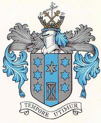
My inspiration for this design was the 1903-1965 coat of arms, before the annexation of Woolwich borough (for this specific purpose, I don't think that references to Woolwich are needed). The first attempt was a simplified version of the banner of arms (i.e. with less stars):
The central stripe is tinier in reference to Prime Meridian, also referred by the hourglass. The stars represent the Royal Observatory.
For my second attempt, I removed one more star, to make the flag look more balanced:
I like the result. But I'm not sure if it's better than with reversed colors:
I have a feeling that this version looks more "natural", but less unique.
Comments and suggestions are welcome.
Which of the three is your favorite proposal for Greenwich flag?
2 Sept 2015
Nubia (Egypt / Sudan)
The Nubia region is currently divided between Egypt and Sudan. I've saw a Facebook post about the nonexistence of a flag for Nubian people (even though proposals exist). So this is my take.
I've designed the following design:

A white crescent on blue background is reported as a symbol of Nubia in European medieval maps. The blue color can also stand for the Nile, while the crescent can represent the predominantly Muslim population. I've added a golden-yellow stripe on fly, representing the desert, but also the old glories e.g. Kush.
I'm not a specialist in Nubia, so I can only hope that my vision is correct. As a design, I like it very much.
Comments and suggestions are welcome.
My computer is starting to work again. So posting frequence may re-normalize.
25 Aug 2015
Fernando de Noronha (Brazil) [II]
To read the original post, click here.
Almost three years ago, I proposed the following flags for the heavenly archipelago of Fernando de Noronha:


For sure, it removed most of the nonsense in current flag (look original post for rationale):

However, I now tend to believe that I could have a more effective proposal. Previous ones had too many colors, and the landscape wasn't effective and, possibly, as relevant as I used to think. My new proposal is the following:

My new design kept the link to current flag as well as Brazilian flag, but is much simpler. I decided to focus on the dolphins, major symbols of the archipelago. The arrangement in circle is classic and catching, and better remarks Brazilian flag.
Comments and suggestions are welcome.
As I'm still without computer, I thought a re-fix is what I could offer.
17 Aug 2015
Qatar
On the post about twin flags, an anonymous commenter on the possibility of redesigning other very similar national flags. It was cited, among others, the Bahrain-Qatar case.
I like the Bahrain flag the most:

The colors, the ratio, the simplicity of the serrated edges... it all looks fresh. But I think the flag of Qatar is the ugly duckling of the family:

I like the diamonds of the 1930s-1949 flag of Qatar:

But I dislike the words (it's country's name in Arab, a really dumb idea). I kept the maroon color, as the region was once famous for its purple dyes. I changed the ratio for more conventional 1:2, too.

Just for curiosity: the nine "teeth" represents the fact that Qatar was the ninth emirate to be "reconciled" with United Kingdom, after the seven United Arab Emirates and Bahrain.
I think the result is striking and more original, but still true to Qatari history.
Your suggestions and comments are welcome, too.
Last week there wasn't a post due to technical issues. I'm so sorry!
5 Aug 2015
Budapest (Hungary)
Budapest is the capital of Budapest. The city was created in 1873, by the union of the cities of Buda, Pest and Óbuda ("Old Buda").
Until 2011, Budapest used this flag, incorporating the red-yellow of Buda and the blue-yellow of Pest:

The rationale for the change included the similarity with the flag of neighbor country Romania (for a brief period, the blue was replaced by green mostly by same reason) and the absence of Hungarian colors more visibly, what would give the impression that Budapest was independent of Hungary (yes, I also think this is a horrible argument).
The current flag is therefore very similar with many Hungarian nationwide flags (compare with naval ensign):

In my opinion, this flag is less interesting and meaningful than previous one, but you improve it to a next level. My first idea is a stylized banner of arms:

I think the banner of arms works there because the coat of arms has the same dynamics from pre-2011 flag: the top, one-towered castle represents Pest, while the bottom, triple-towered castle represent Buda, and the white stripe represents the Danube river separating both. It's Budapest in a nutshell! A bonus point for not remembering neither Romania nor any other country.
But, if one want to incorporate more Hungarian symbolism, you could made the flag red-white-green like national flag:

Another thought is making the Pest part blue and yellow again:

I don't think the last looks particularly Romanian, do you?
Comments and suggestions are welcome.
By the way, which one is your favorite?
Subscribe to:
Posts (Atom)