25 Aug 2015

Fernando de Noronha (Brazil) [II]

To read the original post, click here.

Almost three years ago, I proposed the following flags for the heavenly archipelago of Fernando de Noronha:


For sure, it removed most of the nonsense in current flag (look original post for rationale):


However, I now tend to believe that I could have a more effective proposal. Previous ones had too many colors, and the landscape wasn't effective and, possibly, as relevant as I used to think. My new proposal is the following:


My new design kept the link to current flag as well as Brazilian flag, but is much simpler. I decided to focus on the dolphins, major symbols of the archipelago. The arrangement in circle is classic and catching, and better remarks Brazilian flag.

Comments and suggestions are welcome.
As I'm still without computer, I thought a re-fix is what I could offer.

17 Aug 2015

Qatar

On the post about twin flags, an anonymous commenter on the possibility of redesigning other very similar national flags. It was cited, among others, the Bahrain-Qatar case.

I like the Bahrain flag the most:


The colors, the ratio, the simplicity of the serrated edges... it all looks fresh. But I think the flag of Qatar is the ugly duckling of the family:


I like the diamonds of the 1930s-1949 flag of Qatar:


But I dislike the words (it's country's name in Arab, a really dumb idea). I kept the maroon color, as the region was once famous for its purple dyes. I changed the ratio for more conventional 1:2, too.


Just for curiosity: the nine "teeth" represents the fact that Qatar was the ninth emirate to be "reconciled" with United Kingdom, after the seven United Arab Emirates and Bahrain.

I think the result is striking and more original, but still true to Qatari history.

Your suggestions and comments are welcome, too.
Last week there wasn't a post due to technical issues. I'm so sorry!

5 Aug 2015

Budapest (Hungary)

Budapest is the capital of Budapest. The city was created in 1873, by the union of the cities of Buda, Pest and Óbuda ("Old Buda").

Until 2011, Budapest used this flag, incorporating the red-yellow of Buda and the blue-yellow of Pest:


The rationale for the change included the similarity with the flag of neighbor country Romania (for a brief period, the blue was replaced by green mostly by same reason) and the absence of Hungarian colors more visibly, what would give the impression that Budapest was independent of Hungary (yes, I also think this is a horrible argument).

The current flag is therefore very similar with many Hungarian nationwide flags (compare with naval ensign):


In my opinion, this flag is less interesting and meaningful than previous one, but you improve it to a next level. My first idea is a stylized banner of arms:


I think the banner of arms works there because the coat of arms has the same dynamics from pre-2011 flag: the top, one-towered castle represents Pest, while the bottom, triple-towered castle represent Buda, and the white stripe represents the Danube river separating both. It's Budapest in a nutshell! A bonus point for not remembering neither Romania nor any other country.

But, if one want to incorporate more Hungarian symbolism, you could made the flag red-white-green like national flag:


Another thought is making the Pest part blue and yellow again:


I don't think the last looks particularly Romanian, do you?

Comments and suggestions are welcome.
By the way, which one is your favorite?

28 Jul 2015

St. John's (NL, Canada)

I've recently read inhabitants of St. John's, Newfoundland and Labrador, Canada complaining about its boring flag; you can find one example here. St. John's was the first British settlement in America, so it deserves (which doesn't?) something better than a coat of arms in a white cloth.


The coat of arms dates from the 1960s. The Agnus Dei (lamb of God) and the shells refer to John the Baptist, that gives the city its name. The ship refer to the early finding of the region by John Cabot. The crest is too generic.

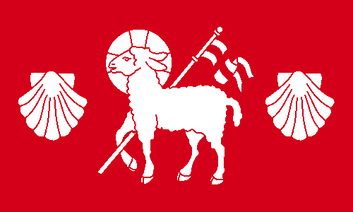
For my design, I first removed the busy chief and aligned the shells to the lamb:


The flag is made only of red and white cloth, notice the St. George's cross carried by the lamb. I could add a symbol related to Cabot, but since he's also named John, the lamb and the shells are also canting (punning). I could remove the shells, but it would make the flag too generic, in my opinion.

Comments are greatly welcome.
Do you have any suggestions of other boring flags that deserve to be fixed?

22 Jul 2015

Sioux Falls (SD, USA)

This week, I was reviewing some old, unpublished stuff, and I found this design for a flag for Sioux Falls, the largest city of South Dakota. Last year, there was an unofficial contest for choosing city's flag and I made, but didn't submit, a design.

The winner designer, designed by Max Rabkin, is below. You can find this and the other five finalist here.


The zig-zag like are for the waterfalls, that give the city its name. The pink area represents the buildings made of "Sioux quartzite", a local stone with that characteristic color. The sun represents South Dakota's nickname "Sunshine State".

My flag attempt has similar motifs, but it's way more abstract:


The superior vertical in blue and white represents the falls, while the inferior vertical in pink and white represents the Sioux quartzite.

I'm not sure that my design is best than the winner one, but I still think it would fly nicely in a pole.

Comments and suggestions are welcome.
A question: of the six finalists, which was your favorite, and why?

16 Jul 2015

Belfast (Northern Ireland, United Kingdom)

Today, I'll try to fix the flag of Belfast, the capital and largest city of Northern Ireland.

This is the current flag of Belfast:


That's not more than a banner of city's coat of arms:


The coat of arms is not the best heraldry, not it's not horrendous, either. The bell seems to be canting (i.e. punning) with city's name. The vair is taken from Chichester's family heraldry, being Arthur Chichester the founder of the town. The ship may refer to the importance of shipbuilding or the etymology of the city (from Gaelic, "mouth of the sandbar") and is decorated with St. Patrick's cross.

But, as a banner of arms, it's not effective, really too busy. My proposal is the following:


Let me explain it...The river refers to city etymology, and its importance as a portuary and shipbuilding city.Besides remarking Chichester's heraldry, the individual parts of a vair are known as "vair bells", thus keeping the pun. With some luck, they can barely remember a sail.

Comments and suggestions are welcome.
Sorry for being REALLY late... It seems like a (negative) record.

8 Jul 2015

Misiones Orientales (Brazil)

Misiones Orientales (from Spanish, "Eastern Missions") or Sete Povos das Missões (from Portuguese, "Seven People from Missions") refer to an area in current Brazilian state Rio Grande do Sul that changed hands many times between Portuguese and Spanish empires, often exchanged by Colónia del Sacramento. De facto, though, it was almost-independently ruled by the Society of Jesus until the religious order was expelled from Portuguese Empire, in the 1750s.

As the Portuguese name makes clear, it was constituted by seven different Jesuit "reductions", one of them, São Miguel Arcanjo (St. Michael Archangel), is a World Heritage Site joined by similar sites in Argentina. So I used the number seven in my flag:


This type of cross is, in Brazil, related to the Missões; it seems to be based in the Caravaca cross. The red colors represents the stone bricks used in the historical buildings and the blood shed in Guaraní War. This flag could be used in related museums, archeological sites, etc.

Now, just a side note... During the for-post research, I found a similar flag, but proposed not only by Brazilian reductions, but also neighbor reductions in Argentina, Paraguay and Bolivia, a supposed "Missionary Nation". In my reconstruction:


Comments are welcome.
This blog only has reached 50,000 views! Ooo-hoo!