24 Feb 2015

Jervis Bay Territory (Australia)

The Jervis Bay Territory is a small area that, in 1915, was surrendered by New South Wales to give Canberra an access to sea. Although Australian Capital Territory's laws apply to the Territory, it's not part of ACT.

My suggestion for a flag for Jervis Bay Territory is the following:


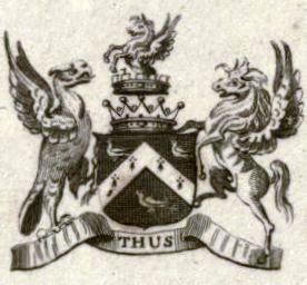
The basic pattern (Southern Cross in hoist third) is the same of a Australian territory. For the rest of the flag, I designed a round badge based in the coat of arms of John Jervis, from whom the territory is named; it also inspired the ship badge of HMAS Jervis Bay. The shells represent the Booderee National Park and the beautiful beaches, while the anchor represents HMAS Creswell.

I like the result, specially the colors arrangement.

Comments are welcome.
I'm planning to soon post my entry in Birmingham community flag contest. Know more here.

18 Feb 2015

USP cards

It's a blog about "flags, etc.". Today, a bit of et cetera!

The end of summer break (summer? Yes, I live in southern hemisphere) is imminent, it's time to remove the dust from the notebooks and all the stuff. Including my ID card.

I study at the University of São Paulo, a top university in Latin America. The ID cards, that haven't changed much during the years, look like this:

Image adapted from there.

Believe me, an actual card looks worse personally. The orange-white gradient looks specially bard.

My idea is making the card more minimalist and symmetric. Here's a model in actual size (the white area on top right is reserved to ID photo):


The shades of orange and blue are the official colors of the university, and appear prominently in its website. The logo is bigger and easier to read (thanks to gradients' removal). The colors are arranged more symmetrically; the next label, that identifies the link with university (in this example, "aluno" i.e. student), was moved to darker blue area. A student's card have then, besides an expiration date, their name ("João dos Santos Silva"), the college where he studies (in this case, "Faculdade de Filosofia, Letras e Ciências Humanas") and the intended degree ("Graduação" i.e. becoming a graduate).

I also made it an alternate color schema, that remarks USP's flag:


The reverse of the card contains magnetic stripe, barcode, the ID number and other sensitive data; it's not the matter of this post that was very funny to write!

Comments and suggestions are welcome.
I'm not the owner of the first image; I can remove it under request.

10 Feb 2015

Brazil [III]

Click to see parts I and II.

Once more, I'm inclined to fix the Brazilian national flag. In this case, my idea is more subtle and doesn't fix all issues I described in parts I and II, it's more like a hotfix.

This is the current Brazilian flag:


My idea, inspired by Paraná flag, is just substitute this confuse set of stars for the Southern Cross:


Apart from being a more effective way of showing a national symbol, it's a much simpler and remarkable design. A side effect is that the white ribbon is less horizontal, a bonus for those that see a reference to the armillary sphere.

It keeps the criticized "Ordem e Progresso" [Order and Progress] writing, considered both unaesthetic and partisan (being originally derived from a Positivist motto). One step further:


Comments are welcome.
Don't forget to check parts I and II of the series.

3 Feb 2015

Croatia

The current flag of Croatia is quite recent, dating from the independence from Yugoslavia. It mirrors a long tradition of Croatian symbols, but I have reservations about how they are combined.

The current flag of Croatia:


The background with pan-Slavic colors is no surprise. The coat of arms keep the traditional Croatian checks, but with a polemic red border. The crown is actually a combination of five historical coats of arms, respectively: ancient Croatia, Dubrovnik, Dalmatia, Istria and Slavonia; its un-traditional look acquired some passionate opposition.

A very old flag I did, using red and white checks but adding blue for a pan-Slavic flavor:


It looks good and balanced, but the checks are all out of proportion. Keeping the same background and twenty-five checks of current flag and coat of arms, I prepared the following design:


As far as I researched, some people still associate the checks starting on white with Nazi occupation, so I used the checks starting with red, like currently.

Taking the opportunity, I'll proposed new naval ensign and jack. The current naval ensign:


I like the way the anchors are placed and think just removing the weird crown and shield's red tiny border is enough for a better flag:


I like it, but maybe a slightly bigger shield (but same anchors) would improve the result.

The current jack is like the naval ensign, but with different background:


Jacks are commonly square, and not rarely a banner of arms, so I had the idea of just using the twenty-five checks:


I can just imagine how awesome it would look on the bow of a ship!

Comments and suggestions are welcome.
I tried to keep it the most neutral, and under a aesthetical and vexillological view.

27 Jan 2015

Brussels-Capital Region (Belgium)

I've recently knew that Brussels is changing its flag. The change, however, is subtle: the flag is still a yellow iris in blue, but the design of the flag is different.

The old regional flag, adopted in 1991:


The new design (there are, actually, five other official chromatic variants):


The rationale for the flag change is, actually, kind simple: the previous flag contained the old logo, the current contains the new. The current logo has a heart, representing the openness and hospitality of its people, and the fact that Brussels is in the heart of Belgium and Europe (hosting many European Union's bodies).

The yellow iris is a symbol of Senne's valley due to a legend telling that the Duke of Brabant once won a battle because he knew that yellow irises only grow in shallow waters. It's fair to keep them on a flag for Brussels-Capital region.

I'm not fine with the design of the iris changing every time a flag is changed, so I thought about fixing a "classic" iris on the flag. Here, a stylized iris i.e. a fleur-de-lis:


Or, alternatively, a more "natural" iris:


I don't really think that the white fimbriation is needed (it appears in the four flags above), but it increases the distinctiveness of the flags. I kept the blue background as it remembers the EU flag, linked to the region.

Comments and suggestions are welcome.
You can read more about Brussel's rebranding here.

20 Jan 2015

International Cooperative Alliance

The International Cooperative Alliance (ICA) is the oldest international cooperative federation. The idea about making a flag for it came from an article I was writing about the flag of Cusco (Peru): the former ICA flag was identical to the Peruvian city's, and are probably related.

That was the first flag of ICA (that was identical to Cusco's), officially adopted in 1925 (read its symbolism on my article):


In 2001, to avoid the confusion to the many rainbow flags that appeared since 1925, it was substituted for a logo flag, with doves appearing from a six-colored rainbow; the seventh color was moved to the letters, that formed ICA's acronym in one of its official languages. For instance, the Anglophone version:


Since then, the flag was replaced once again, for a more logo-like flag. Notice the image formed by the two letters O.


My proposal uses a different cooperative symbol: the twin pine trees. I put it on a green background.


The pine tree is an ancient symbol of life and endurance, while the circle represents eternity. The fact that there are two pine trees represent union and cooperation. Green is a color of life (because of chlorophyll), while the golden yellow represents the sun (specially because it's on a circle), the giver of the life and the light.

For the final design, I chose a variant of the logo where the pine trees are formed by the negative area of the yellow part, but whatever twin pine trees would work. I am happy with the flag, and I think it could embrace not only ICA but cooperativism as a whole.

Comments and suggestions are welcome.
Have you read my post about Cusco? No? You have another chance.

14 Jan 2015

Liverpool (United Kingdom) [II]

More than two years ago, I proposed a flag for Liverpool. After I found a campaign called "Flag for Liverpool", I decided to have a second look at it.

This is my original design:


The purple color is currently used by the city council. It's a neutral color since it's a mix of the colors of the two main football (soccer) teams: red for Liverpool FC and blue for Everton FC. The white stripe in the hoist represents the River Mersey, an import point of Liverpudlian landscape. The bird is a liver bird, a key symbol of the city, often represented as a cormorant.

My first new design was simply substituting the vertical stripe to wavy stripes, and using a neutral liver bird, since the previous was taken from Liverpool FC logo.


My second new proposal substituted the purple to red and blue, firstly in a arrangement that's also reminiscent of Union Jack.


A variant, with similarities to the city's coat of arms:


I don't know how much a flag with both red and blue can be neutral, but I think the last two designs are very charming.

Comments and suggestions are welcome.
Don't forget to check "Flag for Liverpool" page!