Showing posts with label REVIEW. Show all posts

8 Jan 2014

Curitiba (Paraná, Brazil) [REVIEW], Goiânia (Goiás, Brazil)

On this post, we'll comprise two capital cities with very similar flags: Curitiba, the city that recently was elected by Forbes the third "smartest city" of the world, and Goiânia, the second more arbored city in the world (only after Edmonton, Canada). Being two of most sustainable cities of Brazil, the use of green as main colors is justified.

The current flag of Goiânia:

The coat of arms of Goiânia is not bad, in spite of the terrible depiction and bad symbolism: green is hope; the fleur-de-lis stands for "sovereignty", the flames on bordure represent the right for a just government; the golden label is for the fact Goiânia was the second capital of Goiás state during the history (after Goiás city). Of good symbolism, the white wavy stripe represents the Botafogo brook, related to Goiânia foundation.

My proposal takes the symbolism of the center of the shield, but adapting colors and shapes to better fit the flag:

Being such a green city, the green of background an additional symbolism.

Curitiba flag, as I hastened, is very similar to Goiânia one:

My initial proposal (I never developed it completely) would be a rectangular version of coat of arms (i.e. a banner of arms), that contains a Brazilian pine, following the fact that Curitiba means, in Guarani language, "many pines" or "many pine nuts". Like this:

But, searching on internet, I found other interesting proposal by a Reddit user nicknamed "lapalu" (posted there). His proposal is the following:

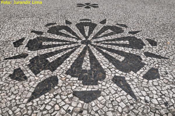
The design is very similar to current Curitiba flag, with a pattern on center that remember a pine cone cut in parallel (the author of the flag refers to it as "pine rose"), that can be found on city's architecture (see photo). I'd only change the shades, that I think are too dark, and make it a little less geometrical.

Your comments are welcome.
You can see original lapalu's rationale here.

17 Jul 2012

Proposed Brazilian States [REVIEW]

Now I'll return with the REVIEW section of this blog, that was a little absent. In this section, I make a review of a flag proposal by somebody else. Today I'll comment the main flags of Brazilian proposed states.


Tapajós: I'll start with the flag that, for me, is the most beautiful. It's used by Tapajós, a proposed states comprising the Pará west, considered "forgotten" by state authorities. This flag was very used in a campaign before a state secession referendum last year (2011), but people voted against the separation.

The explanation of the flag: the yellow stripe is for Amazon River richness, compared with gold, the blue is for Tapajós River, that names the proposed state, and green for the forest.


Carajás: The same referendum that voted Tapajós secession also voted Carajás secession, also failed. Carajás is a proposed states in southeast Pará, in an area comprising some of bigger open-air iron mines, but with small federal and state investment. The flag remember the sunshine, but I don't like it. I don't know what I dislike more: if the small circle or the fimbriation in black.


Gurgueia (old ortography = Gurguéia): It's a proposed state in south Piauí, one of poorest regions in country. The proposal is in voting process in Brazilian Parlament. I don't like too much the flag, because it's very polluted. Maybe without the writing and with a bigger central stripe and symbol it would look better.


Triângulo: It's used by a proposal of new state comprising Minas Gerais region of Triângulo Mineiro ("Minas Triangle", named because its shape), with a supposedly different identity: the region was part of São Paulo and Goiás in the past, and is economically very related with them. It was, probably, one of two most "viable" proposed states. I like the flag, specially the triangle, that names the state.

There's more or less twenty federal law projects related with proposed states, but many of them hasn't a known flag. I'll travel next week, and the time to the blog was low, but I tried to write a fast and interesting post.

I'd like your feedback on comments area. It's important to help the blog get better.
We passed the 1,000 views (I'm late, actually we passed the 1,100 views, too), VERY THANKS, but you can vote on commemorative post yet. It's fun and fast, I recommend you to click on link.

30 Mar 2012

São Paulo, Brazil (Review)

As I said in the main post of this serie, I don't mean to propose a new flag to São Paulo. My reasons were in that page, but I'm going to summarize them: São Paulo's flag isn't exactly the most beautiful flag in world, but it has a great symbolism.


But, I must admit, I'm thinking about change of idea... Someday, I was navigating the internet and found a blog proposing a change in São Paulo flag (the majority of this pages proposes a flag of São Paulo as independent state — what provides the wrong sense that it's a popular opinion). But a found one that's different, I suppose the author's name is Pedro Carvalho. The proposal is this:


According to him, the symbolism is that: the blue stripe is the Atlantic Ocean, the red is what Brazilians know as "purple soil" (very adequate to coffe growing, what helped São Paulo to became the richest state in Brazil), the golden star is wealth and development. In that blog you can find other two versions: one with a shape more similar to the state coats, and one with a white band that harmonizes the design and represents the coastline.

The second proposal, above all, is pretty good, but I still don't know if I should change São Paulo's flag.

And what's your opinion? Comment below.
That blog is with a poll to decide which of three designs is better. Participate!