I've recently saw a Polandball comics containing a Malvinasball, a character representing Argentine claim over Falkland Islands (the islands are commonly known as Malvinas in Spanish). In effect, the claimed region corresponds to Argentine department of Islas del Atlántico Sur (South Atlantic Islands). The character used a novel flag, that I reconstructed on the image below:
Well, it's not a great flag, for many reasons: too similar to Argentine flag, yellow on white isn't a contrasting color scheme, the map is too difficult to be reproduced.
This flag, if used elsewhere, is totally unofficial, as the Argentine department doesn't have a flag. The flag flown by British territory of Falkland Islands is the following (Argentine claim also include parts of South Georgia and South Sandwich Islands and British Antarctic Territory):
Some proposed flags to the department can be found here, but flags are too generic, plagiarist or badly designed.
My flag proposal is inspired by a coat of arms that gained a competition in 1966 to a new coat of arms for Argentine. The coat of arms below, as well as many others related to the islands, can be seen here.
My flag proposal is the following:
The blue-white color scheme is predominant in most Argentine provincial flags, and I decided to follow the pattern to this department. The Sun of May is a symbol of claimed sovereignty over the islands. The symbolism of the waves is very obvious. In a arrangement inspired by coat of arms above, four stars are put on cross, each one representing a island or an archipelago: top (special place) for Falkland, left for South Orkney, right for South Georgia and south for South Sandwich.
Your comments are welcome.
I'd like to remember it's a creative exercise and no way has intentions to show political statements.
29 Jan 2014
South Atlantic Islands (Argentina)
20 Jan 2014
Children of Lir flag (Republic of Ireland)
This post is my part on an interesting thread. The Vexillology Ireland (VIBE) [alternate website] on its Facebook page, make a challenge to design a flag for the president of Republic of Ireland having a reference to the tale of the Children of Lir (actually considered in early 1940s, the reason is in the Facebook post).
The challenge was actually proposed in August 2013, and, although I had read it at the time, wasn't inclined to make one design by myself. Reading a post by Samuel McKittrick, decided to make a design by myself.
A very summarized plot of the tale is the following (not sure if correct):
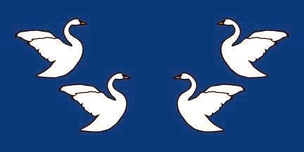
My unofficial contribution to this challenge is the following:
I really don't believe that this kind of design could have been considered in early 1940s, but I like it nonetheless. On center, there's the coat of arms of Republic of Ireland, a sign of president's headship of state. The four swans, as placed, remember heraldic supporters, on a curious effect.
Your comments are welcome.
Zachary Harden's designs can be found here, with Samuel McKittrick's proposals can be found here.
The challenge was actually proposed in August 2013, and, although I had read it at the time, wasn't inclined to make one design by myself. Reading a post by Samuel McKittrick, decided to make a design by myself.
A very summarized plot of the tale is the following (not sure if correct):
Bodb Derg was elected king of Tuatha Dé Danann, with the discordance of Lir (sea god). To pacify Lir, Bod's daughter Aoibh married with him, and the couple had four children. Following the death of Aoibh, that made the children very melancholy, Lir married another Bodb's daughter, Aoife. The jealous Aoife tried to kill the children, but could only manage to transform them in swans. Knowing it, Bodb transformed Aoife in an air demon.Below, you can see six designs: the three on top, by Zachary Harden, was found on original Facebook page, while the bottom three were took from Samuel McKittrick's post.
I really don't believe that this kind of design could have been considered in early 1940s, but I like it nonetheless. On center, there's the coat of arms of Republic of Ireland, a sign of president's headship of state. The four swans, as placed, remember heraldic supporters, on a curious effect.
Your comments are welcome.
Zachary Harden's designs can be found here, with Samuel McKittrick's proposals can be found here.
15 Jan 2014
Dahlak Archipelago (Eritrea)
This post came from a thread on Flags Forum about flags for some African regions (access the link to see this and other proposals). The Dahlak islands is an archipelago located in Red Sea that belongs to Eritrea.
My proposal on that thread was the following:
The main feature of the flag are the shells. The pearl fishing on the islands is famous since Roman times and was once among the most importants of the world. Today, its relevance isn't the same, but it still exists (including as a touristic attraction, together with scuba diving). Having a pearl a generic circular flag, shells were chosen for more direct identification. The flag have four shells, as four are the inhabited islands of the archipelago.
The white color can also represent the white beach and the limpid waters of Dahlak. The red color is chosen as a reference to the Red Sea, and to the Islamism (islanders were converted yet on 7th century).
An alternative proposal have white circles (representing pearls) instead of white shells, making it simpler but more generic.
Your comments are very welcome.
Remembering you can access the Flags Forum thread here.
8 Jan 2014
Curitiba (Paraná, Brazil) [REVIEW], Goiânia (Goiás, Brazil)
On this post, we'll comprise two capital cities with very similar flags: Curitiba, the city that recently was elected by Forbes the third "smartest city" of the world, and Goiânia, the second more arbored city in the world (only after Edmonton, Canada). Being two of most sustainable cities of Brazil, the use of green as main colors is justified.
The current flag of Goiânia:
The coat of arms of Goiânia is not bad, in spite of the terrible depiction and bad symbolism: green is hope; the fleur-de-lis stands for "sovereignty", the flames on bordure represent the right for a just government; the golden label is for the fact Goiânia was the second capital of Goiás state during the history (after Goiás city). Of good symbolism, the white wavy stripe represents the Botafogo brook, related to Goiânia foundation.
My proposal takes the symbolism of the center of the shield, but adapting colors and shapes to better fit the flag:
Being such a green city, the green of background an additional symbolism.
Curitiba flag, as I hastened, is very similar to Goiânia one:
My initial proposal (I never developed it completely) would be a rectangular version of coat of arms (i.e. a banner of arms), that contains a Brazilian pine, following the fact that Curitiba means, in Guarani language, "many pines" or "many pine nuts". Like this:
But, searching on internet, I found other interesting proposal by a Reddit user nicknamed "lapalu" (posted there). His proposal is the following:
The design is very similar to current Curitiba flag, with a pattern on center that remember a pine cone cut in parallel (the author of the flag refers to it as "pine rose"), that can be found on city's architecture (see photo). I'd only change the shades, that I think are too dark, and make it a little less geometrical.
Your comments are welcome.
You can see original lapalu's rationale here.
Subscribe to:
Posts (Atom)