29 Jun 2012

Australasia

In some past sportive competitions, i.e. 1905 to 1914 Davis Cup and 1908 Olympic Games, Australia and New Zealand competed as a unified team under the "Australasia" name. They used this flag:


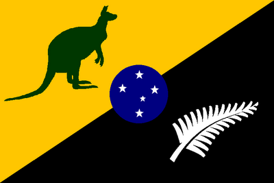
This flag resembles too much the flag of two countries. The crown is there because Australia and New Zealand was, at time, British colonies. It's a sportive flag, so I improved it to look appropriately, if someday it would be needed again. My idea was use symbols and colors yet associated with sports. The result was this:


The position of the symbols denotes the position of their countries at map. Green and gold are Australian sportive colors, took from golden wattle (Acacia pycnantha), its national floral emblem. Supporter flags with kangaroos aren't uncommon in Australian stadiums. The New Zealand is symbolized by the colors of "All Blacks" and a national symbol, the silver fern, very used in sportive kits. The Southern Cross at the center is a common symbol to the two countries, and was also used in "original" Australasian flag.

I also created a variant flag, with a kiwi replacing the fern, using a typical animal to each one:


What's your opinion about the flags? Feel freely to comment.

Sorry I didn't post nothing last week. I'll try to post twice this week for compensation.
I would be very glad if you follow this blog, and I'm always open to suggestions and feedback.

17 Jun 2012

New South Wales (Australia)

New South Wales has a typical Australian state flag: a British blue ensign with the state badge. The badge is also nothing special: a St. George's cross with a golden lion passant, and a Southern Cross in eight-pointed stars.


My first alteration was to drop the British blue ensign, turning the badge more visible. After that, I removed the lion at center of flag: isn't St. George's cross sufficient, or does it need more "englishness"? It looked this way:


It still looks very like St. George's cross, doesn't it? I changed the background to blue, to become more distinguishable and reference an old New South Welsh flag. So the final design looks like this:


It looks pretty good for me. Not than I dislike other proposals to NSW, but I think this one is more realistic about state necessities. And what's your opinion?

This post was planned to be published very earlier, but I was occupied with my Brazilian states series.
Every comment is welcome and fairly received. Give the yours.

10 Jun 2012

Northern Ireland (United Kingdom)

The United Kingdom is formed by four constituent countries: England, Scotland, Wales and Northern Ireland. But, before the division of Ireland island between Northern Ireland and independent Republic of Ireland, they were: England, Scotland, Wales and Ireland. Of the four, Northern Ireland is the only without a current official flag.

From 1953 to 1972, they used this flag:


The main problem to re-adopt this flag is that it's very monarchist — look at St. George's cross (symbol of England) and crown. It's hard to be accepted, because there are Northern Irishmen that provide loyalty to British crown, the one that want Northern Ireland to unite with Republic of Ireland and the one that want Ulster independent from the two.

At online Flags Forum (I like to visit it for meet new people interested in flags), I met Sam McKittrick, a Northern Ireland resident discontent with the fact him homeland hasn't a flag, and, with other willing guys, each one proposed ideas. My last proposed flag, based on other guys desires, was this:


The basic element of this flag is the St. Patrick's cross. I chose this one for three reasons (to know more about the Northern Irish flag question, click here):

  1. It's politically neutral, supposedly.
  2. It represents Northern Irish identity, isn't a generic flag.
  3. It's used for centuries. It's easier to somebody use something he knows and regards than something/someone force him to use it.

Originally, I was interested in use a "plan" St. Patrick's saltire, as it was intended to symbolize Northern Ireland in Queen's Diamond Jubilee last week. But Sammy suggested me to use the Red Hand, Northern Ireland more recognized symbol, in it; it's based in Ulster ancient flag. My next design contained a white shield with red hand, but the shield was after colored yellow, more similar with Ulster's flag. Now I want to show it to the bigger number of people, to know their opinion about it. And yours, too!

To express your opinion, you can choose (just now!) between comment or post your opinion on topic (the link is in text).
Thanks to Sammy, Armiger, TheNewTeddy and all other people that opined in that forum topic. Sorry if I forgot someone.

2 Jun 2012

Rio Grande do Norte (Brazil) [II]

To read the original post, click here.

Approximately two months ago, during my Brazilian States Series, I showed a proposal to Rio Grande do Norte. But, unsatisfied with my own result, suring the series epilogue, I said I was unsatisfied with Rio Grande do Norte and CearĂ¡ final proposals. See the current state flag, and my first proposal below:


Hum, it's specially very meaningful, but, for my taste, too colorful and unorthodox. My new proposal is this:


Blue and green have the same meaning than in original proposal, but yellow substitutes the white for representing sand more effectively. The new element is the rising sun. If you realize, RN isn't the most Western state in Brazil, but it symbolizes the state's geographical position, however. It also has the same symbolism than green and white colors in current flag: hope.

After completed, I noticed something: green, yellow, blue, white... the national colors!

What of three flag in this post is your favorite? Comment.
I'm accepting suggestions to my new CearĂ¡ flag. You can contribute with it.