A commenter called Bruno Rodolfo asked about designs for a new Paraíba state flag.
When I had a series for new Brazilian flags, I argued that Paraíba hasn't one of the best flag designs, but I'd keep it for its important link to history. However, this link to history is being strongly desconstructed last years.
This is current Paraíba flag:
It was adopted in 1930 to mourn the murder of João Pessoa, then-governor of Paraíba and running candidate for vice-president of Brazil. For similar reasons, the state capital was also renamed "João Pessoa".
Many argue against the flag currently, because: it represents only negative feelings; the murder had more passional than political reasons; his death was catalyst for a coup d'etat that gave birth to dictatorship.
Some of those favor new designs, but it seems that most of them favor the previous state flag:
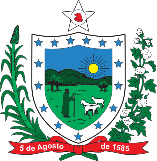
The design is certainly lighter. The shield is pointless, especially the text, but it seems to have inspired
state coat of arms. My first design was mere simplification of current flag, emphasizing Republican symbolism:
My next design used the colonial arms of Paraíba, often found in the heraldry of the state, on a fancy-shaped shield:
The second design is symmetrical, simple, apolitical and has all the colors of national flag. The coat of arms supposedly contains six sugar breads, representing the historical importance of sugarcane in state economy.
Bonus: a tongue-in-cheek design I once design, just to prove a point. Hint: the text in current flag reads "I DENY" in Portuguese, even though current ortography is identical to a N-word. It wasn't made for serious purposes, but still better than current design.
Comments and suggestions are welcome.
I'd link to thank Bruno Rodolfo for his precious suggestion.


