17 Dec 2014

La Graciosa (Canary Islands, Spain)

Among the Canary inhabitated islands, La Graciosa is the only without a flag. Trying to solve this, local inhabitant Jesús Manuel Páez started an online poll asking people's opinion about his design.

Here, you can my rendition of his design:


This flag is based in previous ideas, as can be read here. The two blue stripes represents the sky and the sea. The middle stripe forms the silhouette of La Graciosa and neighbor islets.

I'm not so sure about the design, as the silhouette is not very obvious, to say the least. José Manuel Erbez Rodríguez created the following proposal, a much more ellegant design on same theme:


Without pretensions of beating Erbez's design, I decided to make my own contribution:


Yellow for sand, blue for the light sea. The cauldron is punning to the Playa de la Cocina (cocina = kitchen, cuisine), one of most important beaches in Canary Islands, and commonly found in regional heraldry. The two stars represent the two settlements in the island: Caleta de Sebo and Casas de Pedro Barba.

As I couldn't find similar design, and some Canarian flags are really simple, this design could also be used:


Comments and suggestions are welcome.
I'll be traveling next weeks, so hiatuses can occur.

9 Dec 2014

Windsor (MA, USA)

Windsor, Massachusetts unveiled its flag last December, 7th. A complete report can be read here.

The chosen design, by a local artist called Susan Edwards, is the following:

It was requested that the design included "elements of the town's topography, natural resources and snow", according to the report. Many aspects of the work are clearly against vexillography principles: use of words, very complex shapes, etc.

Taking Susan Edwards' idea, but with a better layout, I obtained the following result:

My proposal is more stylized, with less colors and simpler shapes. Another positive point is that it discards any letters or numbers, that doesn't go well in the wind. Anyway, it still follows the guidelines given by the report.

Comments and suggestions are welcome.
It's always good to remember the principles under a good flag. You can read Ted Kaye's book online on NAVA's website.

4 Dec 2014

Caithness (Scotland, United Kingdom)

Caithness is near to become the first mainland Scottish historic county (Orkney and Shetland already did it) to adopt its own flag. Today's post is for raise the awareness about this possibility.

Although it's not so common a post about the theme, I have made, along the years, many flags for Scottish localities. My favorite proposal for Caithness, that Meiriongwril has "resurrected" in Flags Forum, is a simple banner of arms:


A sailing ship has been a symbol of Caithness since the times of Norse mormaers. The raven is took from the "raven banner" conjecturally flown in Viking ships.

For a most laboured flag, I looked for the coat of arms of the Earl of Caithness:


This kind of ship in first and fourth quarters is more similar to most of the presentations of Mormaership of Caithness' coat of arms. Using the same background, and putting the previous flag on first quarter, we obtain the following result:


Whatsoever, doing this post was funny.

Comments and suggestions are welcome.
You can read more the chances of Caithness gaining a flag here.

25 Nov 2014

Cambridgeshire (England, United Kingdom)

One of my designs was selected as finalist to the contest for a new Cambridgeshire flag! Today, I'll talk about its creation process and why I think it's an ideal flag for the county.

The contest's rules permitted me to submit two entries. My first, that wasn't selected, is the following:

The blue stripe represents the river Cam and, together with the red stripe placed like a bridge, is a pun on Cambridge name. The three Saxon crowns on red is took from the coat of arms of the Diocese of Ely, and the three crowns on blue are the coat of arms of East Anglia. The yellow background represents the county's fenlands, and keep the recommendation of using a maximum of three colors.

My second design, that I made in a fast but determined way, is a derivative of the first, but with a better realization. That was selected as a finalist:

The symbolism of the former was kept, but with many improvements: the crowns are now three, in a more direct counting; the river gained some life, with the waves, and was colored in a shade near "Cambridge blue", the color of the traditional University of Cambridge. It represents county's landscape, history and prides in a very ellegant way.

Comments are welcome.
You can vote in your favorite design in the end of this page.

17 Nov 2014

Hong Kong

An anonymous commenter recently asked about my view on a hypothetic flag for an independent Hong Kong.

Firstly, let's face the flag issue... This is the current flag of Hong Kong:

In my opinion, it's a very good flag. But the red background and the five stars are clearly taken from People's Republic of China national flag. Before 1997, when Hong Kong was still a British colony, it used the following flag:

A number of photographs show a flag used by pro-autonomy or pro-independence protesters consisting of the British-age coat of arms, in blue background, with "Hong Kong" witten in Chinese ("香港"):


A former proposed flag of same movement is the following:


The fact that some groups are now avoiding directly British symbolism (the Union Jack) is a point I took to design my proposal below, admittedly inspired by Qing flag:


The blue background represents the British past and the port of Hong Kong. The dragon (and the red details) shows the Chinese culture of the region, and its golden color stands for the financial importance of Hong Kong for the world; notice it appears in the last three flags I showed. The white disk, apart from the rising sun, represents the nickname of "pearl of the Orient" given by the British and present in the coat of arms they attributed to there.

It's, obviously, only one of many paradigms one could take to create such flag.

Comments are welcome.
Notice I tried to be the most politically-neutral I could.

12 Nov 2014

Montevideo (Montevideo, Uruguay)

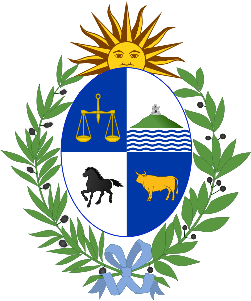
I've been reading the list of sister cities of my hometown, São Paulo, Brazil, and I noticed some of them don't have official flags. One of them is Montevideo, the capital of Uruguay and one of the best cities in Lati America to live.

The city, however, has a coat of arms, that appears in the second quarter of the Uruguay's. A previous version contained olive crowns, British colours in the floor, etc. in reference to the decisive participation of the city in the siege of Buenos Aires. The current version, simpler, is the following:


The shield contains a view of the Montevideo hill (cerro) with the respective fortress, now named General Artigas, with a view of the River Plate (Río de la Plata). The shield also reads "Con libertad, ni offendo ni temo", a famous quote by general Artigas that means "With freedom, I neither offend nor fear".

My interpretation of the coat of arms into a flag is the following:


My personal touch was making the river white, a refence to the Río de la Plata, whose name means, literally, "silver's river". The shade of blue is the same of Uruguayan flag.

Comments are welcome.
Sorry for the delay posting this flag. I was busy this week.

4 Nov 2014

Bangladesh

Today, I'll give my proposal to a possible new flag to Bangladesh. It's a very simple and meaningful flag, but I think the colors lack contrast, as you can see in the image below:

The red disk represents the sun and the blood shed for the independence. The green background represents the lush nature of the country. The golden yellow was present in the former flag of the country, so I decided that it could be a good color to divide the red and the green.

I also added some elements from the country's "emblem": the water lily, the national flower, and the wavy stripes, representing the many rivers of the country, that are also much important to Bangladesh's economy.

Comments are welcome.
Suggestions for new posts, etc. will be gladly received.