25 Nov 2014

Cambridgeshire (England, United Kingdom)

One of my designs was selected as finalist to the contest for a new Cambridgeshire flag! Today, I'll talk about its creation process and why I think it's an ideal flag for the county.

The contest's rules permitted me to submit two entries. My first, that wasn't selected, is the following:

The blue stripe represents the river Cam and, together with the red stripe placed like a bridge, is a pun on Cambridge name. The three Saxon crowns on red is took from the coat of arms of the Diocese of Ely, and the three crowns on blue are the coat of arms of East Anglia. The yellow background represents the county's fenlands, and keep the recommendation of using a maximum of three colors.

My second design, that I made in a fast but determined way, is a derivative of the first, but with a better realization. That was selected as a finalist:

The symbolism of the former was kept, but with many improvements: the crowns are now three, in a more direct counting; the river gained some life, with the waves, and was colored in a shade near "Cambridge blue", the color of the traditional University of Cambridge. It represents county's landscape, history and prides in a very ellegant way.

Comments are welcome.
You can vote in your favorite design in the end of this page.

17 Nov 2014

Hong Kong

An anonymous commenter recently asked about my view on a hypothetic flag for an independent Hong Kong.

Firstly, let's face the flag issue... This is the current flag of Hong Kong:

In my opinion, it's a very good flag. But the red background and the five stars are clearly taken from People's Republic of China national flag. Before 1997, when Hong Kong was still a British colony, it used the following flag:

A number of photographs show a flag used by pro-autonomy or pro-independence protesters consisting of the British-age coat of arms, in blue background, with "Hong Kong" witten in Chinese ("香港"):


A former proposed flag of same movement is the following:


The fact that some groups are now avoiding directly British symbolism (the Union Jack) is a point I took to design my proposal below, admittedly inspired by Qing flag:


The blue background represents the British past and the port of Hong Kong. The dragon (and the red details) shows the Chinese culture of the region, and its golden color stands for the financial importance of Hong Kong for the world; notice it appears in the last three flags I showed. The white disk, apart from the rising sun, represents the nickname of "pearl of the Orient" given by the British and present in the coat of arms they attributed to there.

It's, obviously, only one of many paradigms one could take to create such flag.

Comments are welcome.
Notice I tried to be the most politically-neutral I could.

12 Nov 2014

Montevideo (Montevideo, Uruguay)

I've been reading the list of sister cities of my hometown, São Paulo, Brazil, and I noticed some of them don't have official flags. One of them is Montevideo, the capital of Uruguay and one of the best cities in Lati America to live.

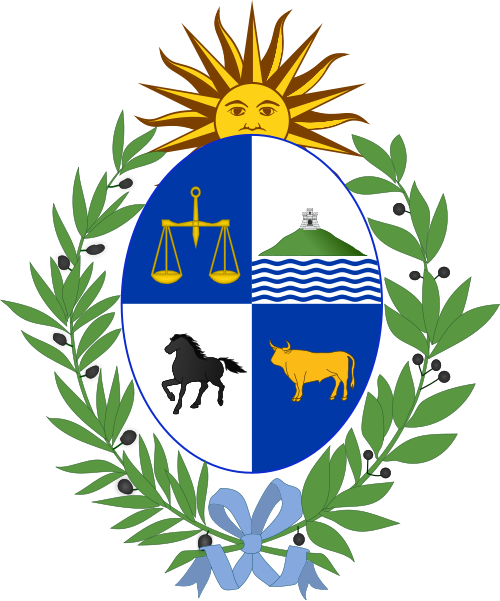
The city, however, has a coat of arms, that appears in the second quarter of the Uruguay's. A previous version contained olive crowns, British colours in the floor, etc. in reference to the decisive participation of the city in the siege of Buenos Aires. The current version, simpler, is the following:


The shield contains a view of the Montevideo hill (cerro) with the respective fortress, now named General Artigas, with a view of the River Plate (Río de la Plata). The shield also reads "Con libertad, ni offendo ni temo", a famous quote by general Artigas that means "With freedom, I neither offend nor fear".

My interpretation of the coat of arms into a flag is the following:


My personal touch was making the river white, a refence to the Río de la Plata, whose name means, literally, "silver's river". The shade of blue is the same of Uruguayan flag.

Comments are welcome.
Sorry for the delay posting this flag. I was busy this week.

4 Nov 2014

Bangladesh

Today, I'll give my proposal to a possible new flag to Bangladesh. It's a very simple and meaningful flag, but I think the colors lack contrast, as you can see in the image below:

The red disk represents the sun and the blood shed for the independence. The green background represents the lush nature of the country. The golden yellow was present in the former flag of the country, so I decided that it could be a good color to divide the red and the green.

I also added some elements from the country's "emblem": the water lily, the national flower, and the wavy stripes, representing the many rivers of the country, that are also much important to Bangladesh's economy.

Comments are welcome.
Suggestions for new posts, etc. will be gladly received.

28 Oct 2014

Portugal: regions

According to 1976 Portuguese Constitution, the country should be divided in administrative regions. It never happened in continental Portugal until then, but Azores and Madeira, in Atlantic Ocean, have their own autonomous regions.

Those regions don't have flags, so I'll give some proposals. The number of proposed regions in continental Portugal is variable, but I'll consider the seven below for this post:

  1. Entre Douro e Minho
  2. Trás-os-Montes e Alto Douro
  3. Beira Litoral
  4. Beira Interior
  5. Estremadura e Ribatejo
  6. Alentejo
  7. Algarve

Seven is more flags than the average by post, so I like some of the flags below more or less.

The first flag I created was to Beira Interior. It's based in the flag flown by the Lusitanian leader Viriatus, that resisted to Roman conquest until his death, in 149 B.C. It's claimed that the flag consisted of a white cloth with a green two-legged dragon. Later, the green dragon became a Portuguese royal symbol.


Other region with a easy flag is Algarve. For long, the title of king of Algarve was subsidiary to that of king of Portugal. Some medieval heralds have attributed arms to the titular kingdom, consisting on a quartered shield with the heads of Saracen and European kings. the other of the heads and the field colors varying.

Firstly, a design with a more contemporary representation, and the armillary sphere from the current flag of Portugal:


Other variation I considered was a banner of arms, with a more Medieval depiction:


The flag of Entre Douro e Minho ("between Douro and Minho rivers") is punning: Douro sounds like "d'ouro" ("of gold"), and a possible etymology of Minho is "red" or "vermillion". The position of the stripes represents, more or less, the disposition of those rivers.


Following, Trás-os-Montes e Alto Douro ("behind the mountains and higher Douro"). I used the same symbolism for Douro, and the green mountains represents the name of Trás-os-Montes and some of its geographical features. I later noticed that the green mountains forms a "M" of Montes ("Mountains"). A curious note is that I have some ancestors from this region of Portugal.


For Alentejo ("beyond the Tejo river"), I designed a flag featuring the yellow of its large camps and the blue of its sky. The darker blue stripe represents the Guadiana river, that divides Portugal and Spain, and where the biggest dam of Western Europe is located.


For Estremadura e Ribatejo ("bounds of Douro and above the Tejo"), a white stripe representing the estuary of Tejo river, with black and white representing Lisbon and purple and white representing Setúbal.


For last, the hardest flag to be design, to Beira Litoral. You can see it below:


The blue cross on white represents the medieval County of Portugal, that would later gives origin to the kingdom of same name. Black and white are the colors of the traditional costumes of the University of Coimbra, one of the them oldest surviving European universities.

Comments are welcome.
The chosen map does not necessarily means I endorse it.

21 Oct 2014

United States of America [President]

The president of the United States of America only gained an all-purposes personal flag in 1902; previously, Army and Navy had their own representation of president's flag for a few decades.

The current design is from 1945, with slight changes after Alaska and Hawaii joined the Union:

However, the first proposal for a president's flag dates from 1817! Its author is Samuel Chester Reid, that also helped creating the rule that a star should be added to each new state while the stripes are fixed in 13. In a reproduction by George Preble:

Or, in a poor reconstruction of how it could look today, by me:

That flag was divided in four quarters, maybe inspired by British royal standard: on the first, a blue background with as many white stars as the number of states; on the second, the coat of arms in white field; the third, white, with a representation of Lady Liberty; on fourth, thirteen red and white stripes.

I decided to take inspiration on Reid's proposal to create a less boring presidential flag:

I decided to remove Lady Liberty, because she gets many different depictions e.g. the Statue of Liberty, in New York, and don't fit the rectangle well. The background of the design ins inspired by the current flag, with two quarters with the stars and two with the stripes. In the center of the flag, the coat of arms, like in current one.

I like it. I'm not sure about some hidden stars, though.

Comments are welcome.
Be gentle on comments, please.

15 Oct 2014

Caribbean Netherlands / BES islands (Netherlands)

The Caribbean Netherlands, also known as BES islands - because of the name of constituent Bonaire, Sint Eustatius and Saba - emerged from the dissolution of Netherlands Antilles in 2011, together with now autonomous Curaçao and Sint Maarten.

Since then, the Netherlands Antilles lost its status as recognized Olympic committtee, the athletes competing in 2011 Pan-American Games and 2012 Olympic Games under PASO and IOC flags, respectively. It's not improbable that Curaçao ans Sin Maarten will gain any time their own separate Olympic committees, but SEB islands may not have same lucky and, currently, they can only compete under Aruba or Netherlands flags.

My first proposal was one of the first flags that I designed seriously, probably before the existance of this blog, so you can see some faults. Here's it, unedited:


This flag was inspired by the logo of the National Office for the Caribbean Netherlands (below), with Olympic rings and colors associated with Dutch sports:


I recently re-thought about the theme. My solution, much simpler than the previous, is the following:


It's a very simple idea: the Dutch flag, with wavy stripes (representing the insular aspect of the region), and the Olympic rings. Bonaire, Saba and Sint Eustatius all have red, white and blue in their flags.

For non-sportive contexts, you can see this:


It's very simple, but, in some visibility conditions, can be too similar to Dutch national flag.

Comments are welcome.
RCN logo used under fair use.