31 Dec 2013

Dunedin (New Zealand)

The city of Dunedin is the capital of the New Zealandic province of Otago, and second most populated city of South Island.

Its flag, whose use is restrict to city council and other authorized bodies, is the banner of arms, similar to this:


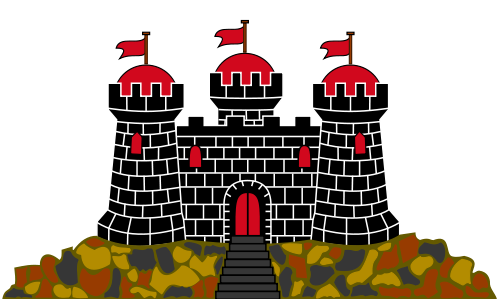
The green zigzag line refers to Otago's mountains and valleys, and its three tops refer to the Mounts Flagstaff (yes, a vexillologic mountain!), Swampy and Cargill. The ram (wool and mutton) and the sheaves (cereals) represents some important economic activities of the region. The castle is inspired in the famous Edinburgh Castle, present on the flag of the Scottish city of Edinburgh, as "Dunedin" name was took from Gaelic name of Edinburgh, Dùn Èideann, and even some Dunedin streets, etc. are named after Edinburgh counterparts. The ship represents the first Scottish immigrant ships, being the foundation of the town related to Free Church of Scotland.

My proposal, using a geometrical approach, is the following:


On bottom, the same zigzag lines of coat of arms, representing the mountains, valleys and the bay (where there's a port), while the blue and white is supposed to form, together with bottom part, an allusion to the Scottish saltire, a reference to Edinburgh and the Scottish founders of the city.

I like the result, aesthetically, but I fear that, maybe, it's a too radical departure from original flag. Anyway, differently of council flag, this flag could be freely flown.

Comments are welcome. Feel free to comment.
I'd like to wish an excellent 2014 to all, and give thanks to all the support during 2013.

24 Dec 2013

Couto Misto (Portugal, Spain)

The Couto Misto (Coto Mixto in Spanish, Couto Mixto in Galician, Couto Misto in Portuguese) was a curious entity in Iberian history. It consisted of a stripe of lands that wasn't owned neither by Spain nor by Portugal, but, actually, a de facto independent republic, whose citizens had many privileges. It lasted until 1864.

There are many proposals to revive the Couto Misto as a Euroregion, a free zone or similar. It consisted of three villages (Santiago de Rubiás, Rubiás and Meaus), that was annexed to Spanish province of Galicia, while the "promiscuous people" and a stripe of uninhabited land was annexed by Portugal.

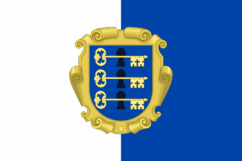
The ancient flag of Couto Misto is considered a square flag divided vertically in white and blue, colors of Galicia and Portugal. However, I found a text on a report by Ricardo J. Rodrigues that contains the following text:
A única novidade é que a mulher de Cesário anda a costurar uma nova bandeira do Couto Misto, que a actual está mais podre do que uma árvore morta. O desenho é o mesmo de sempre: três estrelas dispostas em triângulo e no centro um brasão com três fechaduras.
Translating in English:
The only news is Cesário's wife sewing a new Couto Misto flag, because the current one is more rotten than a dead tree. The design is the same of always: three stars disposed in triangle and a coat of arms with three locks in the center.
Unfortunately, there are missing informations (like colors) that impedes me of reconstructing the flag with exactitude. But the informations are enough to create my own flag proposal:


The locks are an essential symbol of Couto Misto, that relates to its politics: the laws were decided by citizens, then put on a trunk with three locks, that could only be open if the three judges (one nominated by each village, the heads of state of the Couto Misto) agreed, as each one had his own key; honorary judges are annually elected until now. The background of the flag is based on the ancient flag of the country, with a coat of arms with three locks and three keys inserted on a Baroque-style heraldic console (as used by other microstates, like Andorra and San Marino).

This flag could cause awareness of the history and status of Couto Misto, and could be used alternatively to the ancient flag and the flag described on the fragment above.

Your comments are welcome.
I'd like to desire a Merry Christmas and an excellent 2014 to all readers of the blog.

16 Dec 2013

Yi people (China)

Following a request by Michal Hospodár, follower of this blog and a "netfriend", I made a first attempt to a flag representing the Yi (or Lolo) people that inhabits China, Vietnam and Thailand. I have to admit that it took some weeks before a decent idea came to me.

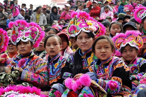
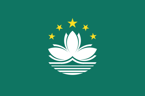
The Yi people suffers from an absence of own vexillology, so I had to start from zero. The inspiration that I cited are some ethnic Yi female folkloric costumes, with examples here, here and here. They all are black, with pink flowers. As I can't identify the specie of flower, I used lotus, common in Chinese vexillology (Macau, for example) and is a good shot. Here is the flag:

Although black and pink, in theory, isn't a good color combination to flags, well-chose shades can make a nice result. An alternative depiction is as follow:

Your comments are welcome.
This flag is made, in part, for scholar purposes, as ethnic flags on China are still officially banished, as far as I know.

10 Dec 2013

Porto Alegre (Rio Grande do Sul, Brazil)

Porto Alegre is the most southern capital of Brazil, and one of largest and most important cities in the country.

His flag is constituted by its coat of arms on a white cloth:


The coat of arms of Porto Alegre has a red cross on gold, representing the Portuguese settlers, as well as the Catholicism that's the main religion on the city. On blue, a golden depiction of the former gate of the city, that was always open in sign of hospitality. In green, a ship that represents the first sixty families that came to the cities, from the Portuguese archipelago of Azores. A golden mural crown with five towers represents the status of capital in Brazilian and Portuguese heraldry, and the scroll reads "Leal e Valerosa (sic) Cidade de Porto Alegre" (in English, "the most loyal and worthy city of Porto Alegre"), title gained during the Empire for keeping loyal during secessionist attempts in the state of Rio Grande do Sul.

Firstly, being Rio Grande do Sul flag a reconstruction of the Rio-Grandense Republic flag, as stated on a previous post, I think references to that flag, although very acceptable, would contradict the historic title of Porto Alegre. The basic inspiration for my flag proposal are the stripes of coat of arms. Look:


The plain yellow-blue-green stripes are a beautiful and rarely used design (at least I can't remember similar design), but, to make sure the flag is unique, I added the cross of the coat of arms. I kept it blue and white, in reference to the flag of Azores, a reference to the foundation and early years of the city.

Your comments are welcome.
There are only six remaining cities on the capital series. Wait the next chapters!

3 Dec 2013

Iberian Union

Last week, Samuel McKittrick released, on his blog, an excellent post about an Iberian peninsular flag. Although it's unclear if European Union is good or bad for a future federation or confederation between Portugal and Spain, being Latin American, I'm personally favorable to stronger ties between the two countries, specially in cultural aspects.

Below, you'll find the currently most popular Iberist flag, followed by two designs by Sammy:
Proposal by Sinibald di Mas i Sans (1854), with the colors of Portugal coat of arms (blue and white, also used in then flag) and the colors of Spanish flag (red and yellow).

Proposal #1 by Samuel McKittrick, with the union of both Spanish and Portuguese flags, and coat of arms of Spain with Portugal in highlight position.

Proposal #2 by Samuel McKittrick, with the union of both Spanish and Portuguese flags, and two stars for the two countries.

I like the designs, but I decided it would be fun to go on a different approach. Here's what I came:

This design is inspired by Union Jack and other similar designs. The blue cross on white was the first coat of arms of Portugal, and survives on current coat of arms of that country. The knotted (said raguly in heraldic language) red saltire on white is the famous "cross of Burgundy", used as merchant ensign (specially in former Spanish America), among other uses, and still present on the personal coat of arms of Spanish monarchs. I also made versions with the cross of Order of Christ in red and blue.

As a bonus, a what-if. Portugal and Spain had a joint candidate to host the 2018 football World Cup. If they won, I think this design, inspired by candidature logo, could be used to promote the tournament:

Your comments are welcome.
Don't forget to visit Sammy's post here.

26 Nov 2013

DROPS: The roundel of Brazil

I'm very busy this week, so I decided to make drops about the aircraft roundel of Brazil, or more specifically about the question "What if Brazil had only one roundel?".

Why the question? Look:


There isn't something like a single unified roundel on Brazil. The original roundel of Brazil, inspired by national cockade, is used on navy's aviation. The air force itself use one design inspired on Brazilian coat of arms. The army's aviation use the insignia of the Army on the wings of its airplanes. A fouth roundel was also used on Brazilian history: the Brazilian Expeditionary Force, that represented the country of World War II, used a design inspired in USA roundel, to help the identification between the Allies, and this design could be reused on a future war.

My proposal is a mix of the first roundel (current Navy's roundel) with the current one. Summarizing, I put the current roundel on a green disc (I like round "roundels") and changed the color of outer disc of current insignia from white to yellow, what incidentally also remember Army's roundel. This design, therefore, can be used by the three armed forces and is still distinguishable on low visibility, what's fundamental to all aircraft insignia. Here you can see it:


Your comments are welcome.
The colors of the roundel will be theme to next drops. Wait it!

21 Nov 2013

Gloucester (England, UK)

I recently knew about a unofficial campaign to the adoption of a flag to the city of Gloucester. I've sent my proposal to newspaper, hope they'll publish it.

Gloucester don't have a flag. The city council reportedly fly, even if rarely, a white cloth (of 1:2 ratio) with city's coat of arms on center. Even if this flag has official status (I suppose the opposite), its use should be restricted to the council. The newspaper, on other hand, proposes a flag to be flown by the citizens, observing the recent relaxation for the rules about flags on England. The reported flag is something like this:


Based on the coat of arms, my proposal is the following:


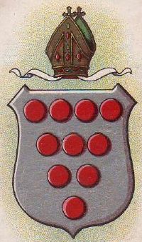
After research, it seems that city's coat of arms is inspired by the arms of De Clare family (that were the original earls of Gloucester), with torteaux (heraldic term for red roundels) believed to come from the arms of the see of Worcester (although a separated diocese of Gloucester exists since 16th century).

My design arranges the three chevronels of De Clare in more traditional way, putting the red torteaux on remaining space (many arms also inspired by diocese of Worcester's also use less torteaux). It's still recognizable, but it's much more adequate to flying on a flag, as it's easier to be hand-made and can better be distinguished on high wind (the council's reported flag could be confused with any other white flag with a coat of arms on it). My design is not copyrighted, and fits the recommendations of British Flag Institute.

Your comments are welcome.
Sorry for the slight delay for posting this week.