26 Nov 2013

DROPS: The roundel of Brazil

I'm very busy this week, so I decided to make drops about the aircraft roundel of Brazil, or more specifically about the question "What if Brazil had only one roundel?".

Why the question? Look:


There isn't something like a single unified roundel on Brazil. The original roundel of Brazil, inspired by national cockade, is used on navy's aviation. The air force itself use one design inspired on Brazilian coat of arms. The army's aviation use the insignia of the Army on the wings of its airplanes. A fouth roundel was also used on Brazilian history: the Brazilian Expeditionary Force, that represented the country of World War II, used a design inspired in USA roundel, to help the identification between the Allies, and this design could be reused on a future war.

My proposal is a mix of the first roundel (current Navy's roundel) with the current one. Summarizing, I put the current roundel on a green disc (I like round "roundels") and changed the color of outer disc of current insignia from white to yellow, what incidentally also remember Army's roundel. This design, therefore, can be used by the three armed forces and is still distinguishable on low visibility, what's fundamental to all aircraft insignia. Here you can see it:


Your comments are welcome.
The colors of the roundel will be theme to next drops. Wait it!

21 Nov 2013

Gloucester (England, UK)

I recently knew about a unofficial campaign to the adoption of a flag to the city of Gloucester. I've sent my proposal to newspaper, hope they'll publish it.

Gloucester don't have a flag. The city council reportedly fly, even if rarely, a white cloth (of 1:2 ratio) with city's coat of arms on center. Even if this flag has official status (I suppose the opposite), its use should be restricted to the council. The newspaper, on other hand, proposes a flag to be flown by the citizens, observing the recent relaxation for the rules about flags on England. The reported flag is something like this:


Based on the coat of arms, my proposal is the following:


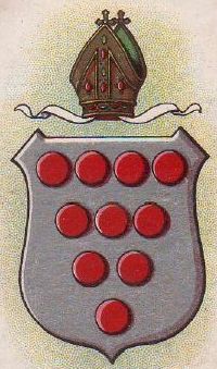
After research, it seems that city's coat of arms is inspired by the arms of De Clare family (that were the original earls of Gloucester), with torteaux (heraldic term for red roundels) believed to come from the arms of the see of Worcester (although a separated diocese of Gloucester exists since 16th century).

My design arranges the three chevronels of De Clare in more traditional way, putting the red torteaux on remaining space (many arms also inspired by diocese of Worcester's also use less torteaux). It's still recognizable, but it's much more adequate to flying on a flag, as it's easier to be hand-made and can better be distinguished on high wind (the council's reported flag could be confused with any other white flag with a coat of arms on it). My design is not copyrighted, and fits the recommendations of British Flag Institute.

Your comments are welcome.
Sorry for the slight delay for posting this week.

11 Nov 2013

Pan-celticism

A thread on Flags Forum gave me the idea to resurrect an old sketch I made to represent the Celtic League but de facto all the pan-Celtic movement i.e. the supporter to bigger contact between the "Celtic nations".

There isn't an official pan-Celtic, but two flags are most commonly used. This is the most popular:

This flag is made with the amalgamation of flags of seven Celtic nations, from top left, in clockwise direction: Galicia, Ireland (in this case, not only the Republic of Ireland, but in a pan-Irish context), Scotland, Cornwall, Isle of Man, Wales and Brittany. Other common variant have only the six original celtic nations, removing Galicia. In the center, a triskelion, a motif common in celtic art.

The other one is a proposal by Robert Berthelier in the 1950s:

This flag have green and golden yellow colors, commonly associated with the Celts, and two conjoined triskelions (in the style of a celtic knot), representing three Gaelic peoples - Scot, Irish and Manx - and three Brittonic peoples - Welsh, Cornish and Breton.

The sketch that I had (as said in first paragraph) is heavily influenced by Andrew Boada's amazing "Irish Celtic Cross". Here is it:

This flag has the same colors of the Berthelier's proposal, with the addition of white. It represents a Celtic cross, but touching the borders instead of square as the latter is used by Neo-Nazis. I like how this flag is simple and vivid. But, to avoid any misconception, I made the reference to celtic flag much more subtle on my next proposal:

It's very much like the anterior flag, with the exception that a white triskelion was added on the center of the flag.

As you can see, the designs don't have any very original approach, but I think them may work well.

Your comments are always welcome.
I've been making the last posts trying to fix the issue of multiple blank lines, specially on cell phones. Comment if it still appear on your browser.

5 Nov 2013

My neighborhood...

Neighborhoods are a common wondering by flag designers [see examples]. The mine haven't a flag, although others in my city do. I had an almost clear idea about what it should be, but it's the first time I "formally" design a flag to it.

I live in a neighborhood (I'll translate "bairro" as this, although "borough" also sounds adequate) called "Cidade Patriarca" (translating, "Patriarch's City"), a proletarian neighborhood in the suburbs of São Paulo, yet too young: it was officially founded only in 1948, when a train station was inaugurated.

Firstly, I'd like the arms to be partly canting, making a tribute to the José Bonifácio, the "patriarch of independence", in effect to his importance in this event. So the flag is green and yellow (more details below). In fact, the anniversary of the neighborhood, September 7th, is also the date of Brazilian independence, and the public schools of the bairro are named after José Bonifácio and the viscount of Cairu (other important politician of the independence time).

It also should have an tree, as one of its key characteristics was being planned (what's an exception), and the large green areas and wide streets are still visible in the landscape. Other feature should be the red color, a reference to the red clay that existed before the region was totally paved: it's very remembered by the oldest inhabitants of the region, specially about how the shoes and pants hems were ruined by red mud after the rains!

My first attempt was the following:


I like how much the design is similar to Brazilian flag, but it's very generic, don't you think? I decided to keep the reference to José Bonifácio clearer. Although he and his relatives denied nobility titles and coats of arms more than once, there's city of Santos coat of arms, white a green and golden bend in reference to José Bonifácio. Based on Santos coat of arms:


My final design, that I like only a bit more than anterior, has a green tree:


Curiously, I once heard that there was a local football team called "Patriarca FC" (or something like this) whose colors were red (actually, maroon), white and green. Although all designs are good, I think the third is the most appropriate. All of them are based on principles of Portuguese vexillology, followed in many parts of Brazil, but simplified to a more striking effect.

Comments are welcome.
What about design a flag for your local community? If you do it, post a link on the comments.

29 Oct 2013

Philadelphia (PA, USA)

It's the 100th post of this blog! I was thinking in doing a commemorative post, but I read an article about the necessity of a new flag for Philadelphia, so I decided to give a try.

Here's the current flag of Philadelphia, that they're trying to substitute:


The problem of Philadelphia coat of arms is its complexity and being, in some opinions, "dated". I really like flags with ships, but I tried to avoid the comparison with Boston, specially because of color scheme.

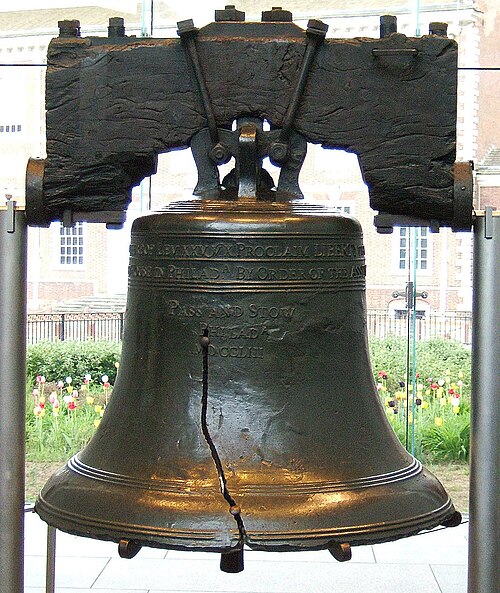
After thinking about the substitute for the coat of arms, I decided for the Liberty Bell, supposed to being rung during the reading of US Declaration of Independence. It's also connected to the fact that the city was an early capital of the USA and one of its most notorious citizens: Benjamin Franklin! It's even used by the city's baseball team, the Philadelphia Phillies.

My first thought was the vertical stripes, inspired by the coat of arms:

The bell is too small, so I decided to change the layout. I decided for the horizontal stripes of current flag, that's enough consolidated for being reportedly used without the coat of arms. Here's the result:


I like this flag, for its simplicity and for keeping the base of current flag.

For a similar attempt, look at the link. I appreciate the idea of the stylized keystone on the top of the bell.

Your comments are very welcome.
In occasion of the 100th post, I'd like to thank the readers, subscribers and commenters of this blog. Thank you very much.

21 Oct 2013

US Virgin Islands (USA)

Last week, Samuel McKittick posted on his blog two proposasl to a new flag for the US Virgin Islands.

The current flag of US Virgin Islands:


After presenting arguments to flag change, Sammy presented the following proposals:
Proposal #1 (by Samuel McKittrick)Proposal #2 (by Samuel McKittrick)

The premise of the proposals by Sammy is very well-thought: before being an American territory, the US Virgin Islands were part of the Danish West Indies. His first design is the Danish flag, with three blue stars on a navy blue background (reference to USA flag) representing the three main islands. His second proposal uses light blue (more similar to the flag of Danish West Indies) and yellow, representing the bananaquit, the national bird of the islands.

The good designs of Sammy gave me an idea to a third design that could be considered. This is it:


Firstly, I changed the star arrangement, to be more similar to the map of the islands and heraldically more traditional. The idea behind this design is to make the Danish flag emulated red and white stripes i.e. the flag of United States, representing the former and the current owners of the islands once.

To a more colorful, we can think on adding bananaquit's yellow:


This design has a much more subtle reference to American flag, what can be a potential fault, but adds local significance and the Caribbean flags' colorfulness.

Your comments are welcome.
Samuel McKittrick's post is very complete and explains more detailed the rationale of his designs. Click here to read it.

15 Oct 2013

Florianópolis (Santa Catarina, Brazil)

Continuing the series where I re-design most of Brazil capital cities flags, we reach Florianópolis today. The city, capital of Santa Catarina, have the third best HDI (Human Development Index) of Brazil, and the best among the capitals. The city is also a popular touristic destination.

The flag of Florianópolis:


The city has a very nice coat of arms, that could make a great banner of arms. It may be, however, too generic to a flag. For this reason, I'll try a different approach.

Florianópolis "postcard" is the Hercílio Luz bridge, posthumously named after its campaigner. It's the biggest suspension bridge of Brazil and, in the time of its inauguration, in May 1926, the fifth biggest in the world. It's closed to traffic since 1991, although it's still a famous touristic attraction, and has a special place in city's history: the physical link between mainland and Santa Catarina island (where the city is located) was fundamental to make Florianópolis a viable capital.

As the sunset and the sea are also symbol of the city (look, for example, to the coat of arms above), I decided to link everything on this proposal:

Design #1

This flag is a kind of modernization of the city's coat of arms. If you want something more geometrical, you may like the design below:

Design #2

I still slightly prefer the design #1. I want to know: what's your favorite?

Your comments are welcome.
Don't forget to answer the poll: what's your favorite between the two designs I presented today?