29 Oct 2013

Philadelphia (PA, USA)

It's the 100th post of this blog! I was thinking in doing a commemorative post, but I read an article about the necessity of a new flag for Philadelphia, so I decided to give a try.

Here's the current flag of Philadelphia, that they're trying to substitute:


The problem of Philadelphia coat of arms is its complexity and being, in some opinions, "dated". I really like flags with ships, but I tried to avoid the comparison with Boston, specially because of color scheme.

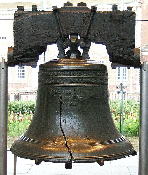
After thinking about the substitute for the coat of arms, I decided for the Liberty Bell, supposed to being rung during the reading of US Declaration of Independence. It's also connected to the fact that the city was an early capital of the USA and one of its most notorious citizens: Benjamin Franklin! It's even used by the city's baseball team, the Philadelphia Phillies.

My first thought was the vertical stripes, inspired by the coat of arms:

The bell is too small, so I decided to change the layout. I decided for the horizontal stripes of current flag, that's enough consolidated for being reportedly used without the coat of arms. Here's the result:


I like this flag, for its simplicity and for keeping the base of current flag.

For a similar attempt, look at the link. I appreciate the idea of the stylized keystone on the top of the bell.

Your comments are very welcome.
In occasion of the 100th post, I'd like to thank the readers, subscribers and commenters of this blog. Thank you very much.

21 Oct 2013

US Virgin Islands (USA)

Last week, Samuel McKittick posted on his blog two proposasl to a new flag for the US Virgin Islands.

The current flag of US Virgin Islands:


After presenting arguments to flag change, Sammy presented the following proposals:
Proposal #1 (by Samuel McKittrick)Proposal #2 (by Samuel McKittrick)

The premise of the proposals by Sammy is very well-thought: before being an American territory, the US Virgin Islands were part of the Danish West Indies. His first design is the Danish flag, with three blue stars on a navy blue background (reference to USA flag) representing the three main islands. His second proposal uses light blue (more similar to the flag of Danish West Indies) and yellow, representing the bananaquit, the national bird of the islands.

The good designs of Sammy gave me an idea to a third design that could be considered. This is it:


Firstly, I changed the star arrangement, to be more similar to the map of the islands and heraldically more traditional. The idea behind this design is to make the Danish flag emulated red and white stripes i.e. the flag of United States, representing the former and the current owners of the islands once.

To a more colorful, we can think on adding bananaquit's yellow:


This design has a much more subtle reference to American flag, what can be a potential fault, but adds local significance and the Caribbean flags' colorfulness.

Your comments are welcome.
Samuel McKittrick's post is very complete and explains more detailed the rationale of his designs. Click here to read it.

15 Oct 2013

Florianópolis (Santa Catarina, Brazil)

Continuing the series where I re-design most of Brazil capital cities flags, we reach Florianópolis today. The city, capital of Santa Catarina, have the third best HDI (Human Development Index) of Brazil, and the best among the capitals. The city is also a popular touristic destination.

The flag of Florianópolis:


The city has a very nice coat of arms, that could make a great banner of arms. It may be, however, too generic to a flag. For this reason, I'll try a different approach.

Florianópolis "postcard" is the Hercílio Luz bridge, posthumously named after its campaigner. It's the biggest suspension bridge of Brazil and, in the time of its inauguration, in May 1926, the fifth biggest in the world. It's closed to traffic since 1991, although it's still a famous touristic attraction, and has a special place in city's history: the physical link between mainland and Santa Catarina island (where the city is located) was fundamental to make Florianópolis a viable capital.

As the sunset and the sea are also symbol of the city (look, for example, to the coat of arms above), I decided to link everything on this proposal:

Design #1

This flag is a kind of modernization of the city's coat of arms. If you want something more geometrical, you may like the design below:

Design #2

I still slightly prefer the design #1. I want to know: what's your favorite?

Your comments are welcome.
Don't forget to answer the poll: what's your favorite between the two designs I presented today?

10 Oct 2013

DROPS: The jack of Brazil

This week I was too busy, so I couldn't post anything in blog. Just for don't go blank, here's a design for an alternate jack of Brazil.

The current jack is the following:


This flag was adopted in imperial times, when a new star was added to the flag every time a new province was created, always keeping the cross layout (inspired by the Southern Cross). With the proclamation of republic, each province became a state in own right, but the jack isn't changed since then. This way, while the country has 27 states, the flag still have 21 stars.

I propose little changes to the jack: change the number of stars to 27, and the ration from the 3:4  to 7:10 (the standard ratio for Brazilian flags). After studying some arrangements, I propose the following:


The construction sheet of the flag is very simple, and I can provide it if necessary.

Comments are welcome.
Next week, I hope the posts frequence to be normalized.

2 Oct 2013

Brazil [coat of arms]

Months ago, I published, on Flags Forum, a draft for a new coat of arms of Brazil that, different of the current one, follow the heraldic practice. After some corrections and additional research, I present it to you.

The current "coat of arms":


My proposal coat of arms have some additional concepts: it's inspired by the CoA of Guyana, maybe the best in South America; while the dexter (the left side of the viewer) will have elements related strictly to Brazil, the sinister (the right side of the viewer) is related to elements inspired by Brazilian colonial past.>

From this point, I think I can present my proposal:

[click on image to enlarge]

The shield is a composition of the arms of the Kingdom of Brazil (the armillary sphere being later used by other Portuguese colonies, and by Portugal itself) with four white stars in cross, representing the Southern Cross. White stars on blue can represent a large symbology related to Brazil: the naval jack, the current coat of arms, the Order of Southern Cross in its imperial and republican versions, etc.

The coffee and tobacco branches are used in both the imperial and current coat of arms. The red lace can remember the etymology of Brasil: "of flame-color". The supporter of the dexter in a jaguar (Panthera onca), the biggest feline of the American continent (and the third of the world, after the tiger and the lion), present, for example, in the 50 reais banknote, holding a banner made of a simplified version of Brazilian flag. The sinister supporter is a green wyvern, that was used, in Portugal, as a symbol of the house of Braganza. The first emperor of Brazil, himself a member of the cited house, used golden wyverns as supporters of his arms (and in his self-named order). The dragon is holding a banner of the Order of Christ, that's generally regarded as the "first" flag of Brazil (see official timeline, in Portuguese).

The helmet and the wreath are green and yellow, the main national colors of Brazil. The crest is an indigene headdress. I didn't use any motto, because Brazil officially don't have one: the empire used Independência ou Morte ("Independence or Death"), the current flag have the Positivist-inspired writing Ordem e Progresso ("Order and Progress") often considered politically un-neutral, while the current "coat of arms" have a simple República Federativa do Brasil ("Federative Republic of Brazil") as motto.

Although I see a heraldically-correct national coat of arms as a nice idea, I don't see any problem in keeping the current arms as, for example, "presidential insignia" for historical reasons.

This is only a concept, therefore your comments, suggestions, etc. are welcome.
If you're not familiarized with basic heraldic vocabulary, this can be useful.

23 Sept 2013

County Durham (England, United Kingdom)

Today, it was announced the six finalists to competition that will select the flag of the traditional county of Durham. My entry didn't form the selection of finalists, but I'll post it to spread the word about the competition.

My entry was the following:


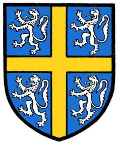
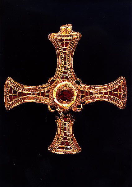
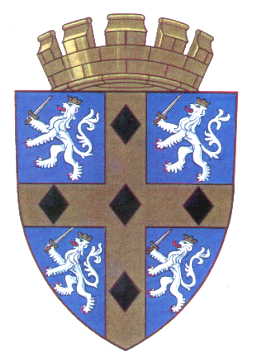
It's based on the coat of arms of the See of Durham. Its relevance is clear: from 13th to 19th centuries, the county was administered as a county palatinate under the figure of the bishop of Durham. The cross was altered to look like the pectoral cross of St. Cuthbert, a local saint of much devotion and historical relevance to the county. The black diamonds (lozenges) were added to the coat of arms granted in 1961, in reference to the famous coal miners of the region; instead of putting four to six big diamonds, I preferred to put twelve smaller ones, to create a more ornamental design. My entry was, actually, an amalgamation between some early designs, that were composed in a layout that I consider aesthetically appealing. Here are some selected drafts:
Draft #1Draft #2Draft #3

Although my design wasn't selected, I'm glad that all the finalist flags have similar themes to the mine.

Comments are greatly welcome.
The official voting is open, and you can access it in the link (bottom of the page).

17 Sept 2013

United Kingdom (without Scotland)

The upcoming referendum about Scottish independence, to be held in 18 September 2014, has generated a doubt about a possible "rest of UK" flag. While many people say the UK flag won't change whatever is the result, we should be aware of the hypothesis of Scottish leaving the Union and the flag of the remaining kingdom being changed; if it occurs, what should be the best option?

My proposal is the following:


In the Yes-winning scenario, the remaining UK should be constituted of England, Wales and Northern Ireland. While the current flag represents the order of the kingdoms joining the Union, the design in the hypothetical could represent all the constituent countries in same way. The yellow cross on black background represents Wales, the red saltire on red stands for Northern Ireland, while the red cross overall represents the England. If Cornwall eventually become a constituent country, part of yellow fimbriation can be turned white. The saltire is completely red, and not counterchanged red and white like in current flag.

At least two other questions about vexillology can be resultant of the hypothetical scenario: the case of the ensigns and the royal standard.

Ensigns: They don't need to be changed. For this occur, it only needs that, while the national flag is changed, the current naval jack is kept. The now-independent countries that still adopt a British ensign (Australia, New Zealand, Fiji, Tuvalu, Cook Islands) can also keep it for historical purposes.

Royal standard: It could be an excellent opportunity to Wales be represented in UK royal standard. However, its inclusion can be ambiguous, as the Prince of Wales uses the "royal" coat of arms of Wales (as used in Wales and in England and Northern Ireland). Other options are quartering England and Northern Ireland, or marshalling them, for example.

As it's a very complex issue, I invite you to leave your opinion on the comments.
This post is about vexillology, not politics. Comment gently, please.