23 Sept 2013

County Durham (England, United Kingdom)

Today, it was announced the six finalists to competition that will select the flag of the traditional county of Durham. My entry didn't form the selection of finalists, but I'll post it to spread the word about the competition.

My entry was the following:


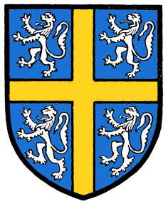
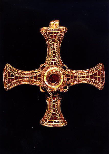
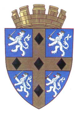
It's based on the coat of arms of the See of Durham. Its relevance is clear: from 13th to 19th centuries, the county was administered as a county palatinate under the figure of the bishop of Durham. The cross was altered to look like the pectoral cross of St. Cuthbert, a local saint of much devotion and historical relevance to the county. The black diamonds (lozenges) were added to the coat of arms granted in 1961, in reference to the famous coal miners of the region; instead of putting four to six big diamonds, I preferred to put twelve smaller ones, to create a more ornamental design. My entry was, actually, an amalgamation between some early designs, that were composed in a layout that I consider aesthetically appealing. Here are some selected drafts:
Draft #1Draft #2Draft #3

Although my design wasn't selected, I'm glad that all the finalist flags have similar themes to the mine.

Comments are greatly welcome.
The official voting is open, and you can access it in the link (bottom of the page).

17 Sept 2013

United Kingdom (without Scotland)

The upcoming referendum about Scottish independence, to be held in 18 September 2014, has generated a doubt about a possible "rest of UK" flag. While many people say the UK flag won't change whatever is the result, we should be aware of the hypothesis of Scottish leaving the Union and the flag of the remaining kingdom being changed; if it occurs, what should be the best option?

My proposal is the following:


In the Yes-winning scenario, the remaining UK should be constituted of England, Wales and Northern Ireland. While the current flag represents the order of the kingdoms joining the Union, the design in the hypothetical could represent all the constituent countries in same way. The yellow cross on black background represents Wales, the red saltire on red stands for Northern Ireland, while the red cross overall represents the England. If Cornwall eventually become a constituent country, part of yellow fimbriation can be turned white. The saltire is completely red, and not counterchanged red and white like in current flag.

At least two other questions about vexillology can be resultant of the hypothetical scenario: the case of the ensigns and the royal standard.

Ensigns: They don't need to be changed. For this occur, it only needs that, while the national flag is changed, the current naval jack is kept. The now-independent countries that still adopt a British ensign (Australia, New Zealand, Fiji, Tuvalu, Cook Islands) can also keep it for historical purposes.

Royal standard: It could be an excellent opportunity to Wales be represented in UK royal standard. However, its inclusion can be ambiguous, as the Prince of Wales uses the "royal" coat of arms of Wales (as used in Wales and in England and Northern Ireland). Other options are quartering England and Northern Ireland, or marshalling them, for example.

As it's a very complex issue, I invite you to leave your opinion on the comments.
This post is about vexillology, not politics. Comment gently, please.

9 Sept 2013

My personal coat of arms

One year ago, I posted a draft of my personal coat of arms [link to post]. At the time, my personal coat of arms was approximately this way:


After many tests, I developed a design that passes on test of time, and correct under heraldic rules. It's similar to design above, but with many slight corrections. Here's an emblazonment (depiction) made by myself:


l will explain it by parts (this quick glossary can be very useful):

Escutcheon (shield): Very similar to the draft, but with different chief (superior part). I blazon it this way (other variants are possible):
Per fess Or ermined Azure and Azure, on chief a lion passant guardant Pourpre armed and langued Azure, on base a cross moline Or.
The draft contained a ultra-rare tincture (color) called Amaranth, between the pink and the purple. To avoid it being confused with Gules (red) or Pourpre (purple), I adopted the Pourpre tincture instead.

The escutcheon is round in the bottom, the most used in Iberic Peninsula and Latin America.

The lion is canting or punning ("Leo" is also an abbreviation of "Leonardo") and the lion represents many virtues in most of cultures. The cross moline represents my religion (Christianism) and is also one of the most striking heraldic charges, in my opinion. The ermine spots grants that my design is unique, as they rarely occurs.

Crest: The same lion of the shield, but in a different position, holding the cross moline of the same escutcheon. The owl was removed in name of a more homogene coat of arms. I blazon it as follow:
A demi-lion rampant guardant Pourpre langued and armed Azure, holding between the paws a cross moline Or.
Mantling and wreath (torse): Azure (blue) and Or (yellow), the main dark and light colors of my coat of arms.

Helmet: A gentleman (or commoner) coat of arms, to don't claim honors that I don't possess.

Motto: "Homines Sumus, Non Dei" (translation: We Are Men, Not God). Represents the humility, one of the virtues I value the most, and the sense that we must be strong in all situations.

Standard: A simple banner of arms. The idea is use it in more ceremonial occasions. The ratio of 4:5 seems to a gentleman.


Flag: To be used in less formal occasions. The base of the escutcheon.


I know that a golden cross moline in a blue background was used in other occasions; for example, a Lord Molyneux used it on English Civil War, although the cross had a less modern design. Where ambiguity can occur, the banner of arms can be used.

Comments, suggestions, requests are all welcome with pleasure.
Very special thanks to Paul James and Samuel McKittrick from Flags Forum, of whom without the advices and guidance my coat of arms couldn't reach such quality.

3 Sept 2013

West Indies zone

In cricket, many nations of Caribbean compete under "West Indies" umbrella. Most of its members belonged to former British West Indies, although it also includes American and Dutch dependencies. It's formed by six minor associations: Barbados, Guyana, Jamaica, Trinidad and Tobago, Leeward Islands and Windward Islands (the later two subdivided in smaller associations).

The idea of this post is based on the fact that there isn't a representative flag of West Indies. Generally, the flag of the West Indies Cricket Board is used, but it's copyrighted and can't represent the region in a different context. It's WICB flag:


For this purpose, the flag should be as generic as possible, as West Indies area is constituted by countries with their own diversity. But, if possible, it should resembles to WICB logo and, in lesser scale, the West Indies Federation flag.


The wavy pattern and the golden disc comes from both the WICB logo and Federation flag. The palm tree is a feature of IWCB logo[ and a well-known symbol of the Caribbean. The sun disc was moved from the right to the left, to form a more equilibrated layout.

This flag can be carried by West Indies fans, included as handmade pieces. There isn't any symbol that attaches it necessarily to cricket, being possibly used in other contexts. And this flag isn't copyrighted and can be customized.

Your comments are welcome!
The blog doesn't have many posts related to Central Americas. I'm accepting suggestions.

27 Aug 2013

Benedict XVI as pope emeritus

The then pope emeritus Benedict XVI was the first pope to have ever resigned since 1415. A new question was arose: how should be the coat of arms of a pope emeritus?

It's the coat of arms of Benedict XVI while still pope (and possibly still in use):


The external ornaments used are on this coat of arms are:
  • the St. Peter's keys, that represents the papacy (a reference to Matthew 16:19);
  • the mitre, stylized to be similar to a papal tiara (affirming the fact that the pope is also a bishop);
  • the pallium, because the pope is a metropolitan or primate archbishop (in this case, of the Archdiocese of Rome), and to represent the collegiality of all the bishops.
As much of the above ornaments may not be correctly attributed to a pope emeritus, a proposal by cardinal Andrea Cordero Lanza di Montezemolo, the same author of the coat of arms of Benedict XVI as a pope, was saw on the media:


I'm not particularly keen of the cardinal's design. The pallium is never used by an archbishop emeritus, and naturally shouldn't be used by a pope emeritus. Moreover, I don't think that the red chief integrates well with the rest of the the shield. Here's my proposal.


For the reason cited on previous paragraph, I don't think it's a good element to the coat of arms, with the additional reason that it doesn't combine with a round shield, that was preferred. The mitre can stay, as a consecration lasts all the life; even though the mitre is very similar to a papal tiara, it's still a mitre, and can be used as a special honor.

The papal keys are removed from the background and kept on the chief, as an honor, but, differently of cardinal's proposal, I kept the whole design in a way that could be traditional but still resembling current coat of arms. So I opted by the partition in saltire, that seems a sharp option for a now-quartered shield. The motto that was, for unknown reason, dropped from papal coat of arms can return.

Your comments are always welcome.
As religion is a very sensitive theme, I'd decided to write this post in a technical perspective. Prejudiced comments won't be allowed.
I'd like to put the motto on a scroll, but my artistic abilities didn't allow me to do so.
I like very much to write about heraldry! If this post have a good response, I'll write more about the theme.

19 Aug 2013

Aracaju (Sergipe, Brazil)

Aracaju is the capital of the state of Sergipe, in the northeast of Brazil. Just for curiosity, it's considered the healthiest capital of Brazil: more bikes and less smokers.

Here's the flag of Sergipe:


If you're not familiarized to Brazilian flags, you may not have noticed that this flag is heavily based on the Sergipe state flag. The coat of arms says very few about the city: the cross and the gear have obvious symbolisms, the other two quarters represent the importance of the salt and coconut to local economy (although the city isn't very known by it).

Aracaju etymology means "bird's cashew". The city is commonly known as the "City of the Cashew" and there are references to the fruit everywhere around the city. So my proposal is keep the current pattern, pick it less similar to Sergipe state flag and add a cashew. Here is it:


Initially, I rejected the flag for being too "direct to the point", but I think its cleverness has grown on me. If you want, you can consider that the white represents the salt, green the coconuts and yellow for the wealth of its urban center, and then you have made a parallel to the city's coat of arms.

Your comments are welcome.
The flag series is very near the end: only six flags left!

13 Aug 2013

Gaza Strip

My flag proposal to Gaza strip is inspired by the flag of Gaza municipality, the biggest city of the strip.

The flag is a plain field (in many different color variants) with the municipality coat of arms, consisting of checkered red and green and a phoenix (representing the many rebirths of the city along the history). Here's my proposal:


The red and green lozenges are intercalary with white ones, representing the peace and the future to be written. I don't know if a flag based on a municipality's is adequate, but this design is, for sure, striking.

Your comments are welcome.
But, please, don't forget that the this isn't a post about politics or so, but only vexillology.