The Zambia flag is a common topic in flags redesign discussions (see example). I'll show the flag and so it'll become clearer.
The major elements of flag are set on the right, so they're hard to be seen in the wind (see for yourself). Also, this green shade is a little eye-unfriendly for me.
Thinking about these two main faults, I created a new flag:
The vertical stripes were rotated 90° to right, and the eagle was moved to the left, making the flag more "balanced". The green and red shades became darker, making it more contrasting and less eye-tiring. As final touch, the eagle was put leaning on red stripe.
As I wasn't satisfied, I made a second proposal, my favorite:
The colors are the same of previous flag, but the arrangement is better: diagonal stripes crossing two green halves. The eagles is flying on first division, making it more visible.
Now, I'll explain the meaning of elements of Zambian flag. Firstly, the colors: green for the lush flora, red for the blood fallen on fight for freedom, black for Zambian people and gold for natural resources and mineral wealth. Now, the reason because I only made this explanation in the end: the eagle must be, necessarily, flying, because it represents the rise above nation's problem, but on first flag it's leaning. It was corrected on second flag, that I consider the best I made to Zambia.
Your comment is welcome; please, feel free to show your opinion.
I'm working on a set of flags. If it ends soon, I'll post it next week.
28 Oct 2012
21 Oct 2012
Aragon (Spain)
Simplifications are sometimes great issues: what to keep and what to remove? This was the big question I found when doing my Aragon proposal. First, see the current flag:
This flag is complicated (like many Spanish flags). The simplest simplification would keep only the stripes, but we're too late: it's yet used by neighbor and related autonomous community of Catalonia; both were under rule of former Crown of Aragon. So it's needed to choose a symbol to make the flag unique. Therefore we need to look at Aragon coat of arms:
The nationalists use a blue canton with a white star, or a centered red star, but I won't use them because of their political connotations. So, the choice was the Cross of Iñigo Arista. I made two variant versions using this symbol: the flag is divided slightly differently. See them:
I think the results are interesting.
What do you think about the post? Your comment is welcome!
Talking about so old arms can cause controversy, because the historic sources are sometimes contradictory If you have a different information, please share it on comment box.
This flag is complicated (like many Spanish flags). The simplest simplification would keep only the stripes, but we're too late: it's yet used by neighbor and related autonomous community of Catalonia; both were under rule of former Crown of Aragon. So it's needed to choose a symbol to make the flag unique. Therefore we need to look at Aragon coat of arms:
- At first quarter, the arms of the County of Sobrarbe. Too complicated to be in the flag.
- At second quarter, the arms attributed to Iñigo Arista, the first king of Navarre and probably count of Sobrarbe. There's no evidence it was really used, but it's a cool symbol.
- At third quarter, an allusion to the flag used in the Battle of Alcoraz (1096), during the war against Moors. This is used as flag of Sardinia (the Moor heads are, in Sardinian flag, incorrectly turned to right since 1999). A plain version (St. George's cross) is also very popular, but it's the same insignia used by England, Milan, Genoa and many others.
- At fourth flag, the arms of Crown of Aragon, currently held by Catalonia. Also, combining vertical and horizontal stripes would create an undesired effect.
The nationalists use a blue canton with a white star, or a centered red star, but I won't use them because of their political connotations. So, the choice was the Cross of Iñigo Arista. I made two variant versions using this symbol: the flag is divided slightly differently. See them:
I think the results are interesting.
What do you think about the post? Your comment is welcome!
Talking about so old arms can cause controversy, because the historic sources are sometimes contradictory If you have a different information, please share it on comment box.
14 Oct 2012
Michigan (USA)
Reading an interesting Tumblr blog about new United States and Canada flags (visit it), I knew about a proposed flag to Michigan state. The explanation by flag designer (Christopher Zervic) can be found here. Here you can see current flag and, underneath, the proposed flag.
I don't need to explain what's wrong with current flag, the author of the proposed flag explains it good (and I totally agree with him). The Mr. Zervic's proposal is really interesting. Let me explain some facts about it: the two stars represents the two peninsulas that constitute the state, green is for land's fertility, and the five horizontal stripes represent the five Great Lakes (although only four of them waters the state).
This flag inspired me to make my own proposal. I'm not claiming it's better than original one. It's here:
I divided the green part with a blue stripe, as they are divided by Lake Michigan. The lakes themselves are represented by five smaller stars. The white stripes are only fimbriation. After I designed it, I made a little research and found that it's similar to a proposed flag to Minnesota (see it). It's a hard life!
Every kind of comment is welcome.
Promised and fullfilled: two posts this week.
13 Oct 2012
Fernando de Noronha (Brazil)
When I did my series about Brazilian state flags (see intro and epilogue), I originally planned make a flag to Fernando de Noronha, what didn't happened. But now I'll do it.
Actually, Fernando de Noronha isn't a state — it was a territory between 1942 and 1988 (with status similar to a US unorganized territory), being since then a Pernambuco state district (the only state district in Brazil). Also, a great part of the archipelago constitutes the Fernando de Noronha National Park. Since 1982, the archipelago has been using this flag:
The flag is complicated, the blazon isn't heraldically a true coat of arms and there are many writings, including a silly lettering in Latin: "Fernandi Noronhae" (Fernando de Noronha (sic) discovered the islands and held the brazilwood royal monopoly between 1501 and 1504). Being this flag very accepted as a symbol of the islands, I tried to change it the least possible. I made two variants:
Before explain the changes, I'll explain what I kept: a landscape of main island, including its "great rock" and the dolphins — apart from having some of most heavenly beaches in the world (with excellent options to surf, snorkeling or just sea bath), it's considered the best point of dolphin-viewing of the world.
The first proposal shows the landscape in a circle, with the pair of dolphins being used as a kind of "supporters". I prefer this one, because its designis clearer and, for me, resembles more the Brazilian national flag. The second, although, is more "natural" because shows the dolphins as part of the landscape, diving in the sea.
Other change was the inversion of green shades: I'm sure the mountain is greener than the sea. A problem these flags still have is the different shades of blue and green, that I couldn't solve satisfactorily.
All the comments are welcome. Would be a pleasure if you subscribe the blog. Thank you!
Before somebody ask: no, I never was in Fernando de Noronha... so far.
9 Oct 2012
Antofagasta Region (Chile)
Antofagasta is the only Chilean region without its own flag. About a month ago, the region's intendant (the term is equivalent to "manager" or "steward") released a competition to choose a new flag (see a news link here). Apparently, only region's inhabitants can post a proposal, but I created my own anyway.
Currently, as there isn't an official flag, they use the intendant's flag:
That flag is a blue field with a seal consisting of Chilean national coat of arms and a inscription "Intendencia II Región - Antofagasta", that I freely translate as "Administration of Region II - Antofagasta". It's ugly and indistinguishable.
Historically, the Antofagasta constituted the Litoral Department, of Bolivia (Chile gained sovereignty over the area during the War of the Pacific (1879-1883). In this time, they used the flag below, that I discarded:
I was making some prototypes with arrows before, and I found here a perfect opportunity to use them:
I tried to use the Litoral department colors, but it increased too much flag's complexity and decreased the flag's visual impact. Blue is for the ocean: the capital city, Antofagasta, is a great port. The first arrow, pointing to the ocean (see Chile map), represents mining, the biggest economic activity of region. The orange color represents copper, more important and commonly found ore in region. The second arrow represents second biggest economic activity: the tourism, oriented mainly to pre-Columbian archaeology sites and the salares (salt pans). Salt also represent an important role in native ancient inhabitants' life, so it also represents them.
Thank you for reading. Your comment is very appreciated.
There might be two posts in next week. Hope I can...
30 Sept 2012
Canada: Duality
In Canada, the discussions about a possible flag change are very polemic, dividing people between pro-change and anti-change. One of bigger reasons to change (I'm not saying it's my personal opinion) is that, while Canadian population is basically constituted by Anglophones and Francophones, only the firsts are represented in the flag.
The red represents the British heritage, and blue represents the French heritage. The maple leaf is dividing the flag, and it's white because it means peace. The red is not touching the blue, what improves a lot flag's visibility. The position of the colors is based in the principle that French population is concentrated in the east. See the map (darker means bigger Francophone population):
The original meaning of Canadian flag says white is for the French heritage (this color was used in French royal emblems for centuries) and red is for the British, but usually white is considered a neutral flag, so Francophones aren't represented. Therefore, more embracing flags are sometimes proposed. Between them, the most famous is the unofficial "Canadian Duality Flag" or "Canadian Unity Flag", created during 1995 Quebec secession referendum (obviously, by "no" campaign). It consists of Canadian flag with added blue bars. Blue was a color used in flags used in French colonies in America (see example). This is the mentioned flag:
The main virtue of Canadian national flag is simplicity — that "duality flag" ruins. The blue touching the red is neither a good choice. So I come with a new flag proposal to represent the Canadian British-French duality:
Also, it opposes the French national flag's color order, to avoid any misinterpretation. Finishing, I'd note that it's more a proposal to a new "duality flag", although it could, occasionally, be proposed as Canadian national flag, what I didn't pretend to do at the moment.
Your comment is always welcome. Please feel free to express your opinions. Thanks for reading! If you liked the blog, you may like to follow it (button is on the left).
I'd like to clarify that it's not my intention express any political opinion in this post.
Your comment is always welcome. Please feel free to express your opinions. Thanks for reading! If you liked the blog, you may like to follow it (button is on the left).
I'd like to clarify that it's not my intention express any political opinion in this post.
24 Sept 2012
Derry/Londonderry (United Kingdom)
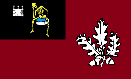
My friend Samuel McKittrick designed a flag to its own city, Londonderry (as unionist usually name it) or Derry (as nationalist usually prefer), the second biggest Northen Irish city (see the post here). It's going to be the first UK City of Culture, in 2013, so it's a good time to build a flag. Just above you can see two flags: the first is the unofficial city council's flag and the second is my favorite Sammy's proposal.
Let's explain them: the first flag depicts the coat of arms, also symbolized in second flag. It depicts a skeleton (or the Death) on a stone with a castle in left. The real origin of the meaning is unknown, but it's popularly said to represent the castle of the 2nd Earl of Ulster, Richard De Burgh (1259-1326), being the skeleton from one of his knights and cousin, starved to death on castle's dungeons. In the chief (top of shield) there's London coat of arms (sometimes with a harp on center), added when city changed its name from Derry to Londonderry.
The field of both flags is a crimson, representing the crimson flag, firstly flown during the Siege of Derry (1689) as symbol of defiance. Sammy's flag contains badge with a oak leaf and a stronghold, taken from a memorial in Guildhall square. The oak represents city's origins and name (Doire means "oak grove" in Irish). The bastion is a reference to the city's insurmountable walled city (hence city's nickname "maiden city").
Based in this flags, I made my own proposal to Derry's/Londonderry's flag:
In the first flag, the coat of arms. I didn't use the London banner of arms to avoid somebody concluding that city has any formal relationship with the English city. The field is crimson, the same shade of flags above. I use the same oak leaves from Doire team in GAA (Gaelic Athletic Association). I'm not still 100% satisfied with the flag, but still think it's reasonable. I tried a half-half version of flag, instead of a "cantoned" one, but that didn't work, for me.
Thanks for reading! Any kind of comment is welcome.
I recommend the visit to Sammy's post about Derry/Londonderry flag: click here.
Subscribe to:
Posts (Atom)